Compare commits
51 commits
| Author | SHA1 | Date | |
|---|---|---|---|
| d97f7762cd | |||
| da0663466c | |||
| 5b35fc67b3 | |||
| f2746123ae | |||
| bc896248a4 | |||
| acd1e97adf | |||
| f2c05fb7fb | |||
| da6ba502cd | |||
| 38f495c0fa | |||
| 44a2708a7c | |||
| ef45e03f0e | |||
| 63daf6e314 | |||
| 9690fa8f68 | |||
| cc879b3d0f | |||
| f6f9ab5e45 | |||
| 35b847105d | |||
| 530dff439c | |||
| 41b6d44259 | |||
| 8c3bcd1bec | |||
| 55405cac2c | |||
| 2e42382720 | |||
| 005db549c0 | |||
| 9d8c8879f8 | |||
| aad6525c3c | |||
| abe67055d0 | |||
| 55b96b4cf4 | |||
| c66a5eb7be | |||
| 7b48653966 | |||
| 4965231f6f | |||
| cef76dfd66 | |||
| b4ce4c8cf7 | |||
| 1bb352f893 | |||
| 46ad64d5aa | |||
| bbb07912bc | |||
| 772d656cfa | |||
| 56d13d2ce3 | |||
| f5adb74028 | |||
| 2997caddde | |||
| cdfe928112 | |||
| 975b045a0a | |||
| 20e31e4796 | |||
| 4b4cbc6cc8 | |||
| 5fc24633f5 | |||
| 37552b4d65 | |||
| d230d962ec | |||
| 50a21b817d | |||
| e3fb0254c7 | |||
| 561294f72c | |||
| b26cb30b9b | |||
| f290e049bd | |||
| 1b3e251a9d |

88 changed files with 5179 additions and 351 deletions
135
.claude/skills/docs-review/SKILL.md
Normal file
135
.claude/skills/docs-review/SKILL.md
Normal file
|
|
@ -0,0 +1,135 @@
|
|||
---
|
||||
name: docs-review
|
||||
description: Review documentation and give structured, actionable feedback grounded in the "50 docs tips" best practices from Sarah Rainsberger, Astro's docs lead. Use this whenever the user asks to review, critique, assess, or improve documentation of any kind — a README, tutorial, guide, API reference, changelog, release notes, docs site page, or Markdown/MDX file — whether they provide a file path, paste the text, or give a URL to a web page. Trigger even for casual phrasings like "look at these docs", "any feedback on this page?", "is this README good?", or "how can this guide be better?".
|
||||
---
|
||||
|
||||
# Docs Review
|
||||
|
||||
Review a piece of documentation and deliver feedback its author can act on
|
||||
immediately. The review standard comes from Sarah Rainsberger's
|
||||
["50 docs tips"](https://www.rainsberger.ca/docs-tips/) series, distilled into
|
||||
`references/docs-tips.md`. The guiding idea of that series: the sole purpose of
|
||||
docs is to be helpful. Every finding you report should trace back to a way the
|
||||
document could help its reader more.
|
||||
|
||||
## Step 1: Get the document
|
||||
|
||||
- **Local file path** → `Read` it. If given a directory, list it and review the
|
||||
entry-point docs first (README, index, getting-started), then ask which others
|
||||
matter or sweep them if the user asked for everything.
|
||||
- **URL** → `WebFetch` with a prompt asking for the page's full content,
|
||||
including headings hierarchy, code blocks (with their titles/filenames, if
|
||||
shown), link text, and admonitions/asides — these details are exactly what the
|
||||
review needs, and a summary would hide them. If `WebFetch` is unavailable or
|
||||
blocked, try `curl -sL <url>` and read the HTML. If the URL is unreachable
|
||||
from the environment, say so plainly and ask the user to paste the content —
|
||||
do not review a page you could not read.
|
||||
- **Pasted text** → review it as-is.
|
||||
|
||||
## Step 2: Establish context before judging
|
||||
|
||||
Identify, and state in the review:
|
||||
|
||||
1. **Document type**: tutorial (learning-oriented), how-to guide
|
||||
(task-oriented), reference (information-oriented), concept/explanation,
|
||||
README, changelog/release notes, or landing page.
|
||||
2. **Assumed audience**: beginner or experienced? Users of the project or
|
||||
contributors to it?
|
||||
3. **Place in the reader's journey**: what has the reader likely already read or
|
||||
done when they land here?
|
||||
|
||||
This matters because several checks depend on purpose: content that is perfect
|
||||
in a tutorial can be wrong in a reference page ("right words, wrong place"), and
|
||||
release notes have their own rules. Judge the document against *its* job, not
|
||||
against a generic ideal.
|
||||
|
||||
Also look for a project style guide (CONTRIBUTING, STYLEGUIDE, writing-guide
|
||||
files) when reviewing docs inside a repo. Where the project's stated conventions
|
||||
conflict with the rubric, the project wins — note the conflict rather than
|
||||
flagging compliant text.
|
||||
|
||||
## Step 3: Review against the rubric
|
||||
|
||||
Read `references/docs-tips.md` in full, then go through the document with its
|
||||
checklist categories:
|
||||
|
||||
1. Helpfulness and truth
|
||||
2. Voice and tone
|
||||
3. Word choice
|
||||
4. Tense and current state
|
||||
5. Positive patterns (show what to do)
|
||||
6. Structure and the reader's journey
|
||||
7. Instructions and procedures
|
||||
8. Code samples
|
||||
9. Scope (what not to document)
|
||||
10. Changelogs and release notes (when applicable)
|
||||
|
||||
Collect concrete findings: quote the actual text, note where it is (heading,
|
||||
section, or line), and identify which principle it violates. If the same issue
|
||||
repeats (e.g. "simply" appears 14 times, or no code block has a title), report
|
||||
it once as a pattern with a count and a couple of examples — don't list every
|
||||
instance.
|
||||
|
||||
## Step 4: Write the review
|
||||
|
||||
Use this structure:
|
||||
|
||||
```markdown
|
||||
# Docs review: <title or path>
|
||||
|
||||
**Type:** <doc type> · **Audience:** <assumed audience>
|
||||
|
||||
## Summary
|
||||
<2–4 sentences: what the document does well and the single biggest opportunity.>
|
||||
|
||||
## What's working
|
||||
<3–5 bullets. Real strengths, specifically observed — not padding.>
|
||||
|
||||
## Findings
|
||||
|
||||
### High impact — hurts the reader's success
|
||||
### Medium — causes friction or confusion
|
||||
### Polish — small wins
|
||||
|
||||
<Each finding:>
|
||||
- **Where:** <section / heading / line>
|
||||
**What:** "<short quote of the current text>"
|
||||
**Why it matters:** <one sentence, citing the tip — e.g. (Tip 23: is not was)>
|
||||
**Try instead:** "<concrete rewritten text, ready to paste>"
|
||||
|
||||
## Quick wins
|
||||
<Top 3–5 changes with the best effort-to-impact ratio.>
|
||||
```
|
||||
|
||||
Rules of conduct for the review itself — the rubric applies to your feedback
|
||||
too:
|
||||
|
||||
- **Show what to do** (Tip 34): never flag something without showing a fixed
|
||||
version. A criticism without a rewrite makes the author do your job.
|
||||
- **Prioritize by reader impact**, not by how easy something is to spot. A
|
||||
broken prerequisite chain outranks ten filler words.
|
||||
- **Be selective.** A review with 8 well-chosen findings gets acted on; one
|
||||
with 40 gets closed. Fold minor repeats into patterns, and let genuinely fine
|
||||
text be fine.
|
||||
- **NWTWWHB** (Tip 49): when reviewing a contribution or a draft, the bar is
|
||||
"not worse than what we had before" — improvements need not be perfect to be
|
||||
worth merging. Frame feedback so the author can land the improvement now and
|
||||
polish later.
|
||||
- **Don't review taste.** If the project consistently uses a voice or
|
||||
convention you wouldn't choose, consistency wins; flag only real barriers to
|
||||
the reader.
|
||||
|
||||
## Edge cases
|
||||
|
||||
- **Very long documents** (roughly 1,500+ lines): review the structure first —
|
||||
headings map, ordering, findability — then deep-review the highest-traffic
|
||||
sections (intro, install, first task). State explicitly which sections got a
|
||||
deep read and which were sampled.
|
||||
- **Multiple files**: give each file a short review plus one shared section for
|
||||
patterns that repeat across the set.
|
||||
- **"Fix it" requests**: if the user asked you to improve the docs rather than
|
||||
just review them, still produce the findings list first (so the reasoning is
|
||||
visible), then apply the edits for everything you flagged.
|
||||
- **Non-docs text** (marketing copy, blog posts): the rubric mostly still
|
||||
applies, but say you're adapting a docs rubric and skip docs-specific checks
|
||||
(code block titles, changelog rules) that don't fit.
|
||||
254
.claude/skills/docs-review/references/docs-tips.md
Normal file
254
.claude/skills/docs-review/references/docs-tips.md
Normal file
|
|
@ -0,0 +1,254 @@
|
|||
# Docs review rubric — distilled from Sarah Rainsberger's "50 docs tips"
|
||||
|
||||
Source: [50 docs tips](https://www.rainsberger.ca/docs-tips/) by Sarah
|
||||
Rainsberger, docs lead for [Astro](https://astro.build), written as a
|
||||
"50 docs tips in 50 days" series, plus her companion talk
|
||||
["Stop writing docs. Start helping!"](https://www.rainsberger.ca/blog/stop-writing-start-helping/).
|
||||
|
||||
This file distills the series into a review rubric organized by theme. Where a
|
||||
check comes from a specific tip, it is cited by number and title. Entries marked
|
||||
*(from title)* are interpreted from the tip's (self-demonstrating) title; the
|
||||
canonical wording lives on the site. The rubric is faithful to the series'
|
||||
philosophy but is a distillation, not a mirror.
|
||||
|
||||
**The one-line philosophy:** the sole purpose of documentation is to be
|
||||
helpful. "Minimum Viable Docs" = every statement is true, and readers can find,
|
||||
read, and understand what the statements mean. Every check below is a
|
||||
concrete way docs fail one of those conditions.
|
||||
|
||||
---
|
||||
|
||||
## 1. Helpfulness and truth
|
||||
|
||||
- **Every statement must be true — docs are the record of truth** (Tip 14:
|
||||
*this post includes advice*). Official docs are the primary resource for how
|
||||
a project works; readers come to docs for the truth they can't get anywhere
|
||||
else. Flag anything speculative, outdated, or contradicted elsewhere in the
|
||||
same docs. Precision extends to small words: "includes" promises a partial
|
||||
list; "are" promises a complete one. Check that the word's promise matches
|
||||
reality.
|
||||
- **Helping beats writing.** If a sentence exists to sound complete rather than
|
||||
to help the reader do or understand something, it's a candidate for deletion.
|
||||
If you want readers to do something to have a successful outcome, just say it
|
||||
that way — as a direct instruction, not a description of possibilities.
|
||||
- **Watch for "should."** "The value should be a string" — is it a requirement,
|
||||
a recommendation, or a hope? Replace with the true statement: "The value must
|
||||
be a string" / "Set the value to a string". Deleting or replacing "should"
|
||||
almost always makes a docs sentence more true.
|
||||
|
||||
## 2. Voice and tone
|
||||
|
||||
- **Don't sound smart; make your reader feel smart** (Tip 1). Flag prose whose
|
||||
main effect is demonstrating the author's expertise — dense jargon, showing
|
||||
off internals, name-dropping theory before the reader can do anything with it.
|
||||
- **Docs is not a conversation — skip the pleasantries** (Tip 3). "Welcome!",
|
||||
"Now, let's dive in!", "Happy coding!", "As you may recall…" cost reading time
|
||||
and carry no information. Cut them. (A single short greeting on a landing page
|
||||
can be fine; a chatty tone *throughout task content* is the problem.)
|
||||
- **Simplify so the meaningful words stand out** (Tip 39: *smarty pants*).
|
||||
Docs must be consumable by readers of every experience and language level.
|
||||
Prefer the plain word over the impressive one: "use" over "leverage,"
|
||||
"so" over "consequently." No one has ever complained that docs were too easy
|
||||
to read.
|
||||
- **Don't say "please"** (Tip 41: *if you please*, from title). Instructions
|
||||
are not requests: "please run the following command" → "Run the following
|
||||
command." Politeness words dilute imperatives and read oddly at scale.
|
||||
- **Trust your reader** (Tip 8: *don't forget*). "Don't forget to…" /
|
||||
"Remember to…" assumes the reader is careless. State the step; trust them to
|
||||
scroll up if something didn't work the first time.
|
||||
- **Don't hedge required steps as optional** (Tip 16: *read this tip… if you
|
||||
want to*, from title). "If you want, you can add…" — if the step is needed
|
||||
for success, instruct it. Reserve "optionally" for things that are truly
|
||||
optional, and say what choosing the option gets you.
|
||||
|
||||
## 3. Word choice
|
||||
|
||||
- **Say exactly what happens — don't "make things happen"** (Tip 2). Vague
|
||||
cause-and-effect phrasing ("this makes the component work") hides the actual
|
||||
behavior. Name the effect: "this registers the component so the browser
|
||||
renders it wherever the tag appears."
|
||||
- **Say how a thing is used, not just "use"** (Tip 26: *use this*). "Use" often
|
||||
obscures the real purpose or action. If someone handed you a hammer and said
|
||||
"Use this!", you'd have a reasonable idea what they meant — your API is not a
|
||||
hammer. "Use the `render` prop" → "Pass a function to the `render` prop to
|
||||
control what each row displays."
|
||||
- **Ban "appropriate," "as needed," "properly"** (Tip 13: *inadvertently
|
||||
inappropriate*). "Configure the appropriate values" is not descriptive — the
|
||||
reader came to the docs precisely because they don't know which values are
|
||||
appropriate. Replace with the actual criteria or an example.
|
||||
- **Define even the "obvious" terms** (Tip 32: *defining the obvious*). Don't
|
||||
rely on the common meaning of a word to explain what it means in your
|
||||
project. Docs serve readers of all experience levels and language levels; a
|
||||
term of art ("island", "hydration", "slot") needs a definition or a link at
|
||||
first use.
|
||||
- **Minimize filler and intensifiers.** "Simply," "just," "easily," "obviously,"
|
||||
"of course" — these claim the task is easy instead of making it easy, and
|
||||
they read as condescending the moment a reader struggles. (Flag as a pattern
|
||||
with a count, not one finding per instance.)
|
||||
|
||||
## 4. Tense and current state
|
||||
|
||||
- **Is, not was** (Tip 23). Document the present state of the project in
|
||||
present tense. Readers don't need the history ("previously this option was
|
||||
called…", "as of v2 you can now…") to use the current version. Historical
|
||||
notes belong in the changelog; "now" ages badly everywhere.
|
||||
- **New features get assimilated, not appended** (Tip 21: *prepare to be
|
||||
assimilated*). Much docs work isn't writing new pages — it's updating
|
||||
existing ones. When a feature gains a new option, the existing sections that
|
||||
are now incomplete or inconsistent must be updated too. In review: check
|
||||
whether the surrounding/related sections still agree with the text under
|
||||
review; flag "NEW in vX.Y"-style bolt-on paragraphs that should be merged
|
||||
into the main flow.
|
||||
|
||||
## 5. Positive patterns — show what to do
|
||||
|
||||
- **Show the good version** (Tip 34: *show what to do*). Present things in the
|
||||
positive: this is how it works, this is how you do it. Avoid teaching via
|
||||
anti-examples — readers skim, copy code blocks, and remember what they saw,
|
||||
so a "❌ don't do this" block can inadvertently introduce or reinforce the
|
||||
unwanted pattern. If a warning is truly needed, keep the bad example small,
|
||||
clearly marked, and always paired with the good version.
|
||||
- **Don't reference what isn't shown** (Tip 31: *as not shown here*, from
|
||||
title). "As shown above," "as mentioned earlier," "see the previous example" —
|
||||
verify the referenced thing actually exists, is nearby, and is where the
|
||||
text claims. Better: link directly to it or restate the one line that
|
||||
matters.
|
||||
|
||||
## 6. Structure and the reader's journey
|
||||
|
||||
- **Make it a heading** (Tip 4). If readers need to find something, make it a
|
||||
heading — headings are what scanning eyes and link anchors can hit. Check:
|
||||
are the questions readers bring to this page answered under headings that
|
||||
name them? Are headings specific ("Deploy to Netlify") rather than clever or
|
||||
vague ("Going live!")? Link to the most specific anchor possible, not to the
|
||||
top of a long page.
|
||||
- **Right words, wrong place** (Tip 37). Writing can be good *and* misplaced.
|
||||
Judge content against the page's purpose and the reader's position in their
|
||||
journey: conceptual background in the middle of a task sequence, or install
|
||||
instructions on a reference page, may need moving, not rewriting. The heavy
|
||||
lifting of structure is the author's job, not the reader's.
|
||||
- **Mise en place — prerequisites up front** (Tip 24). A guide should open by
|
||||
listing what the reader needs ready (account created, project configured,
|
||||
token in hand), so they aren't "baking fudge in the middle of making the ice
|
||||
cream it goes into." Mid-task detours to other tools or pages are a smell:
|
||||
move them into a prerequisites list at the top.
|
||||
- **Don't re-document what's documented elsewhere** (Tip 24 again). Link to the
|
||||
canonical instructions (yours or a third party's) instead of restating them.
|
||||
Restated copies drift: when the other tool changes its settings menu, your
|
||||
guide breaks without you knowing. Prerequisites + links keep the maintenance
|
||||
burden where it belongs.
|
||||
- **A page must stand on its own.** Readers arrive from search engines and
|
||||
deep links, not from page one. Check the page works for someone who landed
|
||||
here first: terms defined or linked, prerequisites stated, no reliance on
|
||||
context from "the previous page."
|
||||
|
||||
## 7. Instructions and procedures
|
||||
|
||||
- **Twist, then pull** (Tip 18: *twist \*then\* pull*, from title). Write steps
|
||||
in the order the reader performs them. "Pull the lever after twisting the
|
||||
cap" forces the reader to buffer and reorder; "Twist the cap, then pull the
|
||||
lever" doesn't. Within a step, put the condition or location before the
|
||||
action: "In `astro.config.mjs`, add…" beats "Add… in `astro.config.mjs`."
|
||||
- **One action per step; a real sequence per procedure** (Tip 22: *and then*,
|
||||
from title). Long "and then… and then…" chains hide steps inside prose.
|
||||
Numbered steps, each with one action and its expected outcome, let readers
|
||||
keep their place and notice when something went wrong.
|
||||
- **Say where code goes and what it does** (Tip 20: *add this code*, from
|
||||
title). "Add this code:" followed by a block is not an instruction. Name the
|
||||
file, the location in it, and what the addition accomplishes — then show the
|
||||
code.
|
||||
|
||||
## 8. Code samples
|
||||
|
||||
- **Title your code blocks** (Tip 7). Add the file name as the code block's
|
||||
title so readers know where the code lives (and which of several files a
|
||||
multi-block sequence is editing). In Markdown/MDX, that's the fence title
|
||||
(```` ```js title="src/components/Card.js" ````) or a lead-in line naming the
|
||||
file.
|
||||
- **Samples are the most-copied part of the page.** They get pasted verbatim,
|
||||
so they must be correct, complete enough to run, and show the pattern you
|
||||
want reproduced (see Tip 34). Placeholder values should be unmistakably
|
||||
placeholders (`YOUR_API_KEY`, not `abc123`).
|
||||
- **Keep prose and code in sync.** If the paragraph says the option is called
|
||||
`retries` and the block shows `retryCount`, one of them is lying (Tip 14).
|
||||
|
||||
## 9. Scope — what not to document
|
||||
|
||||
- **Don't doc when you can fix** (Tip 15). Don't document workarounds, confusing
|
||||
defaults, or error-prone steps — fix them (or file the issue and link it).
|
||||
In review: a paragraph explaining how to work around the product is a signal
|
||||
to escalate to the maintainers, not to polish the paragraph.
|
||||
- **What problem does this solve?** (Tip 33: *what's your problem?*, from
|
||||
title). Features should be introduced in terms of the reader's problem or
|
||||
goal, not as an inventory of what exists. If a section can't say why a reader
|
||||
would want the thing, it isn't done.
|
||||
- **Own the problems your project creates** (Tip 36: *not my problem* —
|
||||
"Creates and solves problems. Sometimes, in that order."). Where your
|
||||
project's choices create work for the reader (breaking changes, sharp edges,
|
||||
integration quirks), the docs should acknowledge and address them rather than
|
||||
staying silent because the fix lives in someone else's tool.
|
||||
|
||||
## 10. Changelogs and release notes
|
||||
|
||||
- **Release notes are docs too** (Tip 19: *be the change you want to see*).
|
||||
"Bug fixes and improvements" announces that something changed; readers need
|
||||
to know what is *different for them*. Describe each change from the reader's
|
||||
perspective — a person who uses the project, not someone who works on it.
|
||||
They care about changes required in *their* code, not changes in yours.
|
||||
"Refactored the resolver" → "Imports with a trailing slash now resolve to the
|
||||
directory's index file. If you relied on X, do Y."
|
||||
|
||||
## 11. Reviewing docs contributions
|
||||
|
||||
- **NWTWWHB — "not worse than what we had before"** (Tip 49). An inclusive
|
||||
standard for community docs: a contribution that makes the docs better —
|
||||
truer, clearer, more complete — is mergeable even if it isn't perfect.
|
||||
Perfect-or-nothing review standards stall docs and exclude contributors.
|
||||
Apply this when reviewing PRs and drafts: separate "must fix before merge"
|
||||
(untruths, broken instructions) from "could polish later" (style, structure),
|
||||
and say which is which.
|
||||
- **Be the change** (Tip 19, spirit of): when you know the fix, propose the
|
||||
exact wording (suggestion blocks in PRs, "Try instead:" in reviews) rather
|
||||
than describing the fix abstractly.
|
||||
|
||||
---
|
||||
|
||||
## Confirmed tip index
|
||||
|
||||
Tips verified against the source (title, and content where captured). The
|
||||
canonical text for every tip is at
|
||||
`https://www.rainsberger.ca/docs-tips/`.
|
||||
|
||||
| # | Title | Gist |
|
||||
|----|-------|------|
|
||||
| 1 | don't sound smart | Make your reader feel smart instead |
|
||||
| 2 | make things happen | Say precisely what happens; avoid vague "makes X happen" |
|
||||
| 3 | skip the pleasantries | Docs is not a conversation |
|
||||
| 4 | make it a heading | Findable content is a (deep-linkable) heading |
|
||||
| 7 | title your code blocks | Add file names as code block titles |
|
||||
| 8 | don't forget | Trust the reader; drop "don't forget to…" |
|
||||
| 13 | inadvertently inappropriate | Remove the word "appropriate" — it describes nothing |
|
||||
| 14 | this post includes advice | Docs are the truth; word-level precision matters |
|
||||
| 15 | don't doc when you can fix | Don't document workarounds — fix them |
|
||||
| 16 | read this tip… if you want to | *(from title)* Don't hedge needed steps as optional |
|
||||
| 18 | twist *then* pull | *(from title)* Steps in the order they're performed |
|
||||
| 19 | be the change you want to see | Release notes from the reader's perspective |
|
||||
| 20 | add this code | *(from title)* Say where code goes and why |
|
||||
| 21 | prepare to be assimilated | Update existing sections when features change |
|
||||
| 22 | and then | *(from title)* Real sequences, not prose chains |
|
||||
| 23 | is not was | Present tense; document current state |
|
||||
| 24 | mise en place | Prerequisites up front; don't re-document |
|
||||
| 26 | use this | Replace vague "use" with the actual action |
|
||||
| 31 | as not shown here | *(from title)* Don't reference content that isn't there |
|
||||
| 32 | defining the obvious | Define terms; serve all language levels |
|
||||
| 33 | what's your problem? | *(from title)* Frame features by the problem they solve |
|
||||
| 34 | show what to do | Positive examples; don't teach anti-patterns |
|
||||
| 36 | not my problem | "Creates and solves problems. Sometimes, in that order." |
|
||||
| 37 | right words, wrong place | Placement along the reader journey matters |
|
||||
| 39 | smarty pants | Simplify so meaningful words stand out |
|
||||
| 41 | if you please | *(from title)* Drop "please" from instructions |
|
||||
| 49 | NWTWWHB | "Not worse than what we had before" is an inclusive merge bar |
|
||||
|
||||
The remaining tips in the series continue the same themes; when network access
|
||||
allows, fetch `https://www.rainsberger.ca/docs-tips/` for the full canonical
|
||||
list before citing a tip number not in this table.
|
||||
122
.claude/skills/update-docs-numbers/SKILL.md
Normal file
122
.claude/skills/update-docs-numbers/SKILL.md
Normal file
|
|
@ -0,0 +1,122 @@
|
|||
---
|
||||
name: update-docs-numbers
|
||||
description: Re-measure the library-size benchmark and update every size/version number in the docs and demo to the latest results. Use whenever the user asks to refresh, update, or re-measure the comparison numbers, the size figures in the docs, or the "why/comparison" guides — e.g. after bumping a pinned library version in demo/package.json, after a base-class size change lands in size-change-log.md, or before a release. Trigger on phrasings like "update the docs numbers", "re-run the size comparison", "the comparison table is stale", "refresh the library sizes".
|
||||
---
|
||||
|
||||
# Update docs numbers
|
||||
|
||||
The size and version numbers quoted across the docs and demo are **measured**,
|
||||
not hand-written, and they drift the moment a pinned library version bumps or a
|
||||
base-class size change lands. This skill regenerates the numbers from their two
|
||||
sources of truth and propagates them to every place that quotes them, so the
|
||||
docs, the demo, and the benchmark never disagree.
|
||||
|
||||
Do the whole sweep in one pass — a partial update (e.g. the guide table but not
|
||||
the demo table) is worse than none, because it hides the drift.
|
||||
|
||||
## The two sources of truth — don't conflate them
|
||||
|
||||
There are **two independent numbers**, measured different ways. Mixing them up
|
||||
is the classic mistake:
|
||||
|
||||
1. **The comparison table** — "cost of your first component": each library's
|
||||
runtime **plus** a minimal counter, bundled and compressed. Produced by
|
||||
`demo/examples/library-comparison/measure.mjs`. The WCB row here is ~**2.6 kB
|
||||
brotli**. This drives the guide's comparison table, the percentages, and the
|
||||
demo page.
|
||||
2. **The base-class size** — just `WebComponent` on its own, min + brotli via
|
||||
`size-limit`. This is ~**1.98 kB** and lives in `size-change-log.md` (latest
|
||||
row) and is the headline in `library-size.md`. It is **not** the 2.6 kB
|
||||
counter number.
|
||||
|
||||
`library-size.md` uses source 2. Everything else uses source 1. Never copy 2.6
|
||||
into the base-class line or 1.98 into the comparison table.
|
||||
|
||||
## Step 1 — regenerate source 1 (the benchmark)
|
||||
|
||||
The benchmark bundles WCB from the published `dist/`, so build first:
|
||||
|
||||
```sh
|
||||
pnpm build # from repo root — refreshes dist/
|
||||
cd demo/examples/library-comparison
|
||||
node measure.mjs --json # raw bytes — use for percentages
|
||||
node measure.mjs --md # Markdown table — what the guide embeds
|
||||
```
|
||||
|
||||
- `--json` gives exact byte counts. **Compute all percentages/ratios from these
|
||||
raw bytes, not from the rounded kB**, or the rounding won't match (e.g. WCB
|
||||
vs Elena reads ~21% from bytes but ~24% from rounded 2.6/3.4 kB).
|
||||
- `--md` gives the table body the guide uses; the kB values also feed the demo.
|
||||
- The library versions in the output come from the pinned deps in
|
||||
`demo/package.json` (and WCB's own `package.json`). If the user's goal was to
|
||||
pick up a new library release, bump that pin, re-run `pnpm --filter demo install`,
|
||||
then re-measure.
|
||||
|
||||
## Step 2 — regenerate source 2 (the base-class size)
|
||||
|
||||
```sh
|
||||
pnpm size-limit # from repo root; the WebComponent.js row is min+brotli
|
||||
```
|
||||
|
||||
The authoritative figure for prose is the **latest row of `size-change-log.md`**
|
||||
(its min+brotli column). Per AGENTS.md, `library-size.md` must match that row
|
||||
exactly. If a size change just landed but no log row was added, that is a
|
||||
separate omission — flag it; don't invent a number.
|
||||
|
||||
## Step 3 — compute the derived figures from raw brotli bytes
|
||||
|
||||
From the `--json` brotli byte counts (`wcb`, `elena`, `lit`, `fast`):
|
||||
|
||||
- **"N% smaller than X"** = `round((X_brotli - wcb_brotli) / X_brotli * 100)`.
|
||||
- **"Lit and FAST cost 2x–Nx more"** = `lit_brotli / wcb_brotli` … `fast_brotli / wcb_brotli`,
|
||||
rounded to one decimal (low end floored to `2x`-style, high end e.g. `4.7x`).
|
||||
- **Feature-comparison version labels** use `major.minor` of each measured
|
||||
version (e.g. `6.1.4` → "WCB 6.1", `3.3.3` → "Lit 3.3").
|
||||
|
||||
## Step 4 — propagate to every location
|
||||
|
||||
Update all of these. The checklist is the point — each holds a copy that drifts.
|
||||
|
||||
**`docs/src/content/docs/guides/comparison.md`**
|
||||
- The **measured size table** — every library's Version / Minified / Gzip /
|
||||
Brotli (from `--md`).
|
||||
- The **"~X% smaller than Elena, …"** sentence under it (Step 3).
|
||||
- The **feature-comparison table header** version labels (`WCB 6.1`, `Lit 3.3`,
|
||||
`Elena 1.0`, `FAST 3.0`) — `major.minor` of the measured versions.
|
||||
- The **footer methodology line** — dates and the WCB version measured. Set the
|
||||
WCB date to today (`date +%Y-%m-%d`); only change the "others measured" date if
|
||||
the external pins actually changed this run.
|
||||
|
||||
**`docs/src/content/docs/guides/why.md`**
|
||||
- The **"Lit and FAST cost 2x–Nx more"** ratio (Step 3).
|
||||
- The **"runtime is 2.6 kB brotli-compressed"** figure — this is the WCB
|
||||
**counter** brotli from source 1, and it appears **twice** (reasons 1 and 2).
|
||||
|
||||
**`docs/src/content/docs/guides/library-size.md`**
|
||||
- The **base-class "N kB (min + brotli)"** headline — source 2, matching the
|
||||
latest `size-change-log.md` row.
|
||||
|
||||
**`demo/examples/library-comparison/index.html`**
|
||||
- The five **counter-card `<span class="size">`** brotli values.
|
||||
- The **Output `<table class="sizes">`** rows — WCB version + every
|
||||
Minified/Gzip/Brotli cell (must equal the guide's table).
|
||||
- The **"about X% under Elena, Y% under Lit, Z% under FAST"** sentence.
|
||||
|
||||
`measure.mjs` and the counter sources under `counters/` are the generators — do
|
||||
**not** hand-edit their numbers.
|
||||
|
||||
## Step 5 — verify no stale copy survives
|
||||
|
||||
Sweep for leftover old values so no copy is missed:
|
||||
|
||||
```sh
|
||||
cd /home/dev/Projects/wcb
|
||||
# old WCB counter/base numbers, old versions — replace the search terms with
|
||||
# whatever the PREVIOUS values were:
|
||||
grep -rn "6\.6 kB\|6\.7 kB\|<old-version>\|<old-percent>%" docs/src demo/examples/library-comparison
|
||||
```
|
||||
|
||||
Confirm the guide's size table and the demo's Output table are cell-for-cell
|
||||
identical, and that the WCB counter brotli (source 1) and the base-class figure
|
||||
(source 2) each appear only where they belong. Note anything you changed and the
|
||||
before→after for the headline numbers in your summary to the user.
|
||||
4
.github/workflows/nightly.yml
vendored
4
.github/workflows/nightly.yml
vendored
|
|
@ -19,8 +19,6 @@ jobs:
|
|||
steps:
|
||||
- uses: actions/checkout@v6
|
||||
- uses: pnpm/action-setup@v4
|
||||
with:
|
||||
version: 11
|
||||
- uses: actions/setup-node@v6
|
||||
with:
|
||||
node-version-file: .nvmrc
|
||||
|
|
@ -37,8 +35,6 @@ jobs:
|
|||
steps:
|
||||
- uses: actions/checkout@v6
|
||||
- uses: pnpm/action-setup@v4
|
||||
with:
|
||||
version: 11
|
||||
- uses: actions/setup-node@v6
|
||||
with:
|
||||
node-version-file: .nvmrc
|
||||
|
|
|
|||
2
.github/workflows/release.yml
vendored
2
.github/workflows/release.yml
vendored
|
|
@ -35,8 +35,6 @@ jobs:
|
|||
- uses: actions/checkout@v6
|
||||
|
||||
- uses: pnpm/action-setup@v4
|
||||
with:
|
||||
version: 11
|
||||
|
||||
- uses: actions/setup-node@v6
|
||||
with:
|
||||
|
|
|
|||
4
.github/workflows/test.yml
vendored
4
.github/workflows/test.yml
vendored
|
|
@ -21,8 +21,6 @@ jobs:
|
|||
steps:
|
||||
- uses: actions/checkout@v6
|
||||
- uses: pnpm/action-setup@v4
|
||||
with:
|
||||
version: 11
|
||||
- uses: actions/setup-node@v6
|
||||
with:
|
||||
node-version-file: .nvmrc
|
||||
|
|
@ -36,8 +34,6 @@ jobs:
|
|||
steps:
|
||||
- uses: actions/checkout@v6
|
||||
- uses: pnpm/action-setup@v4
|
||||
with:
|
||||
version: 11
|
||||
- uses: actions/setup-node@v6
|
||||
with:
|
||||
node-version-file: .nvmrc
|
||||
|
|
|
|||
|
|
@ -3,6 +3,3 @@
|
|||
# re-run these once per remote; keeping them here runs them once per commit.
|
||||
# The full cross-browser e2e matrix still runs nightly in CI. Order: cheap → expensive.
|
||||
pnpm exec lint-staged
|
||||
pnpm test
|
||||
pnpm test:e2e
|
||||
pnpm size-limit
|
||||
|
|
|
|||
45
AGENTS.md
45
AGENTS.md
|
|
@ -14,11 +14,13 @@ This file provides guidance to AI coding agents when working with code in this r
|
|||
- `pnpm lint` — ESLint (flat config in `eslint.config.mjs`, includes `eslint-plugin-jsdoc`).
|
||||
- `pnpm format` — Prettier over the repo.
|
||||
- `pnpm build` — `tsc` emits `.d.ts` types, then `copy:source` uses esbuild to minify/bundle `src/*.js` + `src/utils/*` into `dist/` as ESM. **`dist/` is what gets published; `src/` is shipped as the readable source.**
|
||||
- `pnpm size-limit` — enforces the byte budgets declared in `package.json` `size-limit` (e.g. `WebComponent.js` ≤ 1.2 KB). Keep additions tiny; this gate is a core project value.
|
||||
- `pnpm size-limit` — enforces the per-file byte budgets declared in `package.json` `size-limit` (each `dist/` file has its own, e.g. `WebComponent.js` ≤ 2.05 KB, `html.js` ≤ 0.6 KB, each util ≤ 0.5–0.8 KB). Keep additions tiny; this gate is a core project value. `size-change-log.md` is the running record of how each change moved the base-class bundle and why; its latest row's min+brotli figure is the single source of truth for the base-class size, so `docs/src/content/docs/guides/library-size.md` must be updated in lockstep whenever a new row lands.
|
||||
- `pnpm test:types` — builds, then type-checks the TS type tests (`test/types/typed-props.test-d.ts`) and the `demo/examples/typed-props/` example. `this.props` is typed by passing the props shape as a class type argument: `class X extends WebComponent<typeof props>`.
|
||||
- `pnpm docs` — run the Astro docs site (`docs/` workspace) locally.
|
||||
- `pnpm demo` — run the Vite examples showcase (`demo/` workspace) locally; `pnpm demo:build` builds it.
|
||||
- `pnpm -F storybook dev` — run the Storybook testing ground (`storybook/`) locally; `pnpm -F storybook build` builds it. Both run `cem analyze` first to regenerate `custom-elements.json`. The CEM config imports the plugin from the **published subpath** (`web-component-base/cem-plugin` → `dist/`), so run `pnpm build` at the root first.
|
||||
- `pnpm test:e2e` — run the browser e2e specs (`test/e2e/`) via Vitest browser mode (Playwright). Defaults to Chromium; `pnpm test:e2e:firefox` / `:webkit` / `:all` target the other engines (the `E2E_BROWSERS` env var, comma-separated, selects instances). `pnpm test:all` runs unit + default e2e.
|
||||
- `pnpm test:e2e` — run the browser e2e specs (`test/e2e/`) via Vitest browser mode (Playwright). Defaults to Chromium; `pnpm test:e2e:firefox` / `:webkit` / `:all` target the other engines (the `E2E_BROWSERS` env var, comma-separated, selects instances). `pnpm test:all` runs unit + types + e2e across all engines.
|
||||
- `pnpm create wcb` (the `create/` workspace package) scaffolds a new component project from `create/template/`. `create/` is a separate publishable package, not part of the `web-component-base` bundle.
|
||||
|
||||
pnpm is mandatory (a `preinstall` `only-allow pnpm` guard enforces it). This is a pnpm workspace with three sub-packages: `docs/` (Astro docs site), `demo/` (Vite examples showcase, which consumes the root `web-component-base` package as a `workspace:*` dependency), and `storybook/` (Storybook testing ground — it writes no components of its own, it builds stories over the `demo/examples/` components so the CEM plugin is exercised against real ones). The runnable example sources live in `demo/examples/` and import the package by name (`web-component-base`), not via relative `src/` paths.
|
||||
|
||||
|
|
@ -30,25 +32,48 @@ Everything is in `src/` (entry point `src/index.js` re-exports `WebComponent` an
|
|||
|
||||
- **`src/WebComponent.js`** — the base class and the whole reactivity engine. The flow:
|
||||
- `static props` (a camelCase → default-value map) is the single source of truth. `observedAttributes` is derived from it by kebab-casing each key.
|
||||
- The constructor deep-clones `static props`, records each prop's `typeof` in a private `#typeMap`, reflects defaults to attributes, and wraps the props object in a **Proxy** (`#handler`). Writing `this.props.someProp = x` serializes the value and calls `setAttribute` (kebab-case), which triggers `attributeChangedCallback` → `render()`. That attribute-write-driven cycle *is* the reactivity model — there is no separate scheduler.
|
||||
- The Proxy enforces type stability against `#typeMap` and throws `TypeError` on a type change.
|
||||
- Lifecycle hooks authors may override: `onInit()` (connected), `afterViewInit()` (after first render), `onDestroy()` (disconnected), `onChanges({property, previousValue, currentValue})` (attribute changed). Note `onChanges` currently receives the **kebab-case** `property`.
|
||||
- `template` is a read-only getter (assigning to it throws). `render()` branches on its type: a **string** template is assigned to `innerHTML` directly; an **object** template (a vnode tree from `html`) is diffed against the previous tree with `JSON.stringify` and, on change, built via `createElement` + `replaceChildren` on the *first* render and **reconciled in place** (`patchChildren`, see `src/utils/patch.mjs`) on every render after that, so focus/caret/uncommitted input values survive. `render()` can be called manually or overridden entirely (e.g. to delegate to `lit-html`).
|
||||
- `static styles` are applied as a constructable `CSSStyleSheet` via `adoptedStyleSheets`, which **only works with a shadow root** — set `static shadowRootInit` to opt into shadow DOM.
|
||||
- The constructor only clones defaults and sets up the host — it does **not** touch attributes (the spec forbids attribute mutation in the constructor). `cloneDefaults` deep-copies each default with `structuredClone`, falling back to by-reference for non-cloneable values (functions, class instances) instead of throwing `DataCloneError`, and warns once per class about defaults that can't reflect to an attribute (function/symbol) or a discouraged `true` boolean default. Each prop's `typeof` is recorded in a private `#typeMap`.
|
||||
- Defaults are reflected onto attributes in `connectedCallback` (`#reflectDefaults`), skipping any attribute already set by markup/SSR so authored values win. The props object is wrapped in a **Proxy** (`#handler`): writing `this.props.someProp = x` runs `toAttribute` and calls `setAttribute`/`removeAttribute` (kebab-case), which triggers `attributeChangedCallback` → `render()`. That attribute-write-driven cycle *is* the reactivity model — there is no separate scheduler. `#reflecting` tracks the attribute currently being written (per name, not a shared flag) so the reflection's own `attributeChangedCallback` doesn't parse the value back.
|
||||
- The Proxy guards prop types against `#typeMap`. A type violation is **logged via `console.error` and skipped** by default, so a stray write can't halt `render()`/`onChanges`; set `static strictProps = true` to throw `TypeError` instead. Undeclared props are untyped.
|
||||
- `attributeChangedCallback` handles a *removed* attribute (`currentValue === null`) by resetting to the declared default — or `false` for a boolean prop. A removed or empty-string attribute still runs `render()`/`onChanges` (`''` stays `''`). Attribute-driven side effects are buffered until after `connectedCallback` runs `onInit`, so `onInit` always precedes the first render even when the platform fires attribute callbacks before connect.
|
||||
- **Boolean props follow HTML**: presence means `true`, absence means `false`. `true` reflects as a bare attribute, `false` removes it, so `toggleAttribute()` and `[attr]` selectors work; any present value (even `flag="false"`) is `true`, and wcb warns when it sees a boolean attribute written as `"true"`/`"false"`. `toAttribute(name, value)` / `fromAttribute(name, value)` are overridable per-prop converters (call `super` for the props you don't handle); `toAttribute` returning `null` removes the attribute.
|
||||
- Lifecycle hooks authors may override: `onInit()` (connected), `afterViewInit()` (after first render), `onDestroy()` (disconnected), `onChanges({property, attribute, previousValue, currentValue})` (attribute changed) — `property` is **camelCase** (matching `props` access) and `attribute` is the kebab-case name.
|
||||
- `template` is a read-only getter (assigning to it throws). `render()` branches on its type: a **string** template is written to `#host.innerHTML`; an **object** template (a vnode tree from `html`) is diffed against the previous tree with `JSON.stringify` and, on change, built via `createElement` + `replaceChildren` on the *first* render and **reconciled in place** (`patchChildren`, see `src/utils/patch.mjs`) on every render after that, so focus/caret/uncommitted input values survive. An empty string (and `` html`` `` , which yields `undefined`) empties the rendered subtree. `render()` can be called manually or overridden entirely (e.g. to delegate to `lit-html`).
|
||||
- `static styles` (a string, `CSSStyleSheet`, or an array of them adopted in declaration order — so a shared tokens sheet can precede component styles) are applied as constructable stylesheets via `adoptedStyleSheets`, which **only works with a shadow root** — set `static shadowRootInit` to opt into shadow DOM.
|
||||
|
||||
- **`src/html.js`** — the `html` tagged-template function. It is a bundled/minified copy of [`htm`](https://github.com/developit/htm) bound to a hyperscript `h(type, props, children)` that produces plain `{type, props, children}` vnodes. License lives in `vendors/htm/`.
|
||||
- **`src/html.js`** — the `html` tagged-template function. It imports [`htm`](https://github.com/developit/htm) (the `htm/mini` build, a `devDependency`) and binds it to a hyperscript `h(type, props, children)` that produces plain `{type, props, children}` vnodes. `htm` is bundled into `dist/` at build time by esbuild's `--bundle`, so the published package stays zero-runtime-dependency. License lives in `vendors/htm/`.
|
||||
|
||||
- **`src/cem-plugin.js`** — a **dev-time-only** Custom Elements Manifest analyzer plugin that teaches `@custom-elements-manifest/analyzer` about wcb's `static props` convention (mapping props to CEM attributes/members and hiding wcb internals). It runs in Node during `cem analyze`, is never imported by `WebComponent`, and is published as the `web-component-base/cem-plugin` subpath (`dist/`) — which is why Storybook/CEM consumers must `pnpm build` the root first.
|
||||
|
||||
- **`src/utils/`** — the serialization layer that bridges typed JS values and string attributes: `serialize`/`deserialize` (JSON round-trip for number/boolean/object, passthrough for strings), `get-camel-case`/`get-kebab-case` (attribute ⇄ prop name conversion), `create-element` (turns a vnode tree into real DOM nodes, resolving props to DOM properties/attributes and applying `style` objects — its `applyProp` is the single source of truth for the prop→DOM rule), and `patch` (index-based, non-keyed reconciler used by re-renders; it reuses same-tag elements, applies prop adds/changes/**removals** via `applyProp`, and trims trailing nodes). `src/utils/index.js` re-exports all of them.
|
||||
|
||||
## Definition of done for a behavior change
|
||||
|
||||
Any change to observable behavior ships as one unit — code alone is an incomplete change. Land all four together:
|
||||
|
||||
1. **Tests** — unit specs in `test/` (or colocated `*.test.mjs`) covering the new contract *and* the old behavior it replaces. Add a `test/e2e/` spec whenever the behavior depends on something happy-dom cannot model faithfully — CSS selector matching, computed styles, custom-element upgrade timing.
|
||||
2. **Demo examples** — a runnable example under `demo/examples/` that demonstrates the behavior, linked from a card in `demo/index.html`. Update any existing example the change affects, including ones that now emit a console warning or model a discouraged pattern.
|
||||
3. **Documentation** — the guide under `docs/src/content/docs/guides/` that doubles as the behavioral spec. For a breaking change, also update the `README.md` banner with the migration consumers have to perform.
|
||||
4. **Size budget** — `pnpm size-limit` stays green. If an addition genuinely needs more headroom, raise the budget in `package.json` deliberately and say so in the change description; never let it drift silently. Whenever the change moves the base-class bundle, record it as a new row in `size-change-log.md` **and** update the headline size in `docs/src/content/docs/guides/library-size.md` to match that row's new min+brotli figure — the two must never disagree.
|
||||
|
||||
Verify with `pnpm test:all` (unit + types + e2e across all engines) before calling the change done.
|
||||
|
||||
## Testing notes
|
||||
|
||||
- Environment is **happy-dom** (set in `vitest.config.mjs`), so real custom-element registration works. Any component under test must be registered with `customElements.define(...)` before instantiation, or the browser throws.
|
||||
- Tests live both in `test/` and colocated next to source as `*.test.mjs` (e.g. `src/utils/serialize.test.mjs`). Coverage is restricted to `src`.
|
||||
- happy-dom does not perfectly match browser semantics (notably custom-element upgrade ordering); be skeptical of behaviors that depend on real-browser timing.
|
||||
|
||||
## Known correctness work in flight
|
||||
## State-model invariants (easy to regress)
|
||||
|
||||
The README's top-of-file note flags a set of state-corruption fixes as the current priority — constructor attribute writes, empty-string/removed-attribute handling silently skipping `render()`/`onChanges`, the props Proxy's first-write type lock, and unsafe `structuredClone` of `static props` defaults. Keep these in mind when touching `WebComponent.js`; several current behaviors described above are the *target of* upcoming changes.
|
||||
The v6 state-correctness work has **landed** — the behaviors described above are the *current* contract, not aspirational targets. When touching `WebComponent.js`, preserve these invariants:
|
||||
|
||||
- The constructor never mutates attributes; default reflection happens in `connectedCallback` (`#reflectDefaults`), and authored attributes are never overwritten.
|
||||
- A removed or empty-string attribute still runs `render()`/`onChanges` — removal resets to the declared default (or `false` for booleans), `''` stays `''`.
|
||||
- Prop-type violations **log-and-skip** unless `static strictProps = true`; a bad write never halts rendering.
|
||||
- Defaults are cloned with a `structuredClone` fallback, so non-cloneable defaults (functions, class instances) don't throw.
|
||||
- `onInit` always precedes the first render (attribute-driven side effects are buffered until connect).
|
||||
- Boolean props follow HTML presence/absence semantics in both directions.
|
||||
|
||||
## Docs
|
||||
|
||||
|
|
|
|||
2
CLAUDE.md
Normal file
2
CLAUDE.md
Normal file
|
|
@ -0,0 +1,2 @@
|
|||
@AGENTS.md
|
||||
|
||||
45
README.md
45
README.md
|
|
@ -1,31 +1,41 @@
|
|||
# Web Component Base
|
||||
|
||||
> [!Note]
|
||||
> **Quality of Life improvements shipped (v5.1)** — We now have typed props and a [CEM Analyzer Plugin](https://webcomponent.io/cem-plugin/) that makes developer exerience so much better with code editors and other tooling. Composing stylesheets and a fix for boolean properties behavior is included as well. See the [change log](https://github.com/ayo-run/wcb/releases/tag/v5.1.0) for more details. Next up: more improvements to Boolean props and **faster templates!**
|
||||
> **HTML boolean attributes semantics shipped in v6** - A boolean
|
||||
> prop follows the HTML convention in both directions: **presence means `true`,
|
||||
> absence means `false`**. `true` reflects as a bare attribute and `false`
|
||||
> removes it, so `toggleAttribute()` and `[attr]` CSS selectors finally work as
|
||||
> expected.
|
||||
>
|
||||
> **Any present value is `true`** — including the literal `flag="false"`, just
|
||||
> like native `disabled="false"` is still disabled. If you write boolean
|
||||
> attributes as `setAttribute(name, String(bool))`, that now always means
|
||||
> `true`; switch those call sites to `toggleAttribute(name, bool)`. wcb warns
|
||||
> in the console when it sees a boolean attribute written as `"true"`/`"false"`
|
||||
> so the change cannot fail silently. Attributes whose `"false"` is meaningful
|
||||
> (`aria-*`, `contenteditable`) should be declared as **string** props.
|
||||
>
|
||||
> See [Prop Access](https://webcomponent.io/prop-access/#boolean-props) for details.
|
||||
|
||||
[](https://www.npmjs.com/package/web-component-base)
|
||||
[](https://www.npmjs.com/package/web-component-base)
|
||||
[](https://www.npmjs.com/package/web-component-base)
|
||||
[](https://npmx.dev/package/web-component-base)
|
||||
[](https://npmx.dev/package/web-component-base)
|
||||
[](https://npmx.dev/package/web-component-base)
|
||||
[](#library-size)
|
||||
|
||||
🤷♂️ zero-dependency, 🤏 tiny JS base class for creating reactive [custom elements](https://developer.mozilla.org/en-US/docs/Web/API/Web_Components/Using_custom_elements) easily ✨
|
||||
|
||||
This is the base class used for web components in Ayo's projects, primarily [cozy-games](https://git.ayo.run/ayo/cozy-games), [mcfly](https://git.ayo.run/ayo/mcfly/), his [personal site](https://ayo.ayco.io), his [blog](https://ayos.blog), and [others](https://git.ayo.run/ayo).
|
||||
|
||||
Next actions:
|
||||
|
||||
1. [Read the docs](https://webcomponent.io)
|
||||
2. [View a demo on CodePen](https://codepen.io/ayoayco-the-styleful/pen/ZEwoNOz?editors=1010).
|
||||
|
||||

|
||||
|
||||
When you extend the `WebComponent` class for your component, you only have to define the `template` and `properties`. Any change in any property value will automatically cause just the component UI to render.
|
||||
|
||||
The result is a reactive UI on property changes.
|
||||
|
||||
When the `template` is an `html` tagged template (a vnode tree), a re-render **patches the existing DOM in place** instead of rebuilding it: elements of the same tag are reused, only changed props/attributes/text are touched, and leftover nodes are trimmed. Transient DOM state on the rendered nodes therefore survives a re-render — focus, caret/selection, an `<input>`'s uncommitted value, `:hover`, and running CSS transitions. A controlled text field can write every keystroke back to a prop without losing focus. The first render still builds the tree from scratch, and string templates still assign to `innerHTML`.
|
||||
Next actions:
|
||||
|
||||
Patching is **index-based and non-keyed**: list items are matched by position, not identity. The resulting DOM is always correct, but preserved state follows the *position* rather than the *item* — remove the first row of a list and the node that held row 1 is rewritten to hold row 2, so a caret, an uncommitted value, or a running transition stays where it was while the content shifts under it. Fixed-order lists and append/remove-at-the-end are unaffected; reorderable lists of focusable or animated items are the sharp edge. A `key` prop for identity-based matching is not implemented.
|
||||
1. [Read the docs](https://webcomponent.io)
|
||||
2. [View demos with code examples](https://demo.webcomponent.io/)
|
||||
3. [Play with a demo on CodePen](https://codepen.io/ayo-run/pen/ZEwoNOz?editors=1010).
|
||||
4. [Try it on TypeScript playground](https://www.typescriptlang.org/play/?#code/JYWwDg9gTgLgBAbzgdQKYCMDCFwQHap4wA0cAFjCADZwC+cAZlDnAOQDuGAtAMY6QEiXdAEMAzqlYAoKQHoAVPKlx5cACKoeVEVFRwRcGAE8wehtDhGIAVyhwABmJgiYwHnDDMwY+8tUBJeGAxODwIeF0AR2tgXQATRgt2HnRDCDh2aABrUnRrCJcyVDsRPD84CDAYLmA8OD5wYCpULlcQPWNTODERBlRjDOAYMjgAFRNUMR4oYCrygAEJPQoYbwAuWVlOdAaBQhgAOmAIWU9KrhEeHkmxWQBiSura1om4rjPvGrwX0ymZuZUsiknT0yBSACF8jB8AAFLwhAC8iGUcG06FQVDW3RgMzwAHMUXFgiJ0M04lj0BAIM1SiitG4smIsXhrCB0VApLQZAolCo4ABBbE6GDFer8fD7A5wACiADdikY4FlUIrag4nC43B54fY4MF9HBdJdXPLtZVisZyroGM0eCKEtCDcrROheOJUAkXDjgHkRXBACgEGRmrnxDmGwQOHzEB3pPEZAGp474+dYwHEXJNDEV9DBvb69KUErouLo8HFitG-EDUAAPSCweraMQhMHoSG5-BwWsisstjDYXCCGAAHlb7eheDhlTEAD5kXAha53FGsWOobD4XAkQgUQu0RisaxMFQGXB2qxiLu4ESeqSPViGCIqBJLwuF7HGViAAyvugyBd5OAW5wAAFAAlFuc47m+eoMKBACE4bRlGBw3iSZIQUhkbwjGJ5xmIiYolyKJ4v0hioOA2giuB85vroMC2HUFDUMmMFwMOvoThUeAfgiAAkCBYYBYD0Ghd5xPxglkBGKFiWStAzleMECVhKH7lQ9CBip0nIThH5iLQADrSnsbInH4IpMGsVyxE8NYTg4NKzTtEQ0blgwtSoCBHApMI654BeKAQv5YFSEAA)
|
||||
|
||||
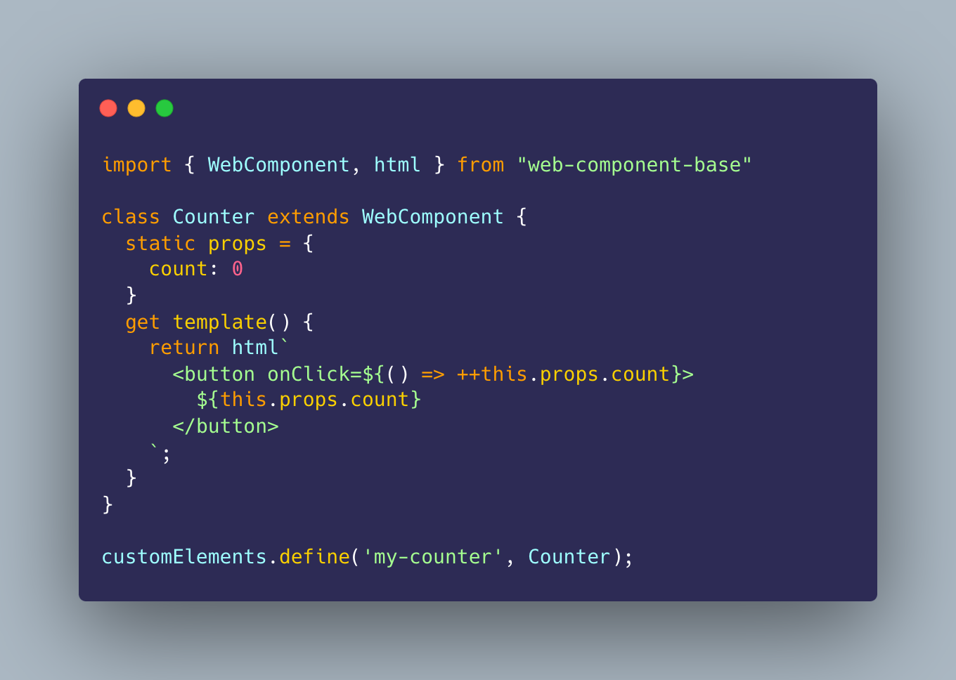
|
||||
|
||||
## Want to get in touch?
|
||||
|
||||
|
|
@ -37,6 +47,7 @@ There are many ways to get in touch:
|
|||
|
||||
## Inspirations and thanks
|
||||
|
||||
1. [Sara Rainsberger](https://rainsberger.ca/) - I never stop singing praises to the Astro documentation team and I use Sarah's ["50 docs tips in 50 days"](https://www.rainsberger.ca/docs-tips/) as a guide in reviewing the [documentation for wcb](https://webcomponent.io). I do not have a team myself, and do not have the level of excellence Sarah brings to reviewing docs. I often need the assistance and have encodified a [docs-review skill](https://github.com/ayo-run/wcb/blob/main/.claude/skills/docs-review/SKILL.md) for it *with permission*.
|
||||
1. [htm](https://github.com/developit/htm) - I use it for the `html` function for tagged templates, and take a lot of inspiration in building the rendering implementation. It is highly likely that I will go for what Preact is doing... but we'll see.
|
||||
1. [fast](https://github.com/microsoft/fast) - When I found that Microsoft has their own base class I thought it was super cool!
|
||||
1. [lit](https://github.com/lit/lit) - `lit-html` continues to amaze me and I worked to make `wcb` generic so I (and others) can continue to use it
|
||||
|
|
@ -45,6 +56,10 @@ There are many ways to get in touch:
|
|||
|
||||
See [`size-change-log.md`](./size-change-log.md) for a running record of how each correctness/feature change affects the `WebComponent` base class bundle size, with the reason and benefit of each.
|
||||
|
||||
## Background
|
||||
|
||||
This is the base class used for web components in Ayo's projects, primarily [cozy-games](https://git.ayo.run/ayo/cozy-games), [mcfly](https://git.ayo.run/ayo/mcfly/), his [personal site](https://ayo.ayco.io), his [blog](https://ayos.blog), and [others](https://git.ayo.run/ayo).
|
||||
|
||||
---
|
||||
|
||||
_Just keep building._<br>
|
||||
|
|
|
|||
59
create/README.md
Normal file
59
create/README.md
Normal file
|
|
@ -0,0 +1,59 @@
|
|||
# create-wcb
|
||||
|
||||
> [!Note] Work in progress CLI for wcb development.
|
||||
> Currently, it scaffolds a new web component project
|
||||
> with our CEM Analyzer Plugin already configured
|
||||
|
||||
Scaffold a publishable [web-component-base](https://webcomponent.io) (wcb)
|
||||
custom element:
|
||||
|
||||
```sh
|
||||
npm create wcb@latest
|
||||
# or: npm create wcb@latest my-button
|
||||
# or: pnpm create wcb / yarn create wcb / bun create wcb
|
||||
```
|
||||
|
||||
## What you get
|
||||
|
||||
- A custom element built on wcb's `static props` convention, written in
|
||||
TypeScript — the class, tag, and file names are stamped from your project
|
||||
name (`my-button` → `MyButton` / `<my-button>`), so there are no rename-me
|
||||
TODOs
|
||||
- A Vite setup patterned on the
|
||||
[`ayo-run/web-component`](https://github.com/ayo-run/web-component)
|
||||
template: `npm run dev` serves the demo page, `npm run build:lib` produces
|
||||
ESM + UMD bundles and `.d.ts` types in `dist/`, with `web-component-base`
|
||||
external as a peerDependency
|
||||
- `custom-elements.json` generation set up end to end:
|
||||
- `custom-elements-manifest.config.mjs` configured with
|
||||
[`web-component-base/cem-plugin`](https://webcomponent.io/cem-plugin/), so
|
||||
every `static props` key becomes a typed attribute + field in the manifest
|
||||
- an `analyze` script (`npm run analyze`) running
|
||||
`@custom-elements-manifest/analyzer`
|
||||
- the `customElements` field set in `package.json`, which is how Storybook,
|
||||
editors, and other tooling discover the manifest
|
||||
- the manifest ships inside the published package: `prepack` rebuilds
|
||||
`dist/` and regenerates `custom-elements.json`, and both are in `files`
|
||||
|
||||
The manifest is one shared `custom-elements.json` per package — the file every
|
||||
tool expects — regenerated on demand and gitignored in the repo.
|
||||
|
||||
## Options
|
||||
|
||||
```sh
|
||||
npm create wcb@latest [directory]
|
||||
```
|
||||
|
||||
Prompts for a directory when omitted; `.` scaffolds into the current (empty)
|
||||
directory. Refuses to write into a non-empty directory. A hyphen-less name
|
||||
gets an `-element` suffix on the tag (`button` → `<button-element>`), since
|
||||
custom element tag names require a hyphen.
|
||||
|
||||
Prefer starting from GitHub instead of the terminal? The
|
||||
[`ayo-run/web-component`](https://github.com/ayo-run/web-component) template
|
||||
repository serves the same purpose via "Use this template".
|
||||
|
||||
---
|
||||
|
||||
Part of the [wcb](https://github.com/ayo-run/wcb) project · MIT ·
|
||||
[Ayo Ayco](https://ayo.ayco.io)
|
||||
141
create/create.test.mjs
Normal file
141
create/create.test.mjs
Normal file
|
|
@ -0,0 +1,141 @@
|
|||
// @vitest-environment node
|
||||
// (the default happy-dom environment replaces the global URL with its DOM
|
||||
// shim, which `fileURLToPath` rejects; this suite needs no DOM anyway)
|
||||
|
||||
import { execFileSync } from 'node:child_process'
|
||||
import fs from 'node:fs'
|
||||
import os from 'node:os'
|
||||
import path from 'node:path'
|
||||
import process from 'node:process'
|
||||
import { fileURLToPath } from 'node:url'
|
||||
import { afterEach, beforeEach, describe, expect, it } from 'vitest'
|
||||
|
||||
const bin = fileURLToPath(new URL('./index.js', import.meta.url))
|
||||
|
||||
describe('create-wcb', () => {
|
||||
let workDir
|
||||
|
||||
beforeEach(() => {
|
||||
workDir = fs.mkdtempSync(path.join(os.tmpdir(), 'create-wcb-'))
|
||||
})
|
||||
|
||||
afterEach(() => {
|
||||
fs.rmSync(workDir, { recursive: true, force: true })
|
||||
})
|
||||
|
||||
const run = (args, options = {}) =>
|
||||
execFileSync(process.execPath, [bin, ...args], {
|
||||
cwd: workDir,
|
||||
encoding: 'utf8',
|
||||
...options,
|
||||
})
|
||||
|
||||
const readJson = (...segments) =>
|
||||
JSON.parse(fs.readFileSync(path.join(workDir, ...segments), 'utf8'))
|
||||
|
||||
const read = (...segments) =>
|
||||
fs.readFileSync(path.join(workDir, ...segments), 'utf8')
|
||||
|
||||
it('scaffolds a project with the CEM story set up', () => {
|
||||
run(['my-button'])
|
||||
|
||||
const root = path.join(workDir, 'my-button')
|
||||
for (const file of [
|
||||
'index.html',
|
||||
'src/my-button.ts',
|
||||
'custom-elements-manifest.config.mjs',
|
||||
'vite-lib.config.ts',
|
||||
'pnpm-workspace.yaml',
|
||||
'README.md',
|
||||
])
|
||||
expect(fs.existsSync(path.join(root, file)), file).toBe(true)
|
||||
|
||||
const packageJson = readJson('my-button', 'package.json')
|
||||
expect(packageJson.name).toBe('my-button')
|
||||
expect(packageJson.customElements).toBe('custom-elements.json')
|
||||
expect(packageJson.scripts.analyze).toBe('cem analyze')
|
||||
expect(packageJson.scripts['build:lib']).toContain('vite-lib.config.ts')
|
||||
expect(packageJson.files).toContain('custom-elements.json')
|
||||
expect(packageJson.peerDependencies['web-component-base']).toBeDefined()
|
||||
expect(
|
||||
packageJson.devDependencies['@custom-elements-manifest/analyzer']
|
||||
).toBeDefined()
|
||||
})
|
||||
|
||||
it('stamps the component identity from the project name', () => {
|
||||
const output = run(['my-button'])
|
||||
expect(output).toContain('<my-button>')
|
||||
|
||||
const component = read('my-button', 'src', 'my-button.ts')
|
||||
expect(component).toContain('export class MyButton')
|
||||
expect(component).toContain("customElements.define('my-button', MyButton)")
|
||||
|
||||
expect(read('my-button', 'index.html')).toContain('<my-button')
|
||||
expect(read('my-button', 'vite-lib.config.ts')).toContain(
|
||||
'src/my-button.ts'
|
||||
)
|
||||
|
||||
const packageJson = readJson('my-button', 'package.json')
|
||||
expect(packageJson.module).toBe('./dist/my-button.js')
|
||||
expect(packageJson.types).toBe('./dist/my-button.d.ts')
|
||||
|
||||
// no template identity survives the stamp
|
||||
for (const file of [
|
||||
'package.json',
|
||||
'index.html',
|
||||
'README.md',
|
||||
'vite-lib.config.ts',
|
||||
path.join('src', 'my-button.ts'),
|
||||
]) {
|
||||
expect(read('my-button', file)).not.toContain('wcb-button')
|
||||
expect(read('my-button', file)).not.toContain('WcbButton')
|
||||
}
|
||||
})
|
||||
|
||||
it('suffixes hyphen-less names so the tag is valid', () => {
|
||||
run(['button'])
|
||||
|
||||
expect(readJson('button', 'package.json').name).toBe('button')
|
||||
const component = read('button', 'src', 'button-element.ts')
|
||||
expect(component).toContain(
|
||||
"customElements.define('button-element', ButtonElement)"
|
||||
)
|
||||
})
|
||||
|
||||
it('renames _gitignore to .gitignore', () => {
|
||||
run(['my-button'])
|
||||
|
||||
const root = path.join(workDir, 'my-button')
|
||||
expect(fs.existsSync(path.join(root, '.gitignore'))).toBe(true)
|
||||
expect(fs.existsSync(path.join(root, '_gitignore'))).toBe(false)
|
||||
expect(read('my-button', '.gitignore')).toContain('custom-elements.json')
|
||||
})
|
||||
|
||||
it('sanitizes the directory name into a valid package name', () => {
|
||||
run(['My Button'])
|
||||
expect(readJson('My Button', 'package.json').name).toBe('my-button')
|
||||
})
|
||||
|
||||
it('scaffolds into the current directory with "."', () => {
|
||||
run(['.'])
|
||||
expect(fs.existsSync(path.join(workDir, 'index.html'))).toBe(true)
|
||||
// package name derives from the temp directory's basename
|
||||
expect(readJson('package.json').name).toMatch(/^create-wcb-/)
|
||||
})
|
||||
|
||||
it('falls back to the default directory when the prompt is empty', () => {
|
||||
run([], { input: '\n' })
|
||||
expect(fs.existsSync(path.join(workDir, 'wcb-button', 'index.html'))).toBe(
|
||||
true
|
||||
)
|
||||
expect(readJson('wcb-button', 'package.json').name).toBe('wcb-button')
|
||||
})
|
||||
|
||||
it('refuses a non-empty target directory', () => {
|
||||
fs.mkdirSync(path.join(workDir, 'taken'))
|
||||
fs.writeFileSync(path.join(workDir, 'taken', 'keep.txt'), 'important')
|
||||
|
||||
expect(() => run(['taken'], { stdio: 'pipe' })).toThrow(/not empty/)
|
||||
expect(read('taken', 'keep.txt')).toBe('important')
|
||||
})
|
||||
})
|
||||
195
create/index.js
Normal file
195
create/index.js
Normal file
|
|
@ -0,0 +1,195 @@
|
|||
#!/usr/bin/env node
|
||||
/**
|
||||
* @license MIT <https://opensource.org/licenses/MIT>
|
||||
* @author Ayo Ayco <https://ayo.ayco.io>
|
||||
*
|
||||
* Scaffolds a wcb (`web-component-base`) component: a publishable custom
|
||||
* element with a Vite library build (ESM + UMD + types), a demo page, and
|
||||
* `custom-elements.json` generation already set up — the CEM analyzer config
|
||||
* with wcb's plugin, an `analyze` script, and the `customElements` field in
|
||||
* `package.json`. The component class, tag, and file names are stamped from
|
||||
* the project name, so no rename-me TODOs are left behind.
|
||||
*
|
||||
* Runs via `npm create wcb@latest [directory]` (npm resolves `create wcb` to
|
||||
* this package's bin). Zero dependencies: prompts use `node:readline`.
|
||||
* @see https://webcomponent.io/cem-plugin/
|
||||
*/
|
||||
|
||||
import fs from 'node:fs'
|
||||
import path from 'node:path'
|
||||
import process from 'node:process'
|
||||
import readline from 'node:readline/promises'
|
||||
import { fileURLToPath } from 'node:url'
|
||||
|
||||
const DEFAULT_DIR = 'wcb-button'
|
||||
/** The component identity used inside the template, rewritten on scaffold. */
|
||||
const TEMPLATE_TAG = 'wcb-button'
|
||||
const TEMPLATE_CLASS = 'WcbButton'
|
||||
|
||||
/**
|
||||
* Sanitizes a directory name into a valid npm package name.
|
||||
* @param {string} name the raw project directory name
|
||||
* @returns {string} a lowercase, hyphenated package name
|
||||
*/
|
||||
function toValidPackageName(name) {
|
||||
return name
|
||||
.trim()
|
||||
.toLowerCase()
|
||||
.replace(/\s+/g, '-')
|
||||
.replace(/^[._]+/, '')
|
||||
.replace(/[^a-z0-9-~._]+/g, '-')
|
||||
}
|
||||
|
||||
/**
|
||||
* Derives a custom element tag name from the package name. Tag names must
|
||||
* start with a lowercase letter and contain a hyphen, so a hyphen-less name
|
||||
* gets an `-element` suffix (`button` → `button-element`).
|
||||
* @param {string} packageName the sanitized package name
|
||||
* @returns {string} a valid custom element tag name
|
||||
*/
|
||||
function toTagName(packageName) {
|
||||
let tag = packageName
|
||||
.replace(/[^a-z0-9-]+/g, '-')
|
||||
.replace(/-+/g, '-')
|
||||
.replace(/^-|-$/g, '')
|
||||
if (!tag) return TEMPLATE_TAG
|
||||
if (!/^[a-z]/.test(tag)) tag = `wc-${tag}`
|
||||
if (!tag.includes('-')) tag = `${tag}-element`
|
||||
return tag
|
||||
}
|
||||
|
||||
/**
|
||||
* Converts a tag name to its PascalCase class name (`my-button` → `MyButton`).
|
||||
* @param {string} tag the custom element tag name
|
||||
* @returns {string} the PascalCase class name
|
||||
*/
|
||||
function toClassName(tag) {
|
||||
return tag
|
||||
.split('-')
|
||||
.filter(Boolean)
|
||||
.map((part) => part[0].toUpperCase() + part.slice(1))
|
||||
.join('')
|
||||
}
|
||||
|
||||
/**
|
||||
* Lists every file under a directory recursively.
|
||||
* @param {string} dir the directory to walk
|
||||
* @returns {string[]} absolute file paths
|
||||
*/
|
||||
function walkFiles(dir) {
|
||||
return fs.readdirSync(dir, { withFileTypes: true }).flatMap((entry) => {
|
||||
const full = path.join(dir, entry.name)
|
||||
return entry.isDirectory() ? walkFiles(full) : [full]
|
||||
})
|
||||
}
|
||||
|
||||
/**
|
||||
* Detects the package manager that launched this scaffold, so the printed
|
||||
* next steps match how the user invoked it (`npm create` / `pnpm create` /
|
||||
* `yarn create` / `bun create`).
|
||||
* @returns {string} `npm` | `pnpm` | `yarn` | `bun`
|
||||
*/
|
||||
function detectPackageManager() {
|
||||
const userAgent = process.env.npm_config_user_agent ?? ''
|
||||
for (const pm of ['pnpm', 'yarn', 'bun'])
|
||||
if (userAgent.startsWith(pm)) return pm
|
||||
return 'npm'
|
||||
}
|
||||
|
||||
/**
|
||||
* Copies the template into the target directory, renaming `_gitignore` to
|
||||
* `.gitignore` (npm strips `.gitignore` files from published packages, so the
|
||||
* template can't ship one under its real name), then stamps the component
|
||||
* identity: the template's `wcb-button` tag, `WcbButton` class, and file
|
||||
* names are rewritten to the ones derived from the package name.
|
||||
* @param {string} root absolute path of the target directory
|
||||
* @param {string} packageName the name to write into the scaffolded `package.json`
|
||||
* @returns {{tag: string, className: string}} the stamped component identity
|
||||
*/
|
||||
function scaffold(root, packageName) {
|
||||
const templateDir = fileURLToPath(new URL('./template', import.meta.url))
|
||||
fs.cpSync(templateDir, root, { recursive: true })
|
||||
fs.renameSync(path.join(root, '_gitignore'), path.join(root, '.gitignore'))
|
||||
|
||||
const tag = toTagName(packageName)
|
||||
const className = toClassName(tag)
|
||||
fs.renameSync(
|
||||
path.join(root, 'src', `${TEMPLATE_TAG}.ts`),
|
||||
path.join(root, 'src', `${tag}.ts`)
|
||||
)
|
||||
for (const file of walkFiles(root)) {
|
||||
const content = fs.readFileSync(file, 'utf8')
|
||||
const stamped = content
|
||||
.replaceAll(TEMPLATE_CLASS, className)
|
||||
.replaceAll(TEMPLATE_TAG, tag)
|
||||
if (stamped !== content) fs.writeFileSync(file, stamped)
|
||||
}
|
||||
|
||||
const packageJsonPath = path.join(root, 'package.json')
|
||||
const packageJson = JSON.parse(fs.readFileSync(packageJsonPath, 'utf8'))
|
||||
packageJson.name = packageName
|
||||
fs.writeFileSync(packageJsonPath, JSON.stringify(packageJson, null, 2) + '\n')
|
||||
|
||||
return { tag, className }
|
||||
}
|
||||
|
||||
/**
|
||||
* Runs the CLI: resolves the target directory from argv or a prompt,
|
||||
* refuses to overwrite existing files, scaffolds, and prints next steps.
|
||||
* @returns {Promise<void>}
|
||||
*/
|
||||
async function main() {
|
||||
const arg = process.argv[2]
|
||||
|
||||
if (arg === '--help' || arg === '-h') {
|
||||
console.log(`Usage: npm create wcb@latest [directory]
|
||||
|
||||
Scaffolds a publishable web-component-base custom element in [directory]
|
||||
(prompts when omitted; "." scaffolds into the current directory). The
|
||||
component class, tag, and file names are derived from the directory name,
|
||||
and the project comes with a Vite library build, a demo page, and
|
||||
custom-elements.json generation set up.`)
|
||||
return
|
||||
}
|
||||
|
||||
let targetDir = arg
|
||||
if (!targetDir) {
|
||||
const rl = readline.createInterface({
|
||||
input: process.stdin,
|
||||
output: process.stdout,
|
||||
})
|
||||
const answer = await rl.question(`Project directory: (${DEFAULT_DIR}) `)
|
||||
rl.close()
|
||||
targetDir = answer.trim() || DEFAULT_DIR
|
||||
}
|
||||
|
||||
const root = path.resolve(process.cwd(), targetDir)
|
||||
const packageName = toValidPackageName(
|
||||
targetDir === '.' ? path.basename(root) : targetDir
|
||||
)
|
||||
|
||||
if (fs.existsSync(root) && fs.readdirSync(root).length > 0) {
|
||||
console.error(
|
||||
`error: target directory "${targetDir}" exists and is not empty`
|
||||
)
|
||||
process.exit(1)
|
||||
}
|
||||
|
||||
const { tag } = scaffold(root, packageName)
|
||||
|
||||
const pm = detectPackageManager()
|
||||
const run = pm === 'npm' ? 'npm run' : pm
|
||||
console.log(`
|
||||
Scaffolded ${packageName} in ${root} — defines <${tag}>
|
||||
|
||||
Next steps:
|
||||
|
||||
cd ${targetDir}
|
||||
${pm} install
|
||||
${run} dev # demo page on the Vite dev server
|
||||
${run} analyze # generate custom-elements.json
|
||||
${run} build:lib # library build: ESM + UMD + types in dist/
|
||||
`)
|
||||
}
|
||||
|
||||
await main()
|
||||
36
create/package.json
Normal file
36
create/package.json
Normal file
|
|
@ -0,0 +1,36 @@
|
|||
{
|
||||
"name": "create-wcb",
|
||||
"version": "0.1.0",
|
||||
"description": "Scaffold a publishable web-component-base (wcb) custom element with custom-elements.json generation already set up",
|
||||
"type": "module",
|
||||
"bin": {
|
||||
"create-wcb": "index.js"
|
||||
},
|
||||
"files": [
|
||||
"index.js",
|
||||
"template",
|
||||
"README.md"
|
||||
],
|
||||
"engines": {
|
||||
"node": ">=18"
|
||||
},
|
||||
"repository": {
|
||||
"type": "git",
|
||||
"url": "git+https://github.com/ayo-run/wcb.git",
|
||||
"directory": "create-wcb"
|
||||
},
|
||||
"homepage": "https://WebComponent.io",
|
||||
"keywords": [
|
||||
"web components",
|
||||
"web component",
|
||||
"custom elements",
|
||||
"custom element",
|
||||
"create",
|
||||
"scaffold"
|
||||
],
|
||||
"author": "Ayo Ayco",
|
||||
"license": "MIT",
|
||||
"bugs": {
|
||||
"url": "https://github.com/ayo-run/wcb/issues"
|
||||
}
|
||||
}
|
||||
30
create/template/README.md
Normal file
30
create/template/README.md
Normal file
|
|
@ -0,0 +1,30 @@
|
|||
# wcb-button
|
||||
|
||||
A publishable custom element built on
|
||||
[web-component-base](https://webcomponent.io), scaffolded with
|
||||
`npm create wcb@latest`.
|
||||
|
||||
## Commands
|
||||
|
||||
- `npm run dev` — start the Vite dev server on the `index.html` demo page
|
||||
- `npm run build` — build the demo page
|
||||
- `npm run build:lib` — build the library: ESM + UMD bundles and `.d.ts`
|
||||
types in `dist/`, with `web-component-base` left external (it is a
|
||||
peerDependency)
|
||||
- `npm run analyze` — generate `custom-elements.json` from the component's
|
||||
`static props`
|
||||
|
||||
## Publishing
|
||||
|
||||
`npm publish` (or `npm pack`) runs the `prepack` script, which rebuilds the
|
||||
library and regenerates `custom-elements.json` — both ship inside the
|
||||
package, and the `customElements` field in `package.json` is how Storybook,
|
||||
editors, and other tooling discover the manifest. In the repo itself the
|
||||
manifest stays gitignored; it is a build artifact.
|
||||
|
||||
See the [CEM plugin guide](https://webcomponent.io/cem-plugin/) for setting
|
||||
it up with Storybook and code editors.
|
||||
|
||||
---
|
||||
|
||||
_Just keep building._
|
||||
6
create/template/_gitignore
Normal file
6
create/template/_gitignore
Normal file
|
|
@ -0,0 +1,6 @@
|
|||
node_modules
|
||||
dist
|
||||
|
||||
# build artifact — regenerated by `npm run analyze` (and on `npm pack`/publish,
|
||||
# where it ships inside the package via the "files" field)
|
||||
custom-elements.json
|
||||
20
create/template/custom-elements-manifest.config.mjs
Normal file
20
create/template/custom-elements-manifest.config.mjs
Normal file
|
|
@ -0,0 +1,20 @@
|
|||
// Custom Elements Manifest config — `npm run analyze` reads this.
|
||||
//
|
||||
// The wcb plugin teaches the analyzer about `static props`: every key becomes
|
||||
// a typed public field plus a reflected attribute in custom-elements.json,
|
||||
// and wcb internals are stripped from the public surface.
|
||||
// See https://webcomponent.io/cem-plugin/ for the Storybook and editor setup.
|
||||
//
|
||||
// `distPaths()` rewrites each module's `path` from the scanned source
|
||||
// (`src/*.ts`) to the built output this package publishes (`dist/*.js`), so a
|
||||
// consumer reading the manifest resolves the files they can actually import —
|
||||
// only `dist/` is shipped, never `src/`. `prepack` runs `build:lib` before
|
||||
// `analyze`, so `dist/` exists when the manifest is generated.
|
||||
|
||||
import { wcbStaticProps, distPaths } from 'web-component-base/cem-plugin'
|
||||
|
||||
export default {
|
||||
globs: ['src/**/*.ts'],
|
||||
outdir: '.',
|
||||
plugins: [wcbStaticProps(), distPaths()],
|
||||
}
|
||||
61
create/template/index.html
Normal file
61
create/template/index.html
Normal file
|
|
@ -0,0 +1,61 @@
|
|||
<!doctype html>
|
||||
<html lang="en">
|
||||
<head>
|
||||
<meta charset="UTF-8" />
|
||||
<meta name="viewport" content="width=device-width, initial-scale=1.0" />
|
||||
<title>wcb-button web component</title>
|
||||
|
||||
<!-- meta -->
|
||||
<meta property="og:title" content="wcb-button web component" />
|
||||
<meta property="og:description" content="A wcb-button web component" />
|
||||
<meta name="description" content="A wcb-button web component" />
|
||||
|
||||
<link
|
||||
rel="stylesheet"
|
||||
href="https://cdn.jsdelivr.net/npm/@picocss/pico@2/css/pico.min.css"
|
||||
/>
|
||||
<script type="module" src="./src/wcb-button.ts"></script>
|
||||
<style>
|
||||
html,
|
||||
body {
|
||||
height: 100%;
|
||||
}
|
||||
body {
|
||||
display: grid;
|
||||
place-content: safe center;
|
||||
}
|
||||
main {
|
||||
padding: 1em;
|
||||
}
|
||||
wcb-button {
|
||||
font-family: 'Courier New', Courier, monospace;
|
||||
}
|
||||
</style>
|
||||
</head>
|
||||
<body>
|
||||
<header>
|
||||
<h1><wcb-button></h1>
|
||||
<hr />
|
||||
</header>
|
||||
<main>
|
||||
<section>
|
||||
<p>A wcb-button web component</p>
|
||||
<wcb-button label="Hello, Beautiful!"></wcb-button>
|
||||
</section>
|
||||
<section>
|
||||
<p>
|
||||
Generate <code>custom-elements.json</code> with
|
||||
<code>npm run analyze</code> — more on the
|
||||
<a href="https://webcomponent.io/cem-plugin/">CEM plugin guide</a>
|
||||
</p>
|
||||
</section>
|
||||
</main>
|
||||
<footer>
|
||||
<hr />
|
||||
<small>
|
||||
Just keep building.<br />
|
||||
A <a href="https://webcomponent.io">web-component-base</a> component.
|
||||
</small>
|
||||
</footer>
|
||||
</body>
|
||||
</html>
|
||||
42
create/template/package.json
Normal file
42
create/template/package.json
Normal file
|
|
@ -0,0 +1,42 @@
|
|||
{
|
||||
"name": "wcb-button",
|
||||
"version": "1.0.0",
|
||||
"type": "module",
|
||||
"description": "A wcb-button web component",
|
||||
"license": "MIT",
|
||||
"homepage": "https://webcomponent.io",
|
||||
"customElements": "custom-elements.json",
|
||||
"module": "./dist/wcb-button.js",
|
||||
"types": "./dist/wcb-button.d.ts",
|
||||
"exports": {
|
||||
".": {
|
||||
"types": "./dist/wcb-button.d.ts",
|
||||
"import": "./dist/wcb-button.js",
|
||||
"require": "./dist/wcb-button.umd.cjs",
|
||||
"default": "./dist/wcb-button.js"
|
||||
}
|
||||
},
|
||||
"files": [
|
||||
"dist",
|
||||
"custom-elements.json",
|
||||
"README.md",
|
||||
"LICENSE"
|
||||
],
|
||||
"scripts": {
|
||||
"test": "echo \"Warning: no test specified\"",
|
||||
"dev": "vite",
|
||||
"build": "vite build",
|
||||
"build:lib": "vite build --config vite-lib.config.ts",
|
||||
"analyze": "cem analyze",
|
||||
"prepack": "npm run build:lib && npm run analyze"
|
||||
},
|
||||
"devDependencies": {
|
||||
"@custom-elements-manifest/analyzer": "^0.11.0",
|
||||
"@types/node": "^26.1.1",
|
||||
"vite": "^8.1.5",
|
||||
"vite-plugin-dts": "^5.0.3"
|
||||
},
|
||||
"peerDependencies": {
|
||||
"web-component-base": "^6.1.4"
|
||||
}
|
||||
}
|
||||
2
create/template/pnpm-workspace.yaml
Normal file
2
create/template/pnpm-workspace.yaml
Normal file
|
|
@ -0,0 +1,2 @@
|
|||
allowBuilds:
|
||||
web-component-base: false
|
||||
40
create/template/src/wcb-button.ts
Normal file
40
create/template/src/wcb-button.ts
Normal file
|
|
@ -0,0 +1,40 @@
|
|||
import { WebComponent, html } from 'web-component-base'
|
||||
|
||||
/**
|
||||
* Declare a type for your `static props`
|
||||
* It is not required for wcb to work, but rather an
|
||||
* opt-in compile-time type safety with Typescript
|
||||
* @see https://webcomponent.io/prop-access/#opt-in-typed-props-in-typescript
|
||||
*/
|
||||
type WcbButtonProps = {
|
||||
label: string
|
||||
disabled: boolean
|
||||
clicks: number
|
||||
}
|
||||
|
||||
/**
|
||||
* A starter component. Every key in `static props` is a reactive property
|
||||
* reflected to a kebab-cased attribute — writing `this.props.clicks++`
|
||||
* updates the attribute and re-renders.
|
||||
*/
|
||||
export class WcbButton extends WebComponent<WcbButtonProps> {
|
||||
static props: WcbButtonProps = {
|
||||
label: 'Click me',
|
||||
disabled: false,
|
||||
clicks: 0,
|
||||
}
|
||||
|
||||
bump = () => {
|
||||
if (!this.props.disabled) this.props.clicks++
|
||||
}
|
||||
|
||||
get template() {
|
||||
return html`
|
||||
<button onclick=${this.bump} disabled=${this.props.disabled}>
|
||||
${this.props.label} — ${this.props.clicks}×
|
||||
</button>
|
||||
`
|
||||
}
|
||||
}
|
||||
|
||||
customElements.define('wcb-button', WcbButton)
|
||||
28
create/template/vite-lib.config.ts
Normal file
28
create/template/vite-lib.config.ts
Normal file
|
|
@ -0,0 +1,28 @@
|
|||
// Library build — `npm run build:lib` emits ESM + UMD bundles and .d.ts
|
||||
// types into dist/, with web-component-base left external for consumers to
|
||||
// provide (it is a peerDependency). The plain `vite` dev server and
|
||||
// `npm run build` use the default config and the index.html demo page.
|
||||
|
||||
import { resolve } from 'node:path'
|
||||
import { defineConfig } from 'vite'
|
||||
import dts from 'vite-plugin-dts'
|
||||
|
||||
export default defineConfig({
|
||||
publicDir: false,
|
||||
build: {
|
||||
lib: {
|
||||
entry: resolve(import.meta.dirname, 'src/wcb-button.ts'),
|
||||
name: 'WcbButton',
|
||||
fileName: 'wcb-button',
|
||||
},
|
||||
rolldownOptions: {
|
||||
external: ['web-component-base'],
|
||||
output: {
|
||||
globals: {
|
||||
'web-component-base': 'web-component-base',
|
||||
},
|
||||
},
|
||||
},
|
||||
},
|
||||
plugins: [dts()],
|
||||
})
|
||||
65
demo/examples/attribute-converters/index.html
Normal file
65
demo/examples/attribute-converters/index.html
Normal file
|
|
@ -0,0 +1,65 @@
|
|||
<!doctype html>
|
||||
<html lang="en">
|
||||
<head>
|
||||
<meta charset="UTF-8" />
|
||||
<meta name="viewport" content="width=device-width, initial-scale=1.0" />
|
||||
<title>Custom attribute converters</title>
|
||||
<script type="module" src="./index.js"></script>
|
||||
<script>try{document.documentElement.dataset.theme=localStorage.getItem('wcb-theme')||(matchMedia('(prefers-color-scheme: dark)').matches?'dark':'light')}catch(e){}</script>
|
||||
<link rel="stylesheet" href="../../shell.css" />
|
||||
<script type="module" src="../../shell.js"></script>
|
||||
<style>
|
||||
.hint {
|
||||
opacity: 0.75;
|
||||
font-size: 0.9em;
|
||||
}
|
||||
.row {
|
||||
display: flex;
|
||||
flex-wrap: wrap;
|
||||
gap: 0.5em;
|
||||
align-items: center;
|
||||
}
|
||||
event-card {
|
||||
display: block;
|
||||
padding: 0.4em 1em;
|
||||
border: 2px solid #8884;
|
||||
border-radius: 8px;
|
||||
}
|
||||
</style>
|
||||
</head>
|
||||
<body>
|
||||
<h1>Custom attribute converters</h1>
|
||||
<p>
|
||||
Override <code>toAttribute</code> and <code>fromAttribute</code> when a
|
||||
prop needs its own serialization, and delegate the rest to
|
||||
<code>super</code>. Both take the <strong>camelCase prop key</strong>,
|
||||
matching your <code>static props</code> declaration.
|
||||
</p>
|
||||
|
||||
<h2>A Date prop and an Array prop</h2>
|
||||
<p>
|
||||
<code>when</code> is a real <code>Date</code> and <code>tags</code> is a
|
||||
real <code>Array</code> — reflected as an ISO date and a comma-separated
|
||||
list. Each button reports the attributes the conversion produced.
|
||||
</p>
|
||||
<converter-demo></converter-demo>
|
||||
|
||||
<h2>Parsed from markup</h2>
|
||||
<p>
|
||||
Attributes written from outside the component are parsed through
|
||||
<code>fromAttribute</code>, so these mount with a real
|
||||
<code>Date</code> and a real <code>Array</code>:
|
||||
</p>
|
||||
<event-card when="2026-01-02" tags="alpha,beta" title="From markup"></event-card>
|
||||
|
||||
<h2>Why lossy conversion is safe</h2>
|
||||
<p>
|
||||
Reflection does <strong>not</strong> round-trip: when you assign a prop,
|
||||
wcb reflects it but never parses the attribute back — the value you
|
||||
assigned is already the source of truth. That is why
|
||||
<code>when</code> can keep its full timestamp while the attribute carries
|
||||
only the date. <code>render()</code> and <code>onChanges</code> still fire
|
||||
as normal.
|
||||
</p>
|
||||
</body>
|
||||
</html>
|
||||
127
demo/examples/attribute-converters/index.js
Normal file
127
demo/examples/attribute-converters/index.js
Normal file
|
|
@ -0,0 +1,127 @@
|
|||
import { WebComponent, html } from 'web-component-base'
|
||||
|
||||
/**
|
||||
* `toAttribute` / `fromAttribute` are the escape hatch for props whose
|
||||
* reflection doesn't fit the built-in rules. Override the props you care
|
||||
* about and hand the rest to `super`.
|
||||
*
|
||||
* Two things worth noticing in this example:
|
||||
*
|
||||
* - `when` is a `Date`, so it declares a `Date` default — the prop's runtime
|
||||
* type comes from the default's `typeof`, and the props proxy would reject
|
||||
* a Date written to a prop declared as a string.
|
||||
* - `toAttribute` is deliberately lossy (it drops the time of day), which is
|
||||
* safe: a prop write is not parsed back through `fromAttribute`, so
|
||||
* `props.when` keeps the exact value you assigned.
|
||||
*/
|
||||
class EventCard extends WebComponent {
|
||||
static props = {
|
||||
when: new Date('2026-07-20T09:30:00Z'),
|
||||
tags: [],
|
||||
title: 'Release day',
|
||||
}
|
||||
// renders into a shadow root so a parent's re-render can't reconcile away
|
||||
// the children this component renders for itself
|
||||
static shadowRootInit = { mode: 'open' }
|
||||
|
||||
toAttribute(name, value) {
|
||||
// ISO date only — the attribute is a summary, not the whole value
|
||||
if (name === 'when') return value.toISOString().slice(0, 10)
|
||||
// a list reflects as a readable comma-separated attribute...
|
||||
if (name === 'tags') return value.length ? value.join(',') : null
|
||||
return super.toAttribute(name, value)
|
||||
}
|
||||
|
||||
fromAttribute(name, value) {
|
||||
if (name === 'when') return new Date(`${value}T00:00:00Z`)
|
||||
// ...and parses back the same way
|
||||
if (name === 'tags') return value.split(',').filter(Boolean)
|
||||
return super.fromAttribute(name, value)
|
||||
}
|
||||
|
||||
get template() {
|
||||
const { when, tags, title } = this.props
|
||||
return html`
|
||||
<h3>${title}</h3>
|
||||
<p>
|
||||
prop <code>when</code> (a real Date):
|
||||
<strong>${when.toISOString()}</strong>
|
||||
</p>
|
||||
<p>
|
||||
prop <code>tags</code> (a real Array):
|
||||
<strong>${JSON.stringify(tags)}</strong>
|
||||
</p>
|
||||
`
|
||||
}
|
||||
}
|
||||
customElements.define('event-card', EventCard)
|
||||
|
||||
/**
|
||||
* Panel that drives the card and shows the attribute each conversion produces.
|
||||
*/
|
||||
class ConverterDemo extends WebComponent {
|
||||
static props = { log: '' }
|
||||
|
||||
afterViewInit() {
|
||||
this.card = this.querySelector('event-card')
|
||||
this.#report('initial mount')
|
||||
}
|
||||
|
||||
#report(action) {
|
||||
const el = this.card
|
||||
if (!el) return
|
||||
const attr = (name) =>
|
||||
el.hasAttribute(name) ? `${name}="${el.getAttribute(name)}"` : '(absent)'
|
||||
this.props.log = `${action} → ${attr('when')} · ${attr('tags')}`
|
||||
}
|
||||
|
||||
#setPreciseDate() {
|
||||
// the time of day survives on the prop even though the attribute drops it
|
||||
this.card.props.when = new Date('2026-12-25T18:45:12Z')
|
||||
this.#report('props.when = 2026-12-25T18:45:12Z')
|
||||
}
|
||||
|
||||
#setTags(tags) {
|
||||
this.card.props.tags = tags
|
||||
this.#report(`props.tags = ${JSON.stringify(tags)}`)
|
||||
}
|
||||
|
||||
#writeAttribute() {
|
||||
// an outside write *is* parsed through fromAttribute
|
||||
this.card.setAttribute('tags', 'html,css,js')
|
||||
this.#report('setAttribute("tags", "html,css,js")')
|
||||
}
|
||||
|
||||
get template() {
|
||||
return html`
|
||||
<event-card></event-card>
|
||||
|
||||
<p class="log"><code>${this.props.log}</code></p>
|
||||
|
||||
<div class="row">
|
||||
<button onclick=${() => this.#setPreciseDate()}>
|
||||
props.when = a precise Date
|
||||
</button>
|
||||
<button onclick=${() => this.#setTags(['web', 'components'])}>
|
||||
props.tags = ['web', 'components']
|
||||
</button>
|
||||
<button onclick=${() => this.#setTags([])}>
|
||||
props.tags = [] (removes the attribute)
|
||||
</button>
|
||||
<button onclick=${() => this.#writeAttribute()}>
|
||||
setAttribute("tags", "html,css,js")
|
||||
</button>
|
||||
</div>
|
||||
|
||||
<p class="hint">
|
||||
Setting <code>tags</code> to an empty array makes
|
||||
<code>toAttribute</code> return <code>null</code>, which
|
||||
<strong>removes the attribute</strong> — the same mechanism that makes a
|
||||
<code>false</code> boolean an absent attribute. The last button writes
|
||||
the attribute from outside, which <em>is</em> parsed back through
|
||||
<code>fromAttribute</code> into a real array.
|
||||
</p>
|
||||
`
|
||||
}
|
||||
}
|
||||
customElements.define('converter-demo', ConverterDemo)
|
||||
70
demo/examples/boolean-props/index.html
Normal file
70
demo/examples/boolean-props/index.html
Normal file
|
|
@ -0,0 +1,70 @@
|
|||
<!doctype html>
|
||||
<html lang="en">
|
||||
<head>
|
||||
<meta charset="UTF-8" />
|
||||
<meta name="viewport" content="width=device-width, initial-scale=1.0" />
|
||||
<title>Boolean props as bare attributes</title>
|
||||
<script type="module" src="./index.js"></script>
|
||||
<script>try{document.documentElement.dataset.theme=localStorage.getItem('wcb-theme')||(matchMedia('(prefers-color-scheme: dark)').matches?'dark':'light')}catch(e){}</script>
|
||||
<link rel="stylesheet" href="../../shell.css" />
|
||||
<script type="module" src="../../shell.js"></script>
|
||||
<style>
|
||||
.hint {
|
||||
opacity: 0.75;
|
||||
font-size: 0.9em;
|
||||
}
|
||||
.row {
|
||||
display: flex;
|
||||
flex-wrap: wrap;
|
||||
gap: 0.5em;
|
||||
align-items: center;
|
||||
}
|
||||
.log code {
|
||||
font-size: 0.95em;
|
||||
}
|
||||
</style>
|
||||
</head>
|
||||
<body>
|
||||
<h1>Boolean props are bare attributes</h1>
|
||||
<p>
|
||||
A boolean prop follows the HTML convention in both directions:
|
||||
<strong>presence means <code>true</code>, absence means
|
||||
<code>false</code></strong>. Reflecting <code>true</code> sets the bare
|
||||
attribute; reflecting <code>false</code> removes it. Nothing ever gets
|
||||
stamped as <code>flag="false"</code>.
|
||||
</p>
|
||||
|
||||
<h2>Driving the prop</h2>
|
||||
<p>
|
||||
Every button below reports the resulting prop value and the actual
|
||||
attribute. The border lights up via
|
||||
<code>:host([flag])</code> — a presence selector that now matches only
|
||||
when the prop is genuinely true.
|
||||
</p>
|
||||
<boolean-demo></boolean-demo>
|
||||
|
||||
<h2>Presence in markup</h2>
|
||||
<p>
|
||||
All three of these mount with <code>props.flag === true</code>. The last
|
||||
one is the surprise worth internalizing: any present value counts,
|
||||
including the literal string <code>"false"</code>, exactly like
|
||||
<code><input disabled="false"></code> is still disabled.
|
||||
</p>
|
||||
<div class="row">
|
||||
<flag-box flag></flag-box>
|
||||
<flag-box flag=""></flag-box>
|
||||
<flag-box flag="false"></flag-box>
|
||||
</div>
|
||||
|
||||
<h2>Absent means false</h2>
|
||||
<p>
|
||||
No attribute, no <code>[flag]</code> match, and
|
||||
<code>props.flag === false</code>. Removing the attribute later also
|
||||
lands on <code>false</code> rather than restoring a declared default —
|
||||
which is why boolean props should default to <code>false</code> and use
|
||||
an inverted name (<code>disabled</code>, not <code>enabled</code>) when
|
||||
you want them on by default.
|
||||
</p>
|
||||
<flag-box></flag-box>
|
||||
</body>
|
||||
</html>
|
||||
113
demo/examples/boolean-props/index.js
Normal file
113
demo/examples/boolean-props/index.js
Normal file
|
|
@ -0,0 +1,113 @@
|
|||
import { WebComponent, html } from 'web-component-base'
|
||||
|
||||
/**
|
||||
* Boolean props reflect as **bare attributes**: `true` sets the attribute with
|
||||
* no value, `false` removes it entirely — exactly how native `disabled` and
|
||||
* `required` behave.
|
||||
*
|
||||
* Two things that silently broke under the old string reflection now work:
|
||||
*
|
||||
* - `el.toggleAttribute(name, force)` only ever adds/removes an attribute,
|
||||
* it never rewrites a value. With `flag="false"` sitting there, forcing
|
||||
* `true` changed nothing — no attributeChangedCallback, no re-render.
|
||||
* - `[flag]` CSS selectors match on *presence*, so a stamped `flag="false"`
|
||||
* matched too and painted the "on" style onto an element whose prop was
|
||||
* false.
|
||||
*/
|
||||
class FlagBox extends WebComponent {
|
||||
static props = { flag: false }
|
||||
static shadowRootInit = { mode: 'open' }
|
||||
static styles = `
|
||||
:host {
|
||||
display: block;
|
||||
padding: 0.8em 1em;
|
||||
border: 2px solid #8884;
|
||||
border-radius: 8px;
|
||||
font-family: system-ui, sans-serif;
|
||||
}
|
||||
/* presence selector: matches only while the prop is actually true */
|
||||
:host([flag]) {
|
||||
border-color: #c2410c;
|
||||
background: #c2410c22;
|
||||
}
|
||||
.state { font-weight: 600; }
|
||||
`
|
||||
|
||||
get template() {
|
||||
return html`
|
||||
<div>flag is <span class="state">${String(this.props.flag)}</span></div>
|
||||
`
|
||||
}
|
||||
}
|
||||
customElements.define('flag-box', FlagBox)
|
||||
|
||||
/**
|
||||
* The panel wires the three ways host code drives a boolean prop, and prints
|
||||
* what the DOM actually looks like after each one.
|
||||
*/
|
||||
class BooleanDemo extends WebComponent {
|
||||
static props = { log: '' }
|
||||
|
||||
onInit() {
|
||||
this.box = null
|
||||
}
|
||||
|
||||
afterViewInit() {
|
||||
this.box = this.querySelector('flag-box')
|
||||
this.#report('initial mount')
|
||||
}
|
||||
|
||||
#report(action) {
|
||||
const el = this.box
|
||||
if (!el) return
|
||||
const attr = el.hasAttribute('flag')
|
||||
? `flag="${el.getAttribute('flag')}"`
|
||||
: '(absent)'
|
||||
this.props.log = `${action} → prop: ${el.props.flag} · attribute: ${attr}`
|
||||
}
|
||||
|
||||
#toggle() {
|
||||
// the platform API — a silent no-op back when flag="false" was stamped
|
||||
this.box.toggleAttribute('flag', !this.box.props.flag)
|
||||
this.#report('toggleAttribute()')
|
||||
}
|
||||
|
||||
#write(value) {
|
||||
this.box.props.flag = value
|
||||
this.#report(`props.flag = ${value}`)
|
||||
}
|
||||
|
||||
#stringly() {
|
||||
// the pre-v6 idiom: any present value is true, so this turns the flag ON
|
||||
// even though it reads as "off". wcb warns in the console when it sees it.
|
||||
this.box.setAttribute('flag', 'false')
|
||||
this.#report('setAttribute("flag", "false")')
|
||||
}
|
||||
|
||||
get template() {
|
||||
return html`
|
||||
<flag-box></flag-box>
|
||||
|
||||
<p class="log"><code>${this.props.log}</code></p>
|
||||
|
||||
<div class="row">
|
||||
<button onclick=${() => this.#toggle()}>toggleAttribute()</button>
|
||||
<button onclick=${() => this.#write(true)}>props.flag = true</button>
|
||||
<button onclick=${() => this.#write(false)}>props.flag = false</button>
|
||||
<button onclick=${() => this.#stringly()}>
|
||||
setAttribute("flag", "false") ⚠️
|
||||
</button>
|
||||
</div>
|
||||
|
||||
<p class="hint">
|
||||
The last button is the migration trap:
|
||||
<strong>any present value is true</strong>, so writing the string
|
||||
<code>"false"</code> turns the flag <em>on</em> — just like native
|
||||
<code>disabled="false"</code> is still disabled. Check the console for
|
||||
the warning wcb logs. Use
|
||||
<code>toggleAttribute(name, bool)</code> instead.
|
||||
</p>
|
||||
`
|
||||
}
|
||||
}
|
||||
customElements.define('boolean-demo', BooleanDemo)
|
||||
29
demo/examples/library-comparison/README.md
Normal file
29
demo/examples/library-comparison/README.md
Normal file
|
|
@ -0,0 +1,29 @@
|
|||
# Library comparison
|
||||
|
||||
The counter component from the [comparison guide](https://webcomponent.io/comparison/),
|
||||
implemented in each library it's measured against, plus the reproducible size
|
||||
benchmark behind the guide's numbers.
|
||||
|
||||
- `counters/*.mjs` — the same minimal counter (one reactive `count` prop, a
|
||||
click handler, a re-render on change) in `web-component-base`, Elena, Lit,
|
||||
FAST, and vanilla `HTMLElement`. `index.html` runs all five live.
|
||||
- `measure.mjs` — bundles each counter _with_ its library runtime (esbuild,
|
||||
`--bundle --minify --format=esm`) and compresses the result with gzip (−9) and
|
||||
brotli (q11) via Node's `zlib`. That's the real "cost of your first
|
||||
component": library runtime + component code, everything the browser
|
||||
downloads.
|
||||
|
||||
## Run the benchmark
|
||||
|
||||
From this folder:
|
||||
|
||||
```sh
|
||||
node measure.mjs # human-readable table
|
||||
node measure.mjs --md # Markdown table (what the guide embeds)
|
||||
node measure.mjs --json # raw numbers
|
||||
```
|
||||
|
||||
The external libraries are pinned dev dependencies of the `demo` workspace, and
|
||||
`web-component-base` is bundled from its published `dist/` (run `pnpm build` at
|
||||
the repo root first), so the numbers are deterministic. Bump a pinned version in
|
||||
`demo/package.json`, re-run, and the table moves with it.
|
||||
24
demo/examples/library-comparison/counters/elena.mjs
Normal file
24
demo/examples/library-comparison/counters/elena.mjs
Normal file
|
|
@ -0,0 +1,24 @@
|
|||
// The same reactive counter, written in Elena (@elenajs/core).
|
||||
// Elena's `html` has no inline event syntax, so the click handler is attached
|
||||
// in `firstUpdated` (after the first render) rather than in the template.
|
||||
// `count` is a non-reflected reactive prop.
|
||||
import { Elena, html } from '@elenajs/core'
|
||||
|
||||
export class ElenaCounter extends Elena(HTMLElement) {
|
||||
static tagName = 'elena-counter'
|
||||
static props = [{ name: 'count', reflect: false }]
|
||||
|
||||
count = 0
|
||||
|
||||
render() {
|
||||
return html`<button type="button">${this.count}</button>`
|
||||
}
|
||||
|
||||
firstUpdated() {
|
||||
this.element.addEventListener('click', () => {
|
||||
this.count++
|
||||
})
|
||||
}
|
||||
}
|
||||
|
||||
ElenaCounter.define()
|
||||
25
demo/examples/library-comparison/counters/fast.mjs
Normal file
25
demo/examples/library-comparison/counters/fast.mjs
Normal file
|
|
@ -0,0 +1,25 @@
|
|||
// The same reactive counter, written in FAST (@microsoft/fast-element).
|
||||
// The buildless, non-decorator form: the template binds against the element
|
||||
// instance (`x`), and `count` is declared as a number attribute.
|
||||
import {
|
||||
FASTElement,
|
||||
html,
|
||||
nullableNumberConverter,
|
||||
} from '@microsoft/fast-element'
|
||||
|
||||
const template = html`
|
||||
<button @click=${(x) => x.count++}>${(x) => x.count}</button>
|
||||
`
|
||||
|
||||
export class FastCounter extends FASTElement {
|
||||
constructor() {
|
||||
super()
|
||||
this.count = 0
|
||||
}
|
||||
}
|
||||
|
||||
FastCounter.define({
|
||||
name: 'fast-counter',
|
||||
template,
|
||||
attributes: [{ property: 'count', converter: nullableNumberConverter }],
|
||||
})
|
||||
17
demo/examples/library-comparison/counters/lit.mjs
Normal file
17
demo/examples/library-comparison/counters/lit.mjs
Normal file
|
|
@ -0,0 +1,17 @@
|
|||
// The same reactive counter, written in Lit.
|
||||
import { LitElement, html } from 'lit'
|
||||
|
||||
export class LitCounter extends LitElement {
|
||||
static properties = { count: { type: Number } }
|
||||
|
||||
constructor() {
|
||||
super()
|
||||
this.count = 0
|
||||
}
|
||||
|
||||
render() {
|
||||
return html`<button @click=${() => this.count++}>${this.count}</button>`
|
||||
}
|
||||
}
|
||||
|
||||
customElements.define('lit-counter', LitCounter)
|
||||
33
demo/examples/library-comparison/counters/vanilla.mjs
Normal file
33
demo/examples/library-comparison/counters/vanilla.mjs
Normal file
|
|
@ -0,0 +1,33 @@
|
|||
// The same reactive counter, written from scratch on top of HTMLElement — the
|
||||
// baseline every library above is measured against. No library runtime: the
|
||||
// reactivity, the attribute reflection, and the re-render are all hand-rolled.
|
||||
export class VanillaCounter extends HTMLElement {
|
||||
static observedAttributes = ['count']
|
||||
|
||||
connectedCallback() {
|
||||
if (!this.hasAttribute('count')) this.setAttribute('count', '0')
|
||||
this.render()
|
||||
this.addEventListener('click', () => {
|
||||
this.setAttribute('count', String(this.count + 1))
|
||||
})
|
||||
}
|
||||
|
||||
attributeChangedCallback() {
|
||||
this.render()
|
||||
}
|
||||
|
||||
get count() {
|
||||
return Number(this.getAttribute('count')) || 0
|
||||
}
|
||||
|
||||
render() {
|
||||
let button = this.querySelector('button')
|
||||
if (!button) {
|
||||
button = document.createElement('button')
|
||||
this.append(button)
|
||||
}
|
||||
button.textContent = String(this.count)
|
||||
}
|
||||
}
|
||||
|
||||
customElements.define('vanilla-counter', VanillaCounter)
|
||||
15
demo/examples/library-comparison/counters/wcb.mjs
Normal file
15
demo/examples/library-comparison/counters/wcb.mjs
Normal file
|
|
@ -0,0 +1,15 @@
|
|||
// The same reactive counter, written in web-component-base.
|
||||
// One reactive `count` prop, a click handler, a re-render on change.
|
||||
import { WebComponent, html } from 'web-component-base'
|
||||
|
||||
export class WcbCounter extends WebComponent {
|
||||
static props = { count: 0 }
|
||||
|
||||
get template() {
|
||||
return html`
|
||||
<button onClick=${() => ++this.props.count}>${this.props.count}</button>
|
||||
`
|
||||
}
|
||||
}
|
||||
|
||||
customElements.define('wcb-counter', WcbCounter)
|
||||
231
demo/examples/library-comparison/index.html
Normal file
231
demo/examples/library-comparison/index.html
Normal file
|
|
@ -0,0 +1,231 @@
|
|||
<!doctype html>
|
||||
<html lang="en">
|
||||
<head>
|
||||
<meta charset="UTF-8" />
|
||||
<meta name="viewport" content="width=device-width, initial-scale=1.0" />
|
||||
<title>Library comparison — the same counter, measured</title>
|
||||
<script type="module" src="./counters/vanilla.mjs"></script>
|
||||
<script type="module" src="./counters/wcb.mjs"></script>
|
||||
<script type="module" src="./counters/elena.mjs"></script>
|
||||
<script type="module" src="./counters/lit.mjs"></script>
|
||||
<script type="module" src="./counters/fast.mjs"></script>
|
||||
<script>try{document.documentElement.dataset.theme=localStorage.getItem('wcb-theme')||(matchMedia('(prefers-color-scheme: dark)').matches?'dark':'light')}catch(e){}</script>
|
||||
<link rel="stylesheet" href="../../shell.css" />
|
||||
<script type="module" src="../../shell.js"></script>
|
||||
<style>
|
||||
.counters {
|
||||
display: grid;
|
||||
grid-template-columns: repeat(auto-fill, minmax(180px, 1fr));
|
||||
gap: 1em;
|
||||
margin: 1.5em 0;
|
||||
}
|
||||
.counter-card {
|
||||
border: 1px solid var(--border);
|
||||
border-radius: var(--radius);
|
||||
background: var(--card);
|
||||
padding: 1em;
|
||||
display: flex;
|
||||
flex-direction: column;
|
||||
gap: 0.6em;
|
||||
}
|
||||
.counter-card .lib {
|
||||
font-weight: 600;
|
||||
}
|
||||
.counter-card .size {
|
||||
font-size: 0.85em;
|
||||
color: var(--muted);
|
||||
}
|
||||
.counter-card .size strong {
|
||||
color: var(--accent);
|
||||
}
|
||||
.counter-card button {
|
||||
font-size: 1.4em;
|
||||
padding: 0.3em 0.8em;
|
||||
min-width: 3em;
|
||||
}
|
||||
.win {
|
||||
color: var(--accent);
|
||||
font-weight: 600;
|
||||
}
|
||||
figcaption {
|
||||
color: var(--muted);
|
||||
font-size: 0.9em;
|
||||
margin-top: 0.4em;
|
||||
}
|
||||
table.sizes {
|
||||
border-collapse: collapse;
|
||||
width: 100%;
|
||||
margin: 1em 0;
|
||||
}
|
||||
table.sizes th,
|
||||
table.sizes td {
|
||||
border: 1px solid var(--border);
|
||||
padding: 0.5em 0.75em;
|
||||
text-align: right;
|
||||
}
|
||||
table.sizes th:first-child,
|
||||
table.sizes td:first-child {
|
||||
text-align: left;
|
||||
}
|
||||
table.sizes thead th {
|
||||
background: var(--tag);
|
||||
}
|
||||
table.sizes tbody tr:first-child {
|
||||
font-weight: 600;
|
||||
}
|
||||
.repro {
|
||||
display: flex;
|
||||
flex-wrap: wrap;
|
||||
gap: 0.4em;
|
||||
align-items: baseline;
|
||||
}
|
||||
</style>
|
||||
</head>
|
||||
<body>
|
||||
<h1>The same counter, in each library</h1>
|
||||
<p>
|
||||
This is the component behind the
|
||||
<a href="https://webcomponent.io/comparison/">comparison guide</a>: one
|
||||
minimal counter — a single reactive <code>count</code> prop, a click
|
||||
handler, a re-render on change — implemented in
|
||||
<code>web-component-base</code> and in each library it's measured against.
|
||||
Every counter below is live; click it. The source of each is listed at
|
||||
the bottom of the page, and the
|
||||
<a href="#methodology">measurement that produces the sizes</a> is
|
||||
<code>measure.mjs</code>, runnable from this folder.
|
||||
</p>
|
||||
|
||||
<div class="counters">
|
||||
<figure class="counter-card">
|
||||
<span class="lib">web-component-base</span>
|
||||
<span class="size"><strong>2.6 kB</strong> brotli</span>
|
||||
<wcb-counter></wcb-counter>
|
||||
<figcaption><code>static props</code> + <code>html</code></figcaption>
|
||||
</figure>
|
||||
<figure class="counter-card">
|
||||
<span class="lib">Elena</span>
|
||||
<span class="size"><strong>3.4 kB</strong> brotli</span>
|
||||
<elena-counter></elena-counter>
|
||||
<figcaption>click handler wired in <code>firstUpdated</code></figcaption>
|
||||
</figure>
|
||||
<figure class="counter-card">
|
||||
<span class="lib">Lit</span>
|
||||
<span class="size"><strong>5.3 kB</strong> brotli</span>
|
||||
<lit-counter></lit-counter>
|
||||
<figcaption><code>static properties</code>, shadow DOM</figcaption>
|
||||
</figure>
|
||||
<figure class="counter-card">
|
||||
<span class="lib">FAST</span>
|
||||
<span class="size"><strong>12.2 kB</strong> brotli</span>
|
||||
<fast-counter></fast-counter>
|
||||
<figcaption>binding directives, shadow DOM</figcaption>
|
||||
</figure>
|
||||
<figure class="counter-card">
|
||||
<span class="lib">vanilla <code>HTMLElement</code></span>
|
||||
<span class="size"><strong>~0.2 kB</strong> brotli</span>
|
||||
<vanilla-counter></vanilla-counter>
|
||||
<figcaption>no library — the hand-rolled baseline</figcaption>
|
||||
</figure>
|
||||
</div>
|
||||
|
||||
<h2 id="methodology">How it's measured</h2>
|
||||
<p>
|
||||
The number that matters for a first component is not the library's
|
||||
advertised size — it's <strong>library runtime + your component code,
|
||||
bundled and compressed</strong>, because that's everything the browser
|
||||
actually downloads. So <code>measure.mjs</code>, for each library:
|
||||
</p>
|
||||
<ol>
|
||||
<li>
|
||||
bundles the counter <em>with</em> its library runtime using
|
||||
<code>esbuild</code> (<code>bundle: true</code>,
|
||||
<code>minify: true</code>, <code>format: 'esm'</code>) — tree-shaking
|
||||
away whatever that component doesn't touch;
|
||||
</li>
|
||||
<li>
|
||||
compresses the bundle with <strong>gzip</strong> (level 9) and
|
||||
<strong>brotli</strong> (quality 11) via Node's built-in
|
||||
<code>zlib</code> — the same codecs a CDN or server serves with.
|
||||
</li>
|
||||
</ol>
|
||||
<p>
|
||||
The counters are byte-for-byte the same components running above and
|
||||
listed under Implementation below. The external libraries are pinned dev
|
||||
dependencies of this demo workspace, and <code>web-component-base</code>
|
||||
is bundled from its published <code>dist/</code>, so the run is
|
||||
deterministic.
|
||||
</p>
|
||||
|
||||
<h2>Output</h2>
|
||||
<p>
|
||||
Measured at the pinned versions below (WCB from this repo's build,
|
||||
esbuild <code>0.27</code>, Node <code>zlib</code>):
|
||||
</p>
|
||||
<table class="sizes">
|
||||
<thead>
|
||||
<tr>
|
||||
<th>Library</th>
|
||||
<th>Version</th>
|
||||
<th>Minified</th>
|
||||
<th>Gzip</th>
|
||||
<th>Brotli</th>
|
||||
</tr>
|
||||
</thead>
|
||||
<tbody>
|
||||
<tr>
|
||||
<td>web-component-base</td>
|
||||
<td>6.1.4</td>
|
||||
<td>6.6 kB</td>
|
||||
<td>2.9 kB</td>
|
||||
<td>2.6 kB</td>
|
||||
</tr>
|
||||
<tr>
|
||||
<td>@elenajs/core</td>
|
||||
<td>1.0.0</td>
|
||||
<td>9.1 kB</td>
|
||||
<td>3.7 kB</td>
|
||||
<td>3.4 kB</td>
|
||||
</tr>
|
||||
<tr>
|
||||
<td>lit</td>
|
||||
<td>3.3.3</td>
|
||||
<td>15.3 kB</td>
|
||||
<td>5.9 kB</td>
|
||||
<td>5.3 kB</td>
|
||||
</tr>
|
||||
<tr>
|
||||
<td>@microsoft/fast-element</td>
|
||||
<td>3.0.1</td>
|
||||
<td>44.8 kB</td>
|
||||
<td>13.6 kB</td>
|
||||
<td>12.2 kB</td>
|
||||
</tr>
|
||||
<tr>
|
||||
<td>vanilla <code>HTMLElement</code></td>
|
||||
<td>—</td>
|
||||
<td>0.6 kB</td>
|
||||
<td>0.3 kB</td>
|
||||
<td>0.2 kB</td>
|
||||
</tr>
|
||||
</tbody>
|
||||
</table>
|
||||
<p>
|
||||
The WCB counter is the smallest real component here — about
|
||||
<strong>23% under Elena, 52% under Lit, and 79% under FAST</strong> once
|
||||
compressed.
|
||||
</p>
|
||||
|
||||
<h2>Reproduce it</h2>
|
||||
<p class="repro">
|
||||
From <code>demo/examples/library-comparison/</code>:
|
||||
<code>node measure.mjs</code> for the table,
|
||||
<code>node measure.mjs --md</code> for Markdown, or
|
||||
<code>node measure.mjs --json</code> for raw numbers.
|
||||
</p>
|
||||
<p>
|
||||
Bump a pinned version in <code>demo/package.json</code>, re-run, and the
|
||||
numbers move with it — the benchmark is the source of truth, not this
|
||||
page.
|
||||
</p>
|
||||
</body>
|
||||
</html>
|
||||
125
demo/examples/library-comparison/measure.mjs
Normal file
125
demo/examples/library-comparison/measure.mjs
Normal file
|
|
@ -0,0 +1,125 @@
|
|||
// Reproducible size benchmark behind the comparison guide's numbers.
|
||||
//
|
||||
// For each library it bundles the *same* counter component
|
||||
// (`counters/<lib>.mjs`) together with that library's runtime, minifies with
|
||||
// esbuild, and compresses the result with gzip (level 9) and brotli (quality
|
||||
// 11) using Node's built-in zlib. That is the real "cost of your first
|
||||
// component": everything the browser downloads for one reactive element.
|
||||
//
|
||||
// node measure.mjs # human-readable table
|
||||
// node measure.mjs --md # a Markdown table (what the guide embeds)
|
||||
// node measure.mjs --json # machine-readable JSON
|
||||
//
|
||||
// The external libraries are pinned dev dependencies of this demo workspace, so
|
||||
// the run is deterministic; `web-component-base` is bundled from its published
|
||||
// build output (`dist/`) rather than the workspace source, to measure exactly
|
||||
// what consumers install.
|
||||
import { build } from 'esbuild'
|
||||
import { gzipSync, brotliCompressSync, constants } from 'node:zlib'
|
||||
import { fileURLToPath } from 'node:url'
|
||||
import { dirname, resolve } from 'node:path'
|
||||
import { readFileSync } from 'node:fs'
|
||||
import process from 'node:process'
|
||||
|
||||
const here = dirname(fileURLToPath(import.meta.url))
|
||||
const demoRoot = resolve(here, '../..')
|
||||
|
||||
// Resolve `web-component-base` to its built entry (the published artifact), not
|
||||
// the workspace `src/` the Vite dev server aliases it to.
|
||||
const wcbDist = resolve(here, '../../../dist/index.js')
|
||||
const wcbAlias = {
|
||||
name: 'wcb-dist',
|
||||
setup(b) {
|
||||
b.onResolve({ filter: /^web-component-base$/ }, () => ({ path: wcbDist }))
|
||||
},
|
||||
}
|
||||
|
||||
// Not every library exposes `./package.json` in its `exports` map, so read the
|
||||
// installed manifest straight from the demo's `node_modules`.
|
||||
const version = (pkg) =>
|
||||
JSON.parse(
|
||||
readFileSync(resolve(demoRoot, 'node_modules', pkg, 'package.json'), 'utf8')
|
||||
).version
|
||||
|
||||
const wcbVersion = JSON.parse(
|
||||
readFileSync(resolve(here, '../../../package.json'), 'utf8')
|
||||
).version
|
||||
|
||||
const targets = [
|
||||
{ name: 'web-component-base', file: 'wcb.mjs', version: wcbVersion },
|
||||
{
|
||||
name: '@elenajs/core',
|
||||
file: 'elena.mjs',
|
||||
version: version('@elenajs/core'),
|
||||
},
|
||||
{ name: 'lit', file: 'lit.mjs', version: version('lit') },
|
||||
{
|
||||
name: '@microsoft/fast-element',
|
||||
file: 'fast.mjs',
|
||||
version: version('@microsoft/fast-element'),
|
||||
},
|
||||
{ name: 'vanilla HTMLElement', file: 'vanilla.mjs', version: '-' },
|
||||
]
|
||||
|
||||
const gzip = (buf) => gzipSync(buf, { level: 9 }).length
|
||||
const brotli = (buf) =>
|
||||
brotliCompressSync(buf, {
|
||||
params: { [constants.BROTLI_PARAM_QUALITY]: 11 },
|
||||
}).length
|
||||
|
||||
const kb = (n) => (n / 1000).toFixed(1) + ' kB'
|
||||
|
||||
const rows = []
|
||||
for (const t of targets) {
|
||||
const result = await build({
|
||||
entryPoints: [resolve(here, 'counters', t.file)],
|
||||
bundle: true,
|
||||
minify: true,
|
||||
format: 'esm',
|
||||
write: false,
|
||||
plugins: [wcbAlias],
|
||||
logLevel: 'silent',
|
||||
})
|
||||
const code = result.outputFiles[0].contents
|
||||
rows.push({
|
||||
name: t.name,
|
||||
version: t.version,
|
||||
minified: code.length,
|
||||
gzip: gzip(code),
|
||||
brotli: brotli(code),
|
||||
})
|
||||
}
|
||||
|
||||
const arg = process.argv[2]
|
||||
|
||||
if (arg === '--json') {
|
||||
console.log(JSON.stringify(rows, null, 2))
|
||||
} else if (arg === '--md') {
|
||||
console.log('| Library | Version | Minified | Gzip | Brotli |')
|
||||
console.log('| ------- | ------- | -------- | ---- | ------ |')
|
||||
for (const r of rows) {
|
||||
console.log(
|
||||
`| ${r.name} | ${r.version} | ${kb(r.minified)} | ${kb(r.gzip)} | ${kb(r.brotli)} |`
|
||||
)
|
||||
}
|
||||
} else {
|
||||
const pad = (s, n) => String(s).padEnd(n)
|
||||
const lpad = (s, n) => String(s).padStart(n)
|
||||
console.log(
|
||||
pad('Library', 26),
|
||||
pad('Version', 9),
|
||||
lpad('Minified', 10),
|
||||
lpad('Gzip', 8),
|
||||
lpad('Brotli', 8)
|
||||
)
|
||||
console.log('-'.repeat(63))
|
||||
for (const r of rows) {
|
||||
console.log(
|
||||
pad(r.name, 26),
|
||||
pad(r.version, 9),
|
||||
lpad(kb(r.minified), 10),
|
||||
lpad(kb(r.gzip), 8),
|
||||
lpad(kb(r.brotli), 8)
|
||||
)
|
||||
}
|
||||
}
|
||||
61
demo/examples/nested-composition/index.html
Normal file
61
demo/examples/nested-composition/index.html
Normal file
|
|
@ -0,0 +1,61 @@
|
|||
<!doctype html>
|
||||
<html lang="en">
|
||||
<head>
|
||||
<meta charset="UTF-8" />
|
||||
<meta name="viewport" content="width=device-width, initial-scale=1.0" />
|
||||
<title>Nested composition</title>
|
||||
<script type="module" src="./index.js"></script>
|
||||
<script>try{document.documentElement.dataset.theme=localStorage.getItem('wcb-theme')||(matchMedia('(prefers-color-scheme: dark)').matches?'dark':'light')}catch(e){}</script>
|
||||
<link rel="stylesheet" href="../../shell.css" />
|
||||
<script type="module" src="../../shell.js"></script>
|
||||
<style>
|
||||
.board {
|
||||
border: 1px solid currentColor;
|
||||
border-radius: 0.5em;
|
||||
padding: 1em;
|
||||
max-width: 32em;
|
||||
}
|
||||
.board header {
|
||||
display: flex;
|
||||
gap: 1em;
|
||||
align-items: center;
|
||||
justify-content: space-between;
|
||||
margin-bottom: 0.75em;
|
||||
}
|
||||
.row {
|
||||
display: flex;
|
||||
gap: 0.75em;
|
||||
align-items: center;
|
||||
margin-bottom: 0.4em;
|
||||
}
|
||||
.row-name {
|
||||
min-width: 5em;
|
||||
opacity: 0.75;
|
||||
}
|
||||
</style>
|
||||
</head>
|
||||
<body>
|
||||
<h1>Nested composition</h1>
|
||||
<p class="lede">
|
||||
A component within a component within a component. Each
|
||||
<code><tick-counter></code> lives inside a
|
||||
<code><counter-row></code>, which lives inside a
|
||||
<code><counter-board></code> — three levels, all light DOM.
|
||||
</p>
|
||||
|
||||
<ol>
|
||||
<li>Click a few counters so their counts differ.</li>
|
||||
<li>
|
||||
Click <strong>Rename board</strong>. That changes only the board's
|
||||
title and re-renders the <em>root</em> component.
|
||||
</li>
|
||||
<li>
|
||||
The counts stay exactly as you left them. A nested component owns the
|
||||
DOM it renders for itself; an ancestor re-render patches props down but
|
||||
never trims the inner subtree.
|
||||
</li>
|
||||
</ol>
|
||||
|
||||
<counter-board></counter-board>
|
||||
</body>
|
||||
</html>
|
||||
76
demo/examples/nested-composition/index.js
Normal file
76
demo/examples/nested-composition/index.js
Normal file
|
|
@ -0,0 +1,76 @@
|
|||
// @ts-check
|
||||
import { WebComponent, html } from 'web-component-base'
|
||||
|
||||
/**
|
||||
* Composition: a component within a component within a component.
|
||||
*
|
||||
* The three classes below nest three levels deep, all rendering to light DOM.
|
||||
* The point of interest is what happens to the inner subtrees when an *outer*
|
||||
* component re-renders for a reason unrelated to them.
|
||||
*
|
||||
* A parent's vnode never describes what a nested component rendered for
|
||||
* itself — `<tick-counter></tick-counter>` is empty in the row's template even
|
||||
* though the counter fills itself with a button and a count. The in-place
|
||||
* reconciler therefore treats a nested custom element as opaque: it patches the
|
||||
* element's props (so data still flows down) but leaves the element's own
|
||||
* children alone. Reconciling them would trim away the child's rendered content
|
||||
* on every ancestor re-render and leave it blank until it next re-rendered on
|
||||
* its own.
|
||||
*/
|
||||
|
||||
/** Level 3 (leaf): owns its own count entirely — no prop feeds it. */
|
||||
class TickCounter extends WebComponent {
|
||||
static props = { label: 'tick' }
|
||||
#count = 0
|
||||
get template() {
|
||||
return html`
|
||||
<button onclick=${() => this.#bump()}>
|
||||
${this.props.label}: <strong class="count">${this.#count}</strong>
|
||||
</button>
|
||||
`
|
||||
}
|
||||
#bump() {
|
||||
this.#count++
|
||||
this.render()
|
||||
}
|
||||
}
|
||||
customElements.define('tick-counter', TickCounter)
|
||||
|
||||
/** Level 2 (middle): a labelled row that hosts a leaf counter. */
|
||||
class CounterRow extends WebComponent {
|
||||
static props = { name: 'row' }
|
||||
get template() {
|
||||
return html`
|
||||
<div class="row">
|
||||
<span class="row-name">${this.props.name}</span>
|
||||
<tick-counter label=${this.props.name}></tick-counter>
|
||||
</div>
|
||||
`
|
||||
}
|
||||
}
|
||||
customElements.define('counter-row', CounterRow)
|
||||
|
||||
/** Level 1 (root): a board that re-renders on an unrelated "rename". */
|
||||
class CounterBoard extends WebComponent {
|
||||
static props = { title: 'Board A' }
|
||||
get template() {
|
||||
return html`
|
||||
<section class="board">
|
||||
<header>
|
||||
<h3 id="board-title">${this.props.title}</h3>
|
||||
<button id="rename" onclick=${() => this.#rename()}>
|
||||
Rename board (re-renders the root)
|
||||
</button>
|
||||
</header>
|
||||
<counter-row name="alpha"></counter-row>
|
||||
<counter-row name="bravo"></counter-row>
|
||||
<counter-row name="charlie"></counter-row>
|
||||
</section>
|
||||
`
|
||||
}
|
||||
#renamed = 0
|
||||
#rename() {
|
||||
this.props.title = `Board ${String.fromCharCode(66 + (++this.#renamed % 25))}`
|
||||
}
|
||||
}
|
||||
customElements.define('counter-board', CounterBoard)
|
||||
|
|
@ -85,7 +85,9 @@ class TransitionSafe extends WebComponent {
|
|||
// self-contained so the transition is guaranteed present wherever the
|
||||
// component is used — including the e2e spec, which loads no page CSS
|
||||
static shadowRootInit = { mode: 'open' }
|
||||
|
||||
static styles = `
|
||||
:host { display: block; }
|
||||
.anim-box {
|
||||
width: 4em;
|
||||
height: 2.5em;
|
||||
|
|
@ -131,10 +133,13 @@ customElements.define('transition-safe', TransitionSafe)
|
|||
* attribute is removed, and dropped `style` rules are cleared.
|
||||
*/
|
||||
class PropRemoval extends WebComponent {
|
||||
static props = { decorated: true }
|
||||
// the demo starts decorated, but the boolean prop still defaults to `false`
|
||||
// and carries the inverted name — absence has to mean both "false" and
|
||||
// "default", which only works when they coincide
|
||||
static props = { plain: false }
|
||||
|
||||
get template() {
|
||||
const on = this.props.decorated
|
||||
const on = !this.props.plain
|
||||
// spread so the props are genuinely *absent* when off — that's the removal
|
||||
// path: present in the old vnode, gone from the new one
|
||||
const decoration = on
|
||||
|
|
@ -151,7 +156,7 @@ class PropRemoval extends WebComponent {
|
|||
<code>style</code> are present only while decorated — toggling removes
|
||||
them from the same element instead of building a new one.
|
||||
</p>
|
||||
<button id="toggle" onclick=${() => (this.props.decorated = !on)}>
|
||||
<button id="toggle" onclick=${() => (this.props.plain = on)}>
|
||||
${on ? 'Remove props' : 'Add props'}
|
||||
</button>
|
||||
`
|
||||
|
|
|
|||
|
|
@ -17,9 +17,9 @@
|
|||
<body>
|
||||
<h1>Compile-time prop types</h1>
|
||||
<p>
|
||||
Pass the shape of your defaults as a type argument —
|
||||
<code>extends WebComponent<typeof props></code> — and
|
||||
<code>this.props.*</code> is inferred from them instead of being
|
||||
Declare the shape as a named type and pass it as the class type
|
||||
argument — <code>extends WebComponent<TypedButtonProps></code> —
|
||||
and <code>this.props.*</code> is checked against it instead of being
|
||||
<code>any</code>.
|
||||
</p>
|
||||
|
||||
|
|
|
|||
|
|
@ -1,13 +1,19 @@
|
|||
import { WebComponent, html } from 'web-component-base'
|
||||
|
||||
const buttonProps = {
|
||||
variant: 'primary',
|
||||
disabled: false,
|
||||
clicks: 0,
|
||||
// the type above, the defaults within: unions stay narrow with nothing to
|
||||
// cast, and the annotation checks the defaults themselves too
|
||||
type TypedButtonProps = {
|
||||
variant: 'primary' | 'secondary' | 'ghost'
|
||||
disabled: boolean
|
||||
clicks: number
|
||||
}
|
||||
|
||||
class TypedButton extends WebComponent<typeof buttonProps> {
|
||||
static props = buttonProps
|
||||
class TypedButton extends WebComponent<TypedButtonProps> {
|
||||
static props: TypedButtonProps = {
|
||||
variant: 'primary',
|
||||
disabled: false,
|
||||
clicks: 0,
|
||||
}
|
||||
|
||||
bump = () => {
|
||||
if (!this.props.disabled) this.props.clicks++
|
||||
|
|
@ -16,15 +22,15 @@ class TypedButton extends WebComponent<typeof buttonProps> {
|
|||
toggle = () => (this.props.disabled = !this.props.disabled)
|
||||
|
||||
cycle = () => {
|
||||
const order = ['primary', 'secondary', 'ghost']
|
||||
const order = ['primary', 'secondary', 'ghost'] as const
|
||||
const next = order[(order.indexOf(this.props.variant) + 1) % order.length]
|
||||
this.props.variant = next
|
||||
}
|
||||
|
||||
get template() {
|
||||
// Each read below is inferred from the default it was declared with —
|
||||
// hover them in an editor to see `string`, `boolean` and `number`.
|
||||
const variant: string = this.props.variant
|
||||
// Each read below is typed by the declaration above — hover them in an
|
||||
// editor to see the variant union, `boolean` and `number`.
|
||||
const variant: TypedButtonProps['variant'] = this.props.variant
|
||||
const disabled: boolean = this.props.disabled
|
||||
const clicks: number = this.props.clicks
|
||||
|
||||
|
|
@ -49,16 +55,20 @@ class TypedButton extends WebComponent<typeof buttonProps> {
|
|||
* ERROR examples
|
||||
* `@ts-expect-error` keeps this example working
|
||||
*/
|
||||
class CompileErrors extends WebComponent<typeof buttonProps> {
|
||||
static props = buttonProps
|
||||
class CompileErrors extends WebComponent<TypedButtonProps> {
|
||||
static props: TypedButtonProps = {
|
||||
variant: 'primary',
|
||||
disabled: false,
|
||||
clicks: 0,
|
||||
}
|
||||
|
||||
demo() {
|
||||
// if you remove the ts-expect-error comment below, the editor should show red squiggly lines
|
||||
// @ts-expect-error string is not assignable to boolean
|
||||
this.props.disabled = 'yes'
|
||||
|
||||
// @ts-expect-error boolean is not assignable to string
|
||||
this.props.variant = false
|
||||
// @ts-expect-error 'plaid' is not in the variant union
|
||||
this.props.variant = 'plaid'
|
||||
|
||||
// @ts-expect-error 'varient' is a typo — not a declared prop
|
||||
this.props.varient
|
||||
|
|
|
|||
|
|
@ -25,6 +25,41 @@
|
|||
</p>
|
||||
</header>
|
||||
|
||||
<h2 class="section-label">Library comparison</h2>
|
||||
<div class="grid">
|
||||
<a class="card" href="./examples/library-comparison/index.html">
|
||||
<div class="name">
|
||||
The same counter, measured<span class="tag">sizes</span>
|
||||
</div>
|
||||
<div class="desc">
|
||||
One counter in WCB, Elena, Lit, FAST, and vanilla — live side by side,
|
||||
with the reproducible <code>measure.mjs</code> behind the comparison
|
||||
guide's numbers.
|
||||
</div>
|
||||
</a>
|
||||
</div>
|
||||
|
||||
<h2 class="section-label">v6 behavior demos</h2>
|
||||
<div class="grid">
|
||||
<a class="card" href="./examples/boolean-props/index.html">
|
||||
<div class="name">
|
||||
Boolean props<span class="tag">breaking</span>
|
||||
</div>
|
||||
<div class="desc">
|
||||
Presence/absence reflection: <code>toggleAttribute</code> and
|
||||
<code>[flag]</code> selectors work, and any present value is
|
||||
<code>true</code>.
|
||||
</div>
|
||||
</a>
|
||||
<a class="card" href="./examples/attribute-converters/index.html">
|
||||
<div class="name">Custom attribute converters</div>
|
||||
<div class="desc">
|
||||
Override <code>toAttribute</code>/<code>fromAttribute</code> for Date
|
||||
and Array props; <code>null</code> removes the attribute.
|
||||
</div>
|
||||
</a>
|
||||
</div>
|
||||
|
||||
<h2 class="section-label">v5 behavior demos</h2>
|
||||
<div class="grid">
|
||||
<a class="card" href="./examples/on-changes/index.html">
|
||||
|
|
@ -93,6 +128,13 @@
|
|||
In-place patching: focus, caret, transitions and prop removal.
|
||||
</div>
|
||||
</a>
|
||||
<a class="card" href="./examples/nested-composition/index.html">
|
||||
<div class="name">Nested composition</div>
|
||||
<div class="desc">
|
||||
Components three levels deep keep their own DOM across an ancestor
|
||||
re-render.
|
||||
</div>
|
||||
</a>
|
||||
<a class="card" href="./examples/style-objects/index.html">
|
||||
<div class="name">Style objects</div>
|
||||
<div class="desc">Computed, conditional inline styles.</div>
|
||||
|
|
|
|||
|
|
@ -14,6 +14,10 @@
|
|||
"web-component-base": "workspace:*"
|
||||
},
|
||||
"devDependencies": {
|
||||
"@elenajs/core": "1.0.0",
|
||||
"@microsoft/fast-element": "3.0.1",
|
||||
"esbuild": "^0.27.2",
|
||||
"lit": "3.3.3",
|
||||
"vite": "^7.3.1"
|
||||
}
|
||||
}
|
||||
|
|
|
|||
|
|
@ -5,16 +5,17 @@ import starlight from '@astrojs/starlight'
|
|||
// https://astro.build/config
|
||||
export default defineConfig({
|
||||
redirects: {
|
||||
'/guides/': '/guides/why',
|
||||
'/guides/': '/getting-started',
|
||||
'/api/': '/api/web-component',
|
||||
},
|
||||
integrations: [
|
||||
starlight({
|
||||
title: 'WCB (alpha)',
|
||||
title: 'WCB',
|
||||
social: [
|
||||
{
|
||||
icon: 'npm',
|
||||
label: 'NPM',
|
||||
href: 'https://www.npmjs.com/package/web-component-base',
|
||||
href: 'https://npmx.dev/package/web-component-base',
|
||||
},
|
||||
{
|
||||
icon: 'sourcehut',
|
||||
|
|
@ -34,6 +35,7 @@ export default defineConfig({
|
|||
// Each item here is one entry in the navigation menu.
|
||||
'getting-started',
|
||||
'why',
|
||||
'comparison',
|
||||
'exports',
|
||||
'usage',
|
||||
'examples',
|
||||
|
|
@ -47,13 +49,19 @@ export default defineConfig({
|
|||
'library-size',
|
||||
],
|
||||
},
|
||||
// {
|
||||
// label: 'Reference',
|
||||
// autogenerate: { directory: 'reference' },
|
||||
// },
|
||||
{
|
||||
label: 'API Reference',
|
||||
items: [
|
||||
'api/web-component',
|
||||
'api/html',
|
||||
'api/utils',
|
||||
'api/cem-plugin',
|
||||
],
|
||||
},
|
||||
],
|
||||
components: {
|
||||
Footer: './src/components/Attribution.astro',
|
||||
Hero: './src/components/Hero.astro',
|
||||
},
|
||||
head: [
|
||||
{
|
||||
|
|
|
|||
265
docs/src/components/Hero.astro
Normal file
265
docs/src/components/Hero.astro
Normal file
|
|
@ -0,0 +1,265 @@
|
|||
---
|
||||
// Override of Starlight's Hero so the splash page's visual slot holds the
|
||||
// live size chart instead of an image, and the actions row carries a
|
||||
// copyable `npm create wcb@latest` command chip beside the buttons
|
||||
// (patterned on astro.build's hero). Structure and styles mirror
|
||||
// @astrojs/starlight/components/Hero.astro (0.39.1) — a page that declares
|
||||
// `hero.image` still gets the stock image treatment; pages without one get
|
||||
// the chart.
|
||||
import { Image } from 'astro:assets'
|
||||
import { LinkButton } from '@astrojs/starlight/components'
|
||||
import SizeChart from './SizeChart.astro'
|
||||
|
||||
// mirrors starlight's own constant; not a public export
|
||||
const PAGE_TITLE_ID = '_top'
|
||||
const CREATE_COMMAND = 'npm create wcb@latest'
|
||||
|
||||
const { data } = Astro.locals.starlightRoute.entry
|
||||
const { title = data.title, tagline, image, actions = [] } = data.hero || {}
|
||||
|
||||
const imageAttrs = {
|
||||
loading: 'eager' as const,
|
||||
decoding: 'async' as const,
|
||||
width: 400,
|
||||
height: 400,
|
||||
alt: image?.alt || '',
|
||||
}
|
||||
|
||||
let darkImage: ImageMetadata | undefined
|
||||
let lightImage: ImageMetadata | undefined
|
||||
let rawHtml: string | undefined
|
||||
if (image) {
|
||||
if ('file' in image) {
|
||||
darkImage = image.file
|
||||
} else if ('dark' in image) {
|
||||
darkImage = image.dark
|
||||
lightImage = image.light
|
||||
} else {
|
||||
rawHtml = image.html
|
||||
}
|
||||
}
|
||||
---
|
||||
|
||||
<div class="hero">
|
||||
{
|
||||
darkImage && (
|
||||
<Image
|
||||
src={darkImage}
|
||||
{...imageAttrs}
|
||||
class:list={{ 'light:sl-hidden': Boolean(lightImage) }}
|
||||
/>
|
||||
)
|
||||
}
|
||||
{lightImage && <Image src={lightImage} {...imageAttrs} class="dark:sl-hidden" />}
|
||||
{rawHtml && <div class="hero-html sl-flex" set:html={rawHtml} />}
|
||||
{!image && <div class="hero-chart sl-flex"><SizeChart /></div>}
|
||||
<div class="sl-flex stack">
|
||||
<div class="sl-flex copy">
|
||||
<h1 id={PAGE_TITLE_ID} data-page-title set:html={title} />
|
||||
{tagline && <div class="tagline" set:html={tagline} />}
|
||||
</div>
|
||||
<div class="sl-flex actions">
|
||||
{
|
||||
actions.map(
|
||||
({ attrs: { class: className, ...attrs } = {}, icon, link: href, text, variant }) => (
|
||||
<LinkButton {href} {variant} icon={icon?.name} class:list={[className]} {...attrs}>
|
||||
{text}
|
||||
{icon?.html && <Fragment set:html={icon.html} />}
|
||||
</LinkButton>
|
||||
)
|
||||
)
|
||||
}
|
||||
<div class="create-command">
|
||||
<code>{CREATE_COMMAND}</code>
|
||||
<button
|
||||
type="button"
|
||||
aria-label={`Copy "${CREATE_COMMAND}" to clipboard`}
|
||||
data-command={CREATE_COMMAND}
|
||||
>
|
||||
<svg
|
||||
class="copy-icon"
|
||||
aria-hidden="true"
|
||||
width="16"
|
||||
height="16"
|
||||
viewBox="0 0 24 24"
|
||||
fill="none"
|
||||
stroke="currentColor"
|
||||
stroke-width="2"
|
||||
stroke-linecap="round"
|
||||
stroke-linejoin="round"
|
||||
>
|
||||
<rect x="9" y="9" width="13" height="13" rx="2" />
|
||||
<path d="M5 15H4a2 2 0 0 1-2-2V4a2 2 0 0 1 2-2h9a2 2 0 0 1 2 2v1" />
|
||||
</svg>
|
||||
<svg
|
||||
class="check-icon"
|
||||
aria-hidden="true"
|
||||
width="16"
|
||||
height="16"
|
||||
viewBox="0 0 24 24"
|
||||
fill="none"
|
||||
stroke="currentColor"
|
||||
stroke-width="2"
|
||||
stroke-linecap="round"
|
||||
stroke-linejoin="round"
|
||||
>
|
||||
<path d="M20 6 9 17l-5-5" />
|
||||
</svg>
|
||||
</button>
|
||||
</div>
|
||||
</div>
|
||||
</div>
|
||||
</div>
|
||||
|
||||
<script>
|
||||
const button = document.querySelector<HTMLButtonElement>(
|
||||
'.create-command button'
|
||||
)
|
||||
button?.addEventListener('click', async () => {
|
||||
const command = button.dataset.command
|
||||
if (!command) return
|
||||
await navigator.clipboard.writeText(command)
|
||||
button.setAttribute('data-copied', '')
|
||||
setTimeout(() => button.removeAttribute('data-copied'), 1500)
|
||||
})
|
||||
</script>
|
||||
|
||||
<style>
|
||||
.hero {
|
||||
display: grid;
|
||||
grid-template-columns: 100%;
|
||||
align-items: center;
|
||||
gap: 1rem;
|
||||
padding-bottom: 1rem;
|
||||
}
|
||||
|
||||
.hero > img,
|
||||
.hero > .hero-html {
|
||||
object-fit: contain;
|
||||
width: min(70%, 20rem);
|
||||
height: auto;
|
||||
margin-inline: auto;
|
||||
}
|
||||
|
||||
/* the chart is a layout box, not a picture: it reads better a little wider
|
||||
than the stock image slot and must not be squeezed below ~17rem */
|
||||
.hero > .hero-chart {
|
||||
width: min(100%, 24rem);
|
||||
margin-inline: auto;
|
||||
}
|
||||
|
||||
.stack {
|
||||
flex-direction: column;
|
||||
gap: clamp(1.5rem, calc(1.5rem + 1vw), 2rem);
|
||||
text-align: center;
|
||||
}
|
||||
|
||||
.copy {
|
||||
flex-direction: column;
|
||||
gap: 1rem;
|
||||
align-items: center;
|
||||
}
|
||||
|
||||
.copy > * {
|
||||
max-width: 50ch;
|
||||
}
|
||||
|
||||
h1 {
|
||||
font-size: clamp(var(--sl-text-3xl), calc(0.25rem + 5vw), var(--sl-text-6xl));
|
||||
line-height: var(--sl-line-height-headings);
|
||||
font-weight: 600;
|
||||
color: var(--sl-color-white);
|
||||
}
|
||||
|
||||
.tagline {
|
||||
font-size: clamp(var(--sl-text-base), calc(0.0625rem + 2vw), var(--sl-text-xl));
|
||||
color: var(--sl-color-gray-2);
|
||||
}
|
||||
|
||||
/* no align-items: the default stretch keeps the chip and the link
|
||||
buttons the same height whenever they share a row */
|
||||
.actions {
|
||||
gap: 1rem 2rem;
|
||||
flex-wrap: wrap;
|
||||
justify-content: center;
|
||||
}
|
||||
|
||||
.create-command {
|
||||
display: flex;
|
||||
align-items: center;
|
||||
gap: 0.25rem;
|
||||
border: 1px solid var(--sl-color-gray-5);
|
||||
border-radius: 999rem;
|
||||
background-color: var(--sl-color-black);
|
||||
/* natural height matches the mobile link button (40px); on wider
|
||||
screens the stretch from .actions makes both 56px anyway */
|
||||
padding-inline: 1rem 0.375rem;
|
||||
padding-block: 0.1875rem;
|
||||
font-size: var(--sl-text-sm);
|
||||
}
|
||||
|
||||
.create-command code {
|
||||
font-family: var(--__sl-font-mono);
|
||||
color: var(--sl-color-gray-2);
|
||||
}
|
||||
|
||||
.create-command button {
|
||||
display: inline-flex;
|
||||
padding: 0.5rem;
|
||||
border: 0;
|
||||
border-radius: 999rem;
|
||||
background: none;
|
||||
cursor: pointer;
|
||||
color: var(--sl-color-gray-3);
|
||||
}
|
||||
|
||||
.create-command button:hover {
|
||||
color: var(--sl-color-white);
|
||||
background-color: var(--sl-color-gray-6);
|
||||
}
|
||||
|
||||
.create-command .check-icon {
|
||||
display: none;
|
||||
}
|
||||
|
||||
.create-command button[data-copied] .copy-icon {
|
||||
display: none;
|
||||
}
|
||||
|
||||
.create-command button[data-copied] .check-icon {
|
||||
display: block;
|
||||
color: var(--sl-color-green);
|
||||
}
|
||||
|
||||
@media (min-width: 50rem) {
|
||||
.hero {
|
||||
grid-template-columns: 6fr 5fr;
|
||||
gap: 3%;
|
||||
padding-block: clamp(2.5rem, calc(1rem + 10vmin), 10rem);
|
||||
}
|
||||
|
||||
.hero > img,
|
||||
.hero > .hero-html {
|
||||
order: 2;
|
||||
width: min(100%, 25rem);
|
||||
}
|
||||
|
||||
.hero > .hero-chart {
|
||||
order: 2;
|
||||
width: min(100%, 27rem);
|
||||
margin-inline: 0;
|
||||
}
|
||||
|
||||
.stack {
|
||||
text-align: start;
|
||||
}
|
||||
|
||||
.copy {
|
||||
align-items: flex-start;
|
||||
}
|
||||
|
||||
.actions {
|
||||
justify-content: flex-start;
|
||||
}
|
||||
}
|
||||
</style>
|
||||
145
docs/src/components/SizeChart.astro
Normal file
145
docs/src/components/SizeChart.astro
Normal file
|
|
@ -0,0 +1,145 @@
|
|||
---
|
||||
// Hero visual: emphasis-form horizontal bar chart. WCB in the accent hue,
|
||||
// every other library in the de-emphasis gray. One series, so no legend —
|
||||
// each bar is direct-labeled with its name and value. Deliberately bare:
|
||||
// the full methodology and feature matrix live in /comparison/.
|
||||
const data = [
|
||||
{ name: 'vanilla', kb: 0.2 },
|
||||
{ name: 'web-component-base', kb: 2.6, accent: true },
|
||||
{ name: '@elenajs/core', kb: 3.4 },
|
||||
{ name: 'lit', kb: 5.3 },
|
||||
{ name: 'fast-element', kb: 12.2 },
|
||||
]
|
||||
const max = Math.max(...data.map((d) => d.kb))
|
||||
---
|
||||
|
||||
<figure
|
||||
class="viz-root"
|
||||
aria-label="Bundle size of the same counter component per library, in kilobytes, minified and brotli-compressed. Vanilla 0.2, web-component-base 2.6, elenajs core 3.4, lit 5.3, fast-element 12.2."
|
||||
>
|
||||
<div class="chart">
|
||||
{
|
||||
data.map((d) => (
|
||||
<div class={`row${d.accent ? ' is-accent' : ''}`}>
|
||||
<div class="name">{d.name}</div>
|
||||
<div class="track">
|
||||
<div class="bar" style={`width: ${(d.kb / max) * 100}%`} />
|
||||
</div>
|
||||
<div class="value">{d.kb} kB</div>
|
||||
</div>
|
||||
))
|
||||
}
|
||||
</div>
|
||||
<figcaption><a href="/comparison/">See comparison</a></figcaption>
|
||||
</figure>
|
||||
|
||||
<style>
|
||||
.viz-root {
|
||||
/* light */
|
||||
--surface: #fcfcfb;
|
||||
--text-primary: #0b0b0b;
|
||||
--text-secondary: #52514e;
|
||||
--muted: #898781;
|
||||
--baseline: #c3c2b7;
|
||||
--accent: #2a78d6;
|
||||
--context: #898781;
|
||||
--ring: rgba(11, 11, 11, 0.1);
|
||||
|
||||
width: 100%;
|
||||
margin: 0;
|
||||
padding: 1.1rem 1.2rem 0.9rem;
|
||||
background: var(--surface);
|
||||
border: 1px solid var(--ring);
|
||||
border-radius: 10px;
|
||||
color: var(--text-primary);
|
||||
font-family: system-ui, -apple-system, 'Segoe UI', sans-serif;
|
||||
text-align: start;
|
||||
}
|
||||
|
||||
@media (prefers-color-scheme: dark) {
|
||||
:root:where(:not([data-theme='light'])) .viz-root {
|
||||
--surface: #1a1a19;
|
||||
--text-primary: #ffffff;
|
||||
--text-secondary: #c3c2b7;
|
||||
--baseline: #383835;
|
||||
--accent: #3987e5;
|
||||
--ring: rgba(255, 255, 255, 0.1);
|
||||
}
|
||||
}
|
||||
:root[data-theme='dark'] .viz-root {
|
||||
--surface: #1a1a19;
|
||||
--text-primary: #ffffff;
|
||||
--text-secondary: #c3c2b7;
|
||||
--baseline: #383835;
|
||||
--accent: #3987e5;
|
||||
--ring: rgba(255, 255, 255, 0.1);
|
||||
}
|
||||
|
||||
.chart {
|
||||
display: flex;
|
||||
flex-direction: column;
|
||||
/* 2px surface gap between adjacent bars */
|
||||
gap: 2px;
|
||||
border-left: 1px solid var(--baseline);
|
||||
padding-left: 0.7rem;
|
||||
}
|
||||
|
||||
.row {
|
||||
display: grid;
|
||||
grid-template-columns: minmax(0, 9rem) minmax(0, 1fr) 3.4rem;
|
||||
align-items: center;
|
||||
gap: 0.6rem;
|
||||
padding: 2px 0;
|
||||
}
|
||||
|
||||
.name {
|
||||
font-size: 0.76rem;
|
||||
line-height: 1.25;
|
||||
color: var(--text-secondary);
|
||||
overflow-wrap: anywhere;
|
||||
}
|
||||
.is-accent .name {
|
||||
color: var(--text-primary);
|
||||
font-weight: 600;
|
||||
}
|
||||
|
||||
.track {
|
||||
min-width: 0;
|
||||
}
|
||||
|
||||
.bar {
|
||||
height: 13px;
|
||||
min-width: 3px;
|
||||
background: var(--context);
|
||||
/* rounded data-end only; the baseline end stays square */
|
||||
border-radius: 0 4px 4px 0;
|
||||
}
|
||||
.is-accent .bar {
|
||||
background: var(--accent);
|
||||
}
|
||||
|
||||
.value {
|
||||
font-size: 0.76rem;
|
||||
text-align: right;
|
||||
color: var(--text-secondary);
|
||||
font-variant-numeric: tabular-nums;
|
||||
}
|
||||
.is-accent .value {
|
||||
color: var(--text-primary);
|
||||
font-weight: 600;
|
||||
}
|
||||
|
||||
figcaption {
|
||||
margin-top: 0.8rem;
|
||||
padding-left: 0.7rem;
|
||||
font-size: 0.72rem;
|
||||
}
|
||||
figcaption a {
|
||||
color: var(--text-secondary);
|
||||
text-decoration: underline;
|
||||
text-underline-offset: 0.2em;
|
||||
}
|
||||
figcaption a:hover {
|
||||
color: var(--text-primary);
|
||||
}
|
||||
</style>
|
||||
88
docs/src/content/docs/api/cem-plugin.md
Normal file
88
docs/src/content/docs/api/cem-plugin.md
Normal file
|
|
@ -0,0 +1,88 @@
|
|||
---
|
||||
title: cem-plugin
|
||||
slug: api/cem-plugin
|
||||
description: The wcbStaticProps CEM analyzer plugin.
|
||||
---
|
||||
|
||||
A plugin for
|
||||
[`@custom-elements-manifest/analyzer`](https://custom-elements-manifest.open-wc.org/)
|
||||
that teaches it to read wcb's `static props` object.
|
||||
|
||||
```js
|
||||
import { wcbStaticProps, distPaths } from 'web-component-base/cem-plugin'
|
||||
// wcbStaticProps is also available as the module's default export
|
||||
import wcbStaticProps from 'web-component-base/cem-plugin'
|
||||
```
|
||||
|
||||
See the [CEM Analyzer Plugin guide](/cem-plugin/) for setup, Storybook and
|
||||
editor integration.
|
||||
|
||||
## `wcbStaticProps()`
|
||||
|
||||
Takes no arguments and returns an analyzer plugin object.
|
||||
|
||||
| Field | Type | |
|
||||
| -------------- | ----------------------- | ----------------------------------- |
|
||||
| `name` | `string` | the plugin name |
|
||||
| `analyzePhase` | `(ctx: any) => void` | the analyzer hook |
|
||||
|
||||
```js
|
||||
// custom-elements-manifest.config.mjs
|
||||
import { wcbStaticProps } from 'web-component-base/cem-plugin'
|
||||
|
||||
export default {
|
||||
globs: ['src/**/*.js'],
|
||||
outdir: '.',
|
||||
plugins: [wcbStaticProps()],
|
||||
}
|
||||
```
|
||||
|
||||
## What it does
|
||||
|
||||
For each class that extends `WebComponent`, it reads the `static props`
|
||||
initializer and, for every key, records in the manifest:
|
||||
|
||||
- the **member** under its camelCase name
|
||||
- the **attribute** under its kebab-case name, linked to that member
|
||||
- the **type** inferred from the default value: `boolean`, `number`, `object`
|
||||
or `string`
|
||||
- the **default value** as written
|
||||
|
||||
Without it the analyzer sees `props` as one opaque static field and emits no
|
||||
attributes, so editor completion and Storybook controls have nothing to read.
|
||||
|
||||
The `static props` initializer must resolve to an object literal in the same
|
||||
source file.
|
||||
|
||||
## `distPaths(options?)`
|
||||
|
||||
A companion plugin that rewrites each module's `path` in the manifest from the
|
||||
scanned source to the built output a package publishes, so a shipped
|
||||
`custom-elements.json` points at files consumers can actually import.
|
||||
|
||||
```js
|
||||
// custom-elements-manifest.config.mjs
|
||||
import { wcbStaticProps, distPaths } from 'web-component-base/cem-plugin'
|
||||
|
||||
export default {
|
||||
globs: ['src/**/*.ts'],
|
||||
outdir: '.',
|
||||
plugins: [wcbStaticProps(), distPaths()],
|
||||
}
|
||||
```
|
||||
|
||||
| Option | Type | Default | |
|
||||
| --------- | ------------------------ | -------- | ---------------------------------------------- |
|
||||
| `rootDir` | `string` | `'src'` | source directory prefix to replace |
|
||||
| `outDir` | `string` | `'dist'` | built-output directory to point at |
|
||||
| `ext` | `Record<string, string>` | see below | extension remap, merged over the defaults |
|
||||
|
||||
Zero-config it maps the `rootDir` prefix to `outDir` and rewrites TypeScript
|
||||
extensions to their emitted JS form — `.ts` → `.js`, `.mts` → `.mjs`,
|
||||
`.cts` → `.cjs`. Other extensions pass through, so a plain `.js` source only
|
||||
has its directory swapped. `options.ext` merges over that default map.
|
||||
|
||||
It runs in the analyzer's `packageLinkPhase` (after `wcbStaticProps`'s
|
||||
`analyzePhase`), so ordering the two in the `plugins` array does not matter.
|
||||
Run `cem analyze` after your build so the files the rewritten paths point at
|
||||
exist. See the [publishing note in the guide](/cem-plugin/#configure).
|
||||
85
docs/src/content/docs/api/html.md
Normal file
85
docs/src/content/docs/api/html.md
Normal file
|
|
@ -0,0 +1,85 @@
|
|||
---
|
||||
title: html
|
||||
slug: api/html
|
||||
description: The html tagged template function and the vnode shape it produces.
|
||||
---
|
||||
|
||||
A tagged template function that turns markup into a vnode tree, for use as a
|
||||
component's [`template`](/api/web-component/#template).
|
||||
|
||||
```js
|
||||
import { html } from 'web-component-base'
|
||||
// or
|
||||
import { html } from 'web-component-base/html.js'
|
||||
```
|
||||
|
||||
```js
|
||||
get template() {
|
||||
return html`<p class="greeting">Hello, ${this.props.name}!</p>`
|
||||
}
|
||||
```
|
||||
|
||||
It is [htm](https://github.com/developit/htm) bound to a hyperscript factory, so
|
||||
the full htm syntax applies: standard HTML, self-closing tags, `${}`
|
||||
interpolation in text and attribute positions, spread props (`...${obj}`), and
|
||||
optional closing tags (`<//>`).
|
||||
|
||||
## Return value
|
||||
|
||||
| Markup | Returns |
|
||||
| ----------------- | ------------------------------------------- |
|
||||
| a single root | one vnode object |
|
||||
| several roots | an array of vnodes |
|
||||
| nothing | `undefined` |
|
||||
|
||||
A vnode is a plain object:
|
||||
|
||||
```js
|
||||
html`<p class="a">hi</p>`
|
||||
// { type: 'p', props: { class: 'a' }, children: ['hi'] }
|
||||
```
|
||||
|
||||
| Field | Type | Description |
|
||||
| ---------- | ----------------- | ---------------------------------------------------- |
|
||||
| `type` | `string` | the tag name |
|
||||
| `props` | `object \| null` | attributes and properties as written |
|
||||
| `children` | `any[]` | child vnodes and text; text stays as a raw value |
|
||||
|
||||
Because the tree is a plain object it is comparable and serializable, which is
|
||||
what lets `render()` diff one render against the next.
|
||||
|
||||
`` html`` `` returns `undefined`. This is the idiomatic way for a component to
|
||||
render nothing, and it empties the rendered subtree rather than leaving the
|
||||
previous render on screen.
|
||||
|
||||
See it live: [Templating demo ↗](https://demo.webcomponent.io/examples/templating/)
|
||||
|
||||
## How props are applied
|
||||
|
||||
Each entry in `props` is applied by [`applyProp`](/api/utils/#applypropel-prop-value),
|
||||
in this order:
|
||||
|
||||
1. a `style` object is applied rule by rule
|
||||
2. a name the element owns as a **DOM property** is assigned to that property,
|
||||
so event handlers (`onclick=${fn}`) and non-string values keep their type
|
||||
3. a boolean value with no matching DOM property is toggled as an HTML boolean
|
||||
attribute
|
||||
4. anything else is serialized and set as an attribute
|
||||
|
||||
The same rule applies to freshly created and patched elements, so a prop behaves
|
||||
identically on first render and re-render.
|
||||
|
||||
A `style` prop accepts an object of camelCase CSS properties:
|
||||
|
||||
```js
|
||||
html`<div style=${{ color: 'red', padding: '1em' }}>x</div>`
|
||||
```
|
||||
|
||||
See it live: [Style objects demo ↗](https://demo.webcomponent.io/examples/style-objects/)
|
||||
|
||||
## Re-rendering
|
||||
|
||||
Returning a vnode tree opts into in-place reconciliation: elements of the same
|
||||
tag are reused, only changed props and text are touched, and leftover nodes are
|
||||
trimmed. See [Template vs Render](/template-vs-render/) for what that preserves
|
||||
and the non-keyed matching caveat. See it live: [Render reconciliation demo ↗](https://demo.webcomponent.io/examples/render-reconciliation/)
|
||||
136
docs/src/content/docs/api/utils.md
Normal file
136
docs/src/content/docs/api/utils.md
Normal file
|
|
@ -0,0 +1,136 @@
|
|||
---
|
||||
title: Utilities
|
||||
slug: api/utils
|
||||
description: Case conversion, attribute serialization, element creation and the vnode reconciler.
|
||||
---
|
||||
|
||||
The helpers `WebComponent` uses internally, exported so you can use them
|
||||
directly. Import from the `utils` entry point or each module separately:
|
||||
|
||||
```js
|
||||
import { serialize, getKebabCase } from 'web-component-base/utils'
|
||||
// or
|
||||
import { serialize } from 'web-component-base/utils/serialize.js'
|
||||
```
|
||||
|
||||
See it live: [Just the parts demo ↗](https://demo.webcomponent.io/examples/just-parts/) builds a component from these helpers without extending the base class.
|
||||
|
||||
## Case conversion
|
||||
|
||||
### `getCamelCase(kebab)`
|
||||
|
||||
Converts a kebab-case attribute name to its camelCase prop key.
|
||||
|
||||
| Parameter | Type | |
|
||||
| ----------- | -------- | ------------------------ |
|
||||
| `kebab` | `string` | the attribute name |
|
||||
| **returns** | `string` | the prop key |
|
||||
|
||||
```js
|
||||
getCamelCase('max-count') // 'maxCount'
|
||||
```
|
||||
|
||||
### `getKebabCase(str)`
|
||||
|
||||
Converts a camelCase prop key to its kebab-case attribute name. This is the
|
||||
mapping `observedAttributes` uses.
|
||||
|
||||
| Parameter | Type | |
|
||||
| ----------- | -------- | ------------------------ |
|
||||
| `str` | `string` | the prop key |
|
||||
| **returns** | `string` | the attribute name |
|
||||
|
||||
```js
|
||||
getKebabCase('maxCount') // 'max-count'
|
||||
```
|
||||
|
||||
Consecutive capitals are treated as one word, so `parseHTML` becomes
|
||||
`parse-html`.
|
||||
|
||||
## Attribute serialization
|
||||
|
||||
### `serialize(value)`
|
||||
|
||||
Converts a value to its attribute string form.
|
||||
|
||||
| Parameter | Type | |
|
||||
| ----------- | -------- | -------------------------------------- |
|
||||
| `value` | `any` | the value to serialize |
|
||||
| **returns** | `string` | the attribute value |
|
||||
|
||||
Numbers, booleans and objects go through `JSON.stringify`; strings and
|
||||
everything else pass through unchanged.
|
||||
|
||||
### `deserialize(value, type)`
|
||||
|
||||
Parses an attribute string back into a value of the given declared type, the
|
||||
inverse of `serialize()`.
|
||||
|
||||
| Parameter | Type | |
|
||||
| ----------- | -------- | --------------------------------------------------- |
|
||||
| `value` | `string` | the attribute value |
|
||||
| `type` | `string` | `'boolean'`, `'number'`, `'object'`, `'undefined'` or `'string'` |
|
||||
| **returns** | `any` | the parsed value |
|
||||
|
||||
`'boolean'` always returns `true`: strict HTML boolean-attribute semantics,
|
||||
where any present value is true. Absence is handled by the caller and never
|
||||
reaches here. `'number'`, `'object'` and `'undefined'` use `JSON.parse` and
|
||||
throw on malformed input; strings pass through.
|
||||
|
||||
## Elements
|
||||
|
||||
### `createElement(tree)`
|
||||
|
||||
Builds real DOM from a vnode tree.
|
||||
|
||||
| Parameter | Type | |
|
||||
| ----------- | -------- | ---------------------------------------------------- |
|
||||
| `tree` | `any` | a vnode, an array of vnodes, or a text value |
|
||||
| **returns** | `Node` | an element, a `DocumentFragment`, or a text node |
|
||||
|
||||
An array becomes a `DocumentFragment`; a value with no `type` becomes a text
|
||||
node. Props are applied with `applyProp()` and children are created
|
||||
recursively.
|
||||
|
||||
### `applyProp(el, prop, value)`
|
||||
|
||||
Applies a single vnode prop to an element, using the rule described in
|
||||
[html](/api/html/#how-props-are-applied).
|
||||
|
||||
| Parameter | Type | |
|
||||
| --------- | --------- | ---------------------------------- |
|
||||
| `el` | `Element` | the element to apply the prop to |
|
||||
| `prop` | `string` | the prop name as written in the vnode |
|
||||
| `value` | `any` | the prop value |
|
||||
|
||||
Shared with the reconciler, so a patched element gets props by exactly the same
|
||||
rule as a freshly created one.
|
||||
|
||||
## Reconciler
|
||||
|
||||
These power the in-place re-render described in
|
||||
[Template vs Render](/template-vs-render/). Matching is **index-based and
|
||||
non-keyed**.
|
||||
|
||||
### `patchChildren(parent, oldChildren, newChildren)`
|
||||
|
||||
Reconciles a parent node's children from one vnode list to another, patching
|
||||
matches in place and trimming leftovers.
|
||||
|
||||
| Parameter | Type | |
|
||||
| ------------- | ------ | ---------------------------------------------- |
|
||||
| `parent` | `Node` | the parent node to patch into |
|
||||
| `oldChildren` | `any` | the previous vnode children, or previous tree |
|
||||
| `newChildren` | `any` | the new vnode children, or new tree |
|
||||
|
||||
### `patchNode(parent, dom, oldVnode, newVnode)`
|
||||
|
||||
Reconciles a single node position. Reuses `dom` when the vnode type matches,
|
||||
otherwise replaces it.
|
||||
|
||||
| Parameter | Type | |
|
||||
| ---------- | ----------------- | ---------------------------------------- |
|
||||
| `parent` | `Node` | the parent node being patched |
|
||||
| `dom` | `Node \| null` | the existing node at this index, if any |
|
||||
| `oldVnode` | `any` | the vnode that produced `dom`, if known |
|
||||
| `newVnode` | `any` | the vnode to render |
|
||||
277
docs/src/content/docs/api/web-component.md
Normal file
277
docs/src/content/docs/api/web-component.md
Normal file
|
|
@ -0,0 +1,277 @@
|
|||
---
|
||||
title: WebComponent
|
||||
slug: api/web-component
|
||||
description: 'The WebComponent base class: static configuration, instance members, lifecycle hooks and attribute converters.'
|
||||
---
|
||||
|
||||
The base class every component extends. Import from the package root or its own
|
||||
module:
|
||||
|
||||
```js
|
||||
import { WebComponent } from 'web-component-base'
|
||||
// or
|
||||
import { WebComponent } from 'web-component-base/WebComponent.js'
|
||||
```
|
||||
|
||||
`WebComponent` extends `HTMLElement`, so a subclass is registered with
|
||||
`customElements.define()` like any other custom element.
|
||||
|
||||
In TypeScript, pass the shape of `static props` as a type argument to get a
|
||||
typed `this.props`:
|
||||
|
||||
```ts
|
||||
type CozyButtonProps = {
|
||||
variant: 'primary' | 'ghost'
|
||||
disabled: boolean
|
||||
}
|
||||
|
||||
class CozyButton extends WebComponent<CozyButtonProps> {
|
||||
static props: CozyButtonProps = {
|
||||
variant: 'primary',
|
||||
disabled: false,
|
||||
}
|
||||
}
|
||||
```
|
||||
|
||||
## Static properties
|
||||
|
||||
### `static props`
|
||||
|
||||
An object of declared prop names and their default values.
|
||||
|
||||
```js
|
||||
static props = { count: 0, label: 'hi', disabled: false }
|
||||
```
|
||||
|
||||
It drives three things at once:
|
||||
|
||||
- **Observed attributes.** Each key is kebab-cased, so `maxCount` observes
|
||||
`max-count`.
|
||||
- **The runtime type guard.** The `typeof` each default becomes the prop's
|
||||
declared type. A write of a different type is rejected (see
|
||||
[`strictProps`](#static-strictprops)).
|
||||
- **The compile-time type of `this.props`** when the object is passed as the
|
||||
class type argument.
|
||||
|
||||
Defaults are copied per instance with `structuredClone`, so object and array
|
||||
defaults are never shared between instances. Values that cannot be cloned
|
||||
(functions, class instances) are kept by reference instead of throwing.
|
||||
|
||||
On first use of each class, defaults that cannot reflect to an attribute are
|
||||
reported with `console.warn`:
|
||||
|
||||
| Default | Warning |
|
||||
| ------------------ | --------------------------------------------------- |
|
||||
| a function or symbol | not reflectable: use handlers or refs instead |
|
||||
| `true` | boolean defaults should be `false`: invert the name |
|
||||
|
||||
A `true` boolean default is discouraged because HTML has no true-by-default
|
||||
boolean attribute: absence would have to mean both "false" and "default". Name
|
||||
the prop for its `false` state (`disabled`, not `enabled`).
|
||||
|
||||
See it live: [Props blueprint demo ↗](https://demo.webcomponent.io/examples/props-blueprint/)
|
||||
|
||||
### `static styles`
|
||||
|
||||
CSS adopted into the shadow root as constructable stylesheet(s).
|
||||
|
||||
```js
|
||||
static shadowRootInit = { mode: 'open' }
|
||||
static styles = `p { color: red; }`
|
||||
```
|
||||
|
||||
Accepts a string, a `CSSStyleSheet`, or an array mixing both. An array is
|
||||
adopted in declaration order, so a shared token sheet can come first and
|
||||
per-component rules after it. Strings are compiled to a `CSSStyleSheet` once;
|
||||
existing `CSSStyleSheet` instances are adopted as-is and can be shared across
|
||||
components.
|
||||
|
||||
Adoption happens **once per instance**, when the element is constructed, not
|
||||
per render.
|
||||
|
||||
Requires [`shadowRootInit`](#static-shadowrootinit). Without a shadow root
|
||||
there is nothing to adopt into, and the failure is reported with
|
||||
`console.error` rather than thrown.
|
||||
|
||||
See it live: [Constructable styles demo ↗](https://demo.webcomponent.io/examples/constructed-styles/)
|
||||
|
||||
### `static shadowRootInit`
|
||||
|
||||
A [`ShadowRootInit`](https://developer.mozilla.org/en-US/docs/Web/API/Element/attachShadow#options)
|
||||
object. Its presence is what opts the component into shadow DOM. The shadow
|
||||
root is attached during construction and becomes the render target.
|
||||
|
||||
```js
|
||||
static shadowRootInit = { mode: 'open' }
|
||||
```
|
||||
|
||||
Without it the component renders into its own light DOM.
|
||||
|
||||
See it live: [Shadow DOM demo ↗](https://demo.webcomponent.io/examples/use-shadow/)
|
||||
|
||||
### `static strictProps`
|
||||
|
||||
When `true`, assigning a value whose type does not match the declared type
|
||||
throws a `TypeError`.
|
||||
|
||||
```js
|
||||
static strictProps = true
|
||||
```
|
||||
|
||||
The default is to report the violation with `console.error` and skip the write,
|
||||
so a stray assignment cannot halt `render()` or `onChanges()`.
|
||||
|
||||
Either way, `null` and `undefined` are always allowed.
|
||||
|
||||
See it live: [Prop type enforcement demo ↗](https://demo.webcomponent.io/examples/strict-props/)
|
||||
|
||||
### `static get observedAttributes`
|
||||
|
||||
Returns the kebab-cased keys of [`static props`](#static-props). Provided by the
|
||||
base class; you do not normally define it yourself.
|
||||
|
||||
## Instance properties
|
||||
|
||||
### `props`
|
||||
|
||||
Read-only accessor returning a `Proxy` over the component's prop values. Read
|
||||
and write camelCase keys directly:
|
||||
|
||||
```js
|
||||
this.props.count += 1
|
||||
```
|
||||
|
||||
A write that changes the value reflects to the matching attribute through
|
||||
[`toAttribute()`](#toattributename-value), which in turn triggers a render.
|
||||
Assigning the value it already holds does nothing.
|
||||
|
||||
### `template`
|
||||
|
||||
Read-only getter returning what the component renders. Two kinds are supported:
|
||||
|
||||
- an [`html`](/api/html/) tagged template: a vnode tree, reconciled in place
|
||||
on re-render
|
||||
- a **string**: assigned to the render target's `innerHTML`
|
||||
|
||||
Both render into the same target: the shadow root when `shadowRootInit` is set,
|
||||
the element itself otherwise. Returning `` html`` `` (which is `undefined`) or
|
||||
`''` empties the rendered subtree, which is how a component renders nothing
|
||||
without disturbing light-DOM children a consumer slotted in.
|
||||
|
||||
Switching between the two kinds is safe in either direction: a string render
|
||||
resets the vnode bookkeeping so the next vnode render rebuilds from scratch.
|
||||
|
||||
The base implementation returns `''`.
|
||||
|
||||
See it live: [Templating demo ↗](https://demo.webcomponent.io/examples/templating/)
|
||||
|
||||
### `render()`
|
||||
|
||||
Renders `template` into the render target. Called automatically on connect and
|
||||
on every prop or attribute change; you rarely call it yourself.
|
||||
|
||||
For a vnode template, the new tree is compared against the previous one and
|
||||
re-render **patches the existing DOM in place**. See
|
||||
[Template vs Render](/template-vs-render/) for what that preserves and the
|
||||
non-keyed matching caveat.
|
||||
|
||||
## Lifecycle hooks
|
||||
|
||||
Override any of these; all are no-ops by default.
|
||||
|
||||
| Hook | When it runs |
|
||||
| ----------------- | ----------------------------------------------------- |
|
||||
| `onInit()` | on connect, before the first render |
|
||||
| `afterViewInit()` | on connect, after the first render |
|
||||
| `onChanges(changes)` | after an observed attribute changes |
|
||||
| `onDestroy()` | when the element is disconnected |
|
||||
|
||||
On connect the order is always: default reflection → `onInit()` → `render()` →
|
||||
`afterViewInit()`. Attribute-driven renders and `onChanges()` calls that the
|
||||
platform fires *before* connect are buffered, so `onInit()` is guaranteed to run
|
||||
before the first render even for attributes written in markup.
|
||||
|
||||
`onChanges()` receives:
|
||||
|
||||
| Field | Type | Description |
|
||||
| --------------- | -------- | -------------------------------------------- |
|
||||
| `property` | `string` | camelCase prop key, matching `props` access |
|
||||
| `attribute` | `string` | kebab-case attribute name that changed |
|
||||
| `previousValue` | `any` | value before the change |
|
||||
| `currentValue` | `any` | value after the change |
|
||||
|
||||
See [Life-cycle Hooks](/life-cycle-hooks/) for worked examples. See it live: [Lifecycle order demo ↗](https://demo.webcomponent.io/examples/lifecycle-order/) and [onChanges payload demo ↗](https://demo.webcomponent.io/examples/on-changes/)
|
||||
|
||||
## Attribute converters
|
||||
|
||||
Override these to control how one prop crosses the prop/attribute boundary, and
|
||||
call `super` for the props you do not handle.
|
||||
|
||||
The default conversion round-trips values through JSON. Types JSON cannot
|
||||
restore (`Date`, `Map`, `Set`, `URL`, class instances) need overridden
|
||||
converters to live on `static props`; see
|
||||
[Custom attribute conversion](/prop-access/#custom-attribute-conversion) for
|
||||
worked examples, including the non-serializable cases.
|
||||
|
||||
### `toAttribute(name, value)`
|
||||
|
||||
Converts a prop value into the attribute value that reflects it.
|
||||
|
||||
| Parameter | Type | Description |
|
||||
| --------- | -------- | ---------------------------------------- |
|
||||
| `name` | `string` | camelCase prop key |
|
||||
| `value` | `any` | the prop value being reflected |
|
||||
| **returns** | `string \| null` | the attribute value, or `null` to remove the attribute |
|
||||
|
||||
Returning `null` **removes** the attribute. That is how a `false` boolean
|
||||
becomes an absent attribute, and it works for any prop.
|
||||
|
||||
```js
|
||||
toAttribute(name, value) {
|
||||
if (name === 'point') return `${value.x},${value.y}`
|
||||
return super.toAttribute(name, value)
|
||||
}
|
||||
```
|
||||
|
||||
### `fromAttribute(name, value)`
|
||||
|
||||
Converts an attribute value into the prop value it represents, the inverse of
|
||||
`toAttribute()`.
|
||||
|
||||
| Parameter | Type | Description |
|
||||
| --------- | -------- | --------------------------------------------- |
|
||||
| `name` | `string` | camelCase prop key |
|
||||
| `value` | `string` | the attribute value, never `null` |
|
||||
| **returns** | `any` | the value to store on `this.props[name]` |
|
||||
|
||||
Only called for attributes that are **present**. Removal is handled by the
|
||||
declared-default reset instead, so a converter never has to handle `null`.
|
||||
|
||||
A malformed value for a typed prop falls back to the raw string rather than
|
||||
throwing, so `render()` and `onChanges()` are never skipped.
|
||||
|
||||
See it live: [Custom attribute converters demo ↗](https://demo.webcomponent.io/examples/attribute-converters/) and [Typed props demo ↗](https://demo.webcomponent.io/examples/type-restore/)
|
||||
|
||||
## Boolean props
|
||||
|
||||
Boolean props follow the HTML convention in both directions: **presence means
|
||||
`true`, absence means `false`**.
|
||||
|
||||
| State | Attribute | `toAttribute` returns |
|
||||
| ------- | -------------------- | --------------------- |
|
||||
| `true` | present, empty value | `''` |
|
||||
| `false` | absent | `null` |
|
||||
|
||||
Any present value reads as `true`, including the literal `flag="false"`, just
|
||||
as native `disabled="false"` is still disabled. Removing the attribute always
|
||||
yields `false`, never the declared default.
|
||||
|
||||
Use `toggleAttribute(name, bool)` to set them. Writing
|
||||
`setAttribute(name, String(bool))` always means `true`; wcb warns in the console
|
||||
when it sees a boolean attribute written as `"true"` or `"false"` so the
|
||||
inversion cannot fail silently.
|
||||
|
||||
Attributes whose `"false"` is meaningful (`aria-*`, `contenteditable`) should
|
||||
be declared as **string** props.
|
||||
|
||||
See it live: [Boolean props demo ↗](https://demo.webcomponent.io/examples/boolean-props/)
|
||||
|
|
@ -6,7 +6,7 @@ slug: cem-plugin
|
|||
import { Aside } from '@astrojs/starlight/components'
|
||||
|
||||
A CEM (`custom-elements.json`) is a standard description of the elements a
|
||||
package defines — their tags, attributes, properties, events and slots — so
|
||||
package defines (their tags, attributes, properties, events and slots) so
|
||||
tooling can read your components without executing them. Read more at
|
||||
[custom-elements-manifest.open-wc.org](https://custom-elements-manifest.open-wc.org/)
|
||||
for the analyzer and its plugin API, or the [schema and
|
||||
|
|
@ -15,6 +15,15 @@ the file format itself.
|
|||
|
||||
We provide a CEM Analyzer Plugin `web-component-base/cem-plugin` which allows using the `@custom-elements-manifest/analyzer` by handling wcb's `static props` object. In this guide we show how to use this plugin and the benefits for using it with [Storybook](#storybook) and [code editors](#code-editors).
|
||||
|
||||
<Aside type="tip" title="Starting a new project?">
|
||||
`npm create wcb@latest` scaffolds a project with everything below already
|
||||
set up: a starter component, this plugin configured in
|
||||
`custom-elements-manifest.config.mjs`, an `analyze` script, and the
|
||||
`customElements` field set in `package.json`. The rest of this guide is the
|
||||
manual path: use it to add the manifest to an existing project, or to
|
||||
understand what the scaffold configured.
|
||||
</Aside>
|
||||
|
||||
## Install
|
||||
|
||||
```sh
|
||||
|
|
@ -28,7 +37,7 @@ npm i -D @custom-elements-manifest/analyzer
|
|||
import { wcbStaticProps } from 'web-component-base/cem-plugin'
|
||||
|
||||
export default {
|
||||
globs: ['src/**/*.js'],
|
||||
globs: ['src/**/*.{js,ts}'],
|
||||
outdir: '.',
|
||||
plugins: [wcbStaticProps()],
|
||||
}
|
||||
|
|
@ -40,14 +49,43 @@ Then run the analyzer:
|
|||
npx cem analyze
|
||||
```
|
||||
|
||||
<Aside type="caution" title="Publishing a package? Point the manifest at your built files">
|
||||
The analyzer stamps each module's `path` with the exact file it scanned —
|
||||
so with `globs: ['src/**/*.ts']` every `path` in `custom-elements.json` is a
|
||||
`.ts` source file. Most packages publish only their built `dist/` output
|
||||
(and can't `import` a `.ts` at runtime anyway), so a consumer reading that
|
||||
manifest resolves paths that aren't in the tarball.
|
||||
|
||||
Add `distPaths()` after `wcbStaticProps()` to rewrite those paths to the
|
||||
built output. Zero-config it maps `src/` → `dist/` and TypeScript extensions
|
||||
to their emitted JS form (`.ts` → `.js`, and `.mts` / `.cts` likewise):
|
||||
|
||||
```js
|
||||
import { wcbStaticProps, distPaths } from 'web-component-base/cem-plugin'
|
||||
|
||||
export default {
|
||||
globs: ['src/**/*.ts'],
|
||||
outdir: '.',
|
||||
plugins: [wcbStaticProps(), distPaths()],
|
||||
}
|
||||
```
|
||||
|
||||
For a different layout, override `rootDir` / `outDir` (named to mirror
|
||||
`tsconfig`): `distPaths({ rootDir: 'lib', outDir: 'dist/esm' })`. Run
|
||||
`cem analyze` **after** your build so the `dist/` files it points at exist.
|
||||
Not publishing the manifest — e.g. a local Storybook or editor setup over
|
||||
your own source — needs none of this.
|
||||
|
||||
</Aside>
|
||||
|
||||
<Aside type="caution" title="LOOK OUT! `cem analyze` fails by hanging, not by erroring">
|
||||
Run it **from the directory holding your config and a `package.json`**. Two
|
||||
things make it appear to do nothing, neither of which prints an error:
|
||||
|
||||
- **No config found** — it falls back to a default glob of
|
||||
- **No config found**: it falls back to a default glob of
|
||||
`**/*.{js,ts,tsx}`, which does _not_ exclude `node_modules`. In a real
|
||||
project that is tens of thousands of files through the TypeScript parser.
|
||||
- **No `package.json` in the directory** — it hangs outright.
|
||||
- **No `package.json` in the directory**: it hangs outright.
|
||||
|
||||
With globs scoped to your source it should finish in well under a second.
|
||||
|
||||
|
|
@ -57,11 +95,19 @@ With globs scoped to your source it should finish in well under a second.
|
|||
|
||||
Given a component:
|
||||
|
||||
```js
|
||||
const props = { variant: 'primary', disabled: false, maxCount: 3 }
|
||||
```ts
|
||||
type CozyButtonProps = {
|
||||
variant: 'primary' | 'ghost'
|
||||
disabled: boolean
|
||||
maxCount: number
|
||||
}
|
||||
|
||||
export class CozyButton extends WebComponent {
|
||||
static props = props
|
||||
export class CozyButton extends WebComponent<CozyButtonProps> {
|
||||
static props: CozyButtonProps = {
|
||||
variant: 'primary',
|
||||
disabled: false,
|
||||
maxCount: 3,
|
||||
}
|
||||
static shadowRootInit = { mode: 'open' }
|
||||
static styles = ':host { display: inline-block }'
|
||||
get template() {
|
||||
|
|
@ -83,11 +129,9 @@ customElements.define('cozy-button', CozyButton)
|
|||
|
||||
Two details worth knowing:
|
||||
|
||||
- **Types come from the default literal** — `true`/`false` → `boolean`, numeric → `number`, object/array → `object`, everything else → `string`.
|
||||
- **Types come from the default literal**: `true`/`false` → `boolean`, numeric → `number`, object/array → `object`, everything else → `string`. The TypeScript annotation is not consulted, so `variant`'s union still lands in the manifest as `string`.
|
||||
- **Attribute names come from wcb's own `getKebabCase`**, the same function `observedAttributes` uses, so manifest names can't drift from what the component actually observes.
|
||||
|
||||
The defaults may be written inline or hoisted into a module-level `const` — the latter is required by the [typed props](/prop-access/#typed-props-in-typescript) pattern, and the plugin resolves it either way.
|
||||
|
||||
## Storybook
|
||||
|
||||
Storybook's web-components renderer builds **autodocs and controls** from a [Custom Elements Manifest](https://github.com/webcomponents/custom-elements-manifest).
|
||||
|
|
@ -104,39 +148,57 @@ setCustomElementsManifest(manifest)
|
|||
export default { tags: ['autodocs'] }
|
||||
```
|
||||
|
||||
Bind a story to the tag name and Storybook infers the rest — a text field for `variant`, a toggle for `disabled`, a number input for `maxCount`:
|
||||
Bind a story to the tag name and Storybook infers the rest, giving a text field for `variant`, a toggle for `disabled`, a number input for `maxCount`:
|
||||
|
||||
```js
|
||||
// cozy-button.stories.js
|
||||
import { html } from 'lit'
|
||||
import '../src/cozy-button.js'
|
||||
import '../src/cozy-button.ts'
|
||||
|
||||
export default {
|
||||
title: 'Cozy/Button',
|
||||
component: 'cozy-button', // ← no argTypes needed
|
||||
render: ({ variant, disabled }) => html`
|
||||
<cozy-button variant=${variant} disabled=${disabled}></cozy-button>
|
||||
render: ({ variant, disabled, maxCount }) => html`
|
||||
<cozy-button
|
||||
variant=${variant}
|
||||
?disabled=${disabled}
|
||||
max-count=${maxCount}
|
||||
></cozy-button>
|
||||
`,
|
||||
}
|
||||
|
||||
export const Default = { args: { variant: 'primary', disabled: false } }
|
||||
export const Default = {
|
||||
args: { variant: 'primary', disabled: false, maxCount: 3 },
|
||||
}
|
||||
```
|
||||
|
||||
<Aside type="note" title="The `html` in story files is lit's, not wcb's">
|
||||
Storybook's web-components renderer renders stories with
|
||||
[lit-html](https://lit.dev/docs/templates/overview/), so story files import
|
||||
`html` from `lit` and templates in them use **lit's binding syntax** — the
|
||||
`?disabled=${disabled}` prefix above is lit for "add or remove the boolean
|
||||
attribute" (a plain `disabled=${false}` would write `disabled="false"`,
|
||||
which wcb [parses as `true`](/prop-access/#boolean-props)). None of this
|
||||
applies to your component: it keeps wcb's own `html` tag with no special
|
||||
binding prefixes, and lit is a devDependency of the Storybook setup, never
|
||||
shipped with the component.
|
||||
</Aside>
|
||||
|
||||
<Aside type="tip">
|
||||
Regenerate the manifest before starting Storybook (`cem analyze && storybook
|
||||
dev`) — `custom-elements.json` is a build artifact, so it is usually
|
||||
dev`). `custom-elements.json` is a build artifact, so it is usually
|
||||
gitignored and rebuilt on demand.
|
||||
</Aside>
|
||||
|
||||
This repo runs exactly this setup against the demo components in `storybook/` — see it there for a working reference.
|
||||
This repo runs exactly this setup against the demo components in `storybook/`. See it there for a working reference.
|
||||
|
||||
## Code editors
|
||||
|
||||
Once `custom-elements.json` exists, editors can offer tag-name and attribute autocomplete for your components — driven by the same `static props` the plugin reads, so the hints can't drift from the code.
|
||||
Once `custom-elements.json` exists, editors can offer tag-name and attribute autocomplete for your components, driven by the same `static props` the plugin reads, so the hints can't drift from the code.
|
||||
|
||||
<Aside type="caution">
|
||||
VS Code does **not** read `custom-elements.json` natively. Nothing happens
|
||||
just because the file exists — you need one of the two routes below.
|
||||
just because the file exists. You need one of the two routes below.
|
||||
</Aside>
|
||||
|
||||
First, point tooling at the manifest from your `package.json`. This is the field every option here uses to discover it:
|
||||
|
|
@ -147,7 +209,7 @@ First, point tooling at the manifest from your `package.json`. This is the field
|
|||
}
|
||||
```
|
||||
|
||||
### Route 1 — native VS Code, no extension
|
||||
### Route 1: native VS Code, no extension
|
||||
|
||||
VS Code's built-in HTML language service reads its own [custom data](https://github.com/microsoft/vscode-custom-data) format. A second analyzer plugin converts the manifest into it, so both files come out of one `cem analyze` run:
|
||||
|
||||
|
|
@ -161,7 +223,7 @@ import { wcbStaticProps } from 'web-component-base/cem-plugin'
|
|||
import { generateCustomData } from 'cem-plugin-vs-code-custom-data-generator'
|
||||
|
||||
export default {
|
||||
globs: ['src/**/*.js'],
|
||||
globs: ['src/**/*.{js,ts}'],
|
||||
outdir: '.',
|
||||
plugins: [wcbStaticProps(), generateCustomData()],
|
||||
}
|
||||
|
|
@ -178,25 +240,25 @@ export default {
|
|||
`html.customData` paths resolve from the **workspace root**, not from the
|
||||
settings file. If you run `cem analyze` in a subfolder, either point at
|
||||
`./that-folder/vscode.html-custom-data.json` or give the generator its own
|
||||
`outdir` — `generateCustomData({ outdir: '..' })` — so the file lands where
|
||||
`outdir`, `generateCustomData({ outdir: '..' })`, so the file lands where
|
||||
the setting expects it.
|
||||
</Aside>
|
||||
|
||||
Restart VS Code and `<cozy-` completes in HTML files, with `variant` / `disabled` / `max-count` offered as attributes and their types and defaults on hover.
|
||||
|
||||
**The catch:** `html.customData` only applies to `.html` files. wcb components author their markup in `html` tagged templates inside `.js` / `.ts`, and those do not go through the HTML language service. This route helps whoever writes plain HTML pages against your components — it will not light up inside your own templates.
|
||||
**The catch:** `html.customData` only applies to `.html` files. wcb components author their markup in `html` tagged templates inside `.js` / `.ts`, and those do not go through the HTML language service. This route helps whoever writes plain HTML pages against your components. It will not light up inside your own templates.
|
||||
|
||||
### Route 2 — a language server extension, for tagged templates
|
||||
### Route 2: a language server extension, for tagged templates
|
||||
|
||||
To get the same completions **inside** tagged templates, you need an extension that understands them. The most current option is the [Custom Elements Manifest Language Server](https://marketplace.visualstudio.com/items?itemName=pwrs.cem-language-server-vscode) (`pwrs.cem-language-server-vscode`). It autocompletes tag names and attributes inside template literals in both JS and TS, adds hover documentation for attributes and defaults, and discovers the manifest through the `customElements` field above — no `.vscode/settings.json` needed.
|
||||
To get the same completions **inside** tagged templates, you need an extension that understands them. The most current option is the [Custom Elements Manifest Language Server](https://marketplace.visualstudio.com/items?itemName=pwrs.cem-language-server-vscode) (`pwrs.cem-language-server-vscode`). It autocompletes tag names and attributes inside template literals in both JS and TS, adds hover documentation for attributes and defaults, and discovers the manifest through the `customElements` field above, no `.vscode/settings.json` needed.
|
||||
|
||||
Two alternatives, both worth knowing the state of:
|
||||
|
||||
- [`wc-toolkit/wc-language-server`](https://wc-toolkit.com/integrations/web-components-language-server/) — VS Code and JetBrains, also manifest-driven. Self-described as **alpha and experimental**.
|
||||
- `Matsuuu.custom-elements-language-server-project` — the one you'll find most often in older write-ups. It is alpha, and **its repository was archived in January 2026**, so prefer one of the two above.
|
||||
- [`wc-toolkit/wc-language-server`](https://wc-toolkit.com/integrations/web-components-language-server/): VS Code and JetBrains, also manifest-driven. Self-described as **alpha and experimental**.
|
||||
- `Matsuuu.custom-elements-language-server-project`: the one you'll find most often in older write-ups. It is alpha, and **its repository was archived in January 2026**, so prefer one of the two above.
|
||||
|
||||
<Aside type="note">
|
||||
This corner of the ecosystem moves quickly and every option is pre-1.0. Route
|
||||
1 is the conservative choice — it is plain VS Code configuration with no
|
||||
extension to go stale — at the cost of not covering tagged templates.
|
||||
1 is the conservative choice (it is plain VS Code configuration with no
|
||||
extension to go stale) at the cost of not covering tagged templates.
|
||||
</Aside>
|
||||
|
|
|
|||
54
docs/src/content/docs/guides/comparison.md
Normal file
54
docs/src/content/docs/guides/comparison.md
Normal file
|
|
@ -0,0 +1,54 @@
|
|||
---
|
||||
title: 'WCB & Similar Libraries'
|
||||
slug: comparison
|
||||
---
|
||||
|
||||
The releases since v5 gave the `WebComponent` base class a stricter compliance with custom elements specifications, quality of life improvements, and overall robustness by combining JS components authoring expectations and stable HTML behaviors. We now have in-place re-rendering, HTML boolean semantics and overrideable attribute converters, among other improvements.
|
||||
|
||||
This page puts these benefits and their cost in context: how much does WCB weigh in size compared to similar web-component libraries, what does each library buy you over writing custom elements from scratch, and when is WCB the right choice.
|
||||
|
||||
## Measured size: the same component in each library
|
||||
|
||||
Numbers below are **measured** from the same minimal counter component (one reactive `count` prop, a click handler, a re-render on change) written in each library, bundled with `esbuild --bundle --minify --format=esm`, and compressed with gzip (level 9) and brotli (quality 11). This is the real "cost of your first component": library runtime + component code, everything the browser downloads.
|
||||
|
||||
See it live: [Library comparison demo ↗](https://demo.webcomponent.io/examples/library-comparison/) — every counter running side by side, the source of each, and the `measure.mjs` script that produces the table below.
|
||||
|
||||
| Library | Version | Minified | Gzip | Brotli |
|
||||
| ------------------------- | ------- | -------- | ------- | ---------- |
|
||||
| **web-component-base** | 6.1.4 | 6.6 kB | 2.9 kB | **2.6 kB** |
|
||||
| `@elenajs/core` | 1.0.0 | 9.1 kB | 3.7 kB | 3.4 kB |
|
||||
| `lit` | 3.3.3 | 15.3 kB | 5.9 kB | 5.3 kB |
|
||||
| `@microsoft/fast-element` | 3.0.1 | 44.8 kB | 13.6 kB | 12.2 kB |
|
||||
| vanilla `HTMLElement` | - | 0.6 kB | 0.3 kB | 0.2 kB |
|
||||
|
||||
For scale: even after all of the v5.2–v6.1 work, the WCB counter is **~23% smaller than Elena, ~52% smaller than Lit, and ~79% smaller than FAST**.
|
||||
|
||||
## Feature comparison
|
||||
|
||||
What each library gives you beyond extending directly from `HTMLElement`, the boilerplate you no longer write by hand:
|
||||
|
||||
| Capability | WCB 6.1 | Lit 3.3 | Elena 1.0 | FAST 3.0 |
|
||||
| -------------------------------- | ------------------------------------------------------------------ | -------------------------------------------------------- | --------------------------------------- | ------------------------------------------------ |
|
||||
| Declarative templates | ✅ `html` tagged templates (htm) or plain strings | ✅ `lit-html` tagged templates | ✅ `html` tagged templates | ✅ typed templates with binding expressions |
|
||||
| Reactive props ⇄ attributes | ✅ `static props`, overrideable converters | ✅ `static properties` with converters | ✅ `static props`, opt-in reflection | ✅ `@attr` / observables |
|
||||
| Update strategy | In-place patch (index-based, non-keyed) | Part-based: only touched bindings update, keyed `repeat` | Batched re-renders | Fine-grained observable bindings, keyed `repeat` |
|
||||
| Preserves DOM state on re-render | ✅ since v5.2 | ✅ | ✅ | ✅ |
|
||||
| Update batching / scheduling | ⚠️ renders per prop write | ✅ async batched, `updateComplete` | ✅ batched, `updateComplete` | ✅ queued/batched |
|
||||
| Keyed list reconciliation | ⚠️ positional | ✅ `repeat` directive | ❌ | ✅ `repeat` with recycling controls |
|
||||
| Light DOM by default | ✅ (shadow DOM opt-in via `static shadowRootInit`) | ❌ shadow DOM by default | ✅ (shadow opt-in) | ❌ shadow DOM by default |
|
||||
| Scoped styles | ✅ `static styles` + constructable stylesheets (needs shadow root) | ✅ shadow-scoped CSS | ✅ scoped without shadow DOM | ✅ shadow-scoped + design tokens |
|
||||
| SSR / hydration story | ✅ attribute-driven state renders from any server | ✅ `@lit-labs/ssr` + hydration | ✅ server-rendered markup + hydration utilities | ⚠️ experimental SSR |
|
||||
| Works with zero build tooling | ✅ import from CDN, no compiler | ✅ (buildless possible, decorators need tooling) | ✅ | ⚠️ practical with tooling |
|
||||
| Editor/IDE tooling | ✅ typed props + [CEM analyzer plugin](/cem-plugin/) | ✅ extensive (analyzer, TS decorators, IDE plugins) | ✅ CEM-focused | ✅ TS-first |
|
||||
| Lifecycle hooks | `onInit`, `afterViewInit`, `onChanges`, `onDestroy` | full reactive update lifecycle | `willUpdate`, `firstUpdated`, `updated` | full lifecycle + behaviors |
|
||||
| Backing / ecosystem | solo maintainer, small surface | OpenJS Foundation (donated by Google 2025), large ecosystem | new (2026), solo-authored | Microsoft, powers Fluent UI |
|
||||
|
||||
:::note[Why 11ty WebC isn't here]
|
||||
WebC is a compile-time tool: it resolves components during an Eleventy build and ships plain HTML with no client runtime. Every row above is about what a library does _in the browser at runtime_, so a side-by-side comparison would be measuring two different things. If your components are static at build time, WebC solves a different problem.
|
||||
:::
|
||||
|
||||
For what these numbers and capabilities add up to (and when they don't) see [Why would anyone use WCB?](/why/).
|
||||
|
||||
---
|
||||
|
||||
_WCB re-measured 2026-07-24 at v6.1.4; the other libraries measured 2026-07-19, with esbuild, Node zlib (gzip −9, brotli q11), at the pinned versions above. Methodology: identical counter component per library, bundled per library, compressed. Re-run them yourself — the counters and the [`measure.mjs`](https://demo.webcomponent.io/examples/library-comparison/) script live in the demo workspace (`demo/examples/library-comparison/`). The benchmark is trivially reproducible with the versions pinned above._
|
||||
|
|
@ -3,6 +3,34 @@ title: Examples
|
|||
slug: examples
|
||||
---
|
||||
|
||||
## Live demo gallery
|
||||
|
||||
Every example below runs as a standalone page at
|
||||
[demo.webcomponent.io ↗](https://demo.webcomponent.io/), a live gallery with
|
||||
the source alongside each demo.
|
||||
|
||||
| Demo | Shows |
|
||||
| ---- | ----- |
|
||||
| [Boolean props ↗](https://demo.webcomponent.io/examples/boolean-props/) | presence/absence reflection, `toggleAttribute`, `[flag]` selectors |
|
||||
| [Custom attribute converters ↗](https://demo.webcomponent.io/examples/attribute-converters/) | `toAttribute`/`fromAttribute` for `Date` and array props |
|
||||
| [Props blueprint ↗](https://demo.webcomponent.io/examples/props-blueprint/) | `static props` as the single source of defaults and types |
|
||||
| [Prop type enforcement ↗](https://demo.webcomponent.io/examples/strict-props/) | `static strictProps` and the log-not-throw default |
|
||||
| [Compile-time prop types ↗](https://demo.webcomponent.io/examples/typed-props/) | typing `this.props` in TypeScript |
|
||||
| [Typed props ↗](https://demo.webcomponent.io/examples/type-restore/) | attribute round-trips restoring the declared type |
|
||||
| [Templating ↗](https://demo.webcomponent.io/examples/templating/) | string vs `html` tagged-template rendering |
|
||||
| [Render reconciliation ↗](https://demo.webcomponent.io/examples/render-reconciliation/) | in-place patching preserving focus, caret and input state |
|
||||
| [Style objects ↗](https://demo.webcomponent.io/examples/style-objects/) | calculated and conditional styles via the `style` prop |
|
||||
| [Shadow DOM ↗](https://demo.webcomponent.io/examples/use-shadow/) | `static shadowRootInit` |
|
||||
| [Constructable styles ↗](https://demo.webcomponent.io/examples/constructed-styles/) | `static styles`, including composing several sheets |
|
||||
| [Lifecycle order ↗](https://demo.webcomponent.io/examples/lifecycle-order/) | each hook logged as it fires |
|
||||
| [Attribute lifecycle ↗](https://demo.webcomponent.io/examples/attribute-lifecycle/) | how attribute changes drive the hooks |
|
||||
| [onChanges payload ↗](https://demo.webcomponent.io/examples/on-changes/) | camelCase `property` vs kebab-case `attribute` |
|
||||
| [Just the parts ↗](https://demo.webcomponent.io/examples/just-parts/) | using `html`/`createElement` without the base class |
|
||||
| [Kitchen sink ↗](https://demo.webcomponent.io/examples/demo/) | several features together |
|
||||
| [Single-file pen ↗](https://demo.webcomponent.io/examples/pens/counter-toggle.html) | counter and toggle in one HTML file |
|
||||
|
||||
## CodePen examples
|
||||
|
||||
### 1. To-Do App
|
||||
|
||||
A simple app that allows adding / completing tasks:
|
||||
|
|
@ -20,7 +48,7 @@ Here is an example of using a custom element in a single .html file.
|
|||
<head>
|
||||
<title>WC Base Test</title>
|
||||
<script type="module">
|
||||
import { WebComponent } from 'https://unpkg.com/web-component-base@latest/index.js'
|
||||
import { WebComponent } from 'https://esm.sh/web-component-base@latest'
|
||||
|
||||
class HelloWorld extends WebComponent {
|
||||
static props = {
|
||||
|
|
|
|||
|
|
@ -3,43 +3,63 @@ title: Getting Started
|
|||
slug: getting-started
|
||||
---
|
||||
|
||||
import { Aside, Badge } from '@astrojs/starlight/components';
|
||||
|
||||
**Web Component Base (WCB)**
|
||||
<Badge text="alpha" variant="danger" /> is a zero-dependency, tiny JS base class for creating reactive [custom elements](https://developer.mozilla.org/en-US/docs/Web/API/Web_Components/Using_custom_elements) easily.
|
||||
**Web Component Base (WCB)** is a zero-dependency, tiny JS base class for creating reactive [custom elements](https://developer.mozilla.org/en-US/docs/Web/API/Web_Components/Using_custom_elements).
|
||||
|
||||
When you extend the WebComponent class for your custom element, you only have to define the template and properties. Any change in an observed property's value will automatically cause the component UI to render.
|
||||
|
||||
The result is a reactive UI on property changes.
|
||||
## Quick start
|
||||
|
||||
Note that there's a trade off between productivity & lightweight-ness here, and the project aims to help in writing custom elements in the same way more mature and better maintained projects already do. Please look into popular options such as [Microsoft's FASTElement](https://fast.design/) & [Google's LitElement](https://lit.dev/) as well.
|
||||
**Prerequisites:** [Node.js](https://nodejs.org) (current LTS), which includes npm.
|
||||
|
||||
## Project Status
|
||||
The fastest way to try wcb is to scaffold a new component:
|
||||
|
||||
Treat it as a **stable alpha** product. Though the public APIs are stable, most examples are only useful for simple atomic use-cases due to remaining work needed on the internals.
|
||||
|
||||
<Aside type="tip" title="Rendering">
|
||||
As of v5.2, the re-rendering of an `html` template patches the existing DOM in place to PRESERVE focus, caret/selection, an uncommitted `<input>` value, and running CSS transitions during an interaction. Patching is index-based and non-keyed: list items are matched by position, so preserved state follows the position rather than the item when a list reorders. A `key` prop for identity-based matching is not implemented.
|
||||
</Aside>
|
||||
|
||||
## Installation
|
||||
|
||||
The library is distributed as complete ECMAScript Modules (ESM) and published on [NPM](https://ayco.io/n/web-component-base). Please open a [GitHub issue](https://github.com/ayo-run/wcb/issues/new) or [discussion](https://github.com/ayo-run/wcb/discussions) for problems or requests regarding our distribution. You can also submit a ticket in [SourceHut](https://todo.sr.ht/~ayoayco/wcb).
|
||||
|
||||
### Import via CDN
|
||||
|
||||
It is possible to import directly using a CDN like [esm.sh](https://esm.sh/web-component-base) or [unpkg](https://unpkg.com/web-component-base) in your vanilla JS component or HTML files. In all examples in this document, we use `unpkg` but you can find on CodePen examples that `esm.sh` also works well.
|
||||
|
||||
Additionally, we use `@latest` in the rest of our [usage](/usage) and [examples](/examples) here for simplicity, but take note that this incurs additional resolution steps for CDNs to find the actual latest published version. You may replace the `@latest` in the URL with specific versions as shown in our CodePen examples, and this will typically be better for performance.
|
||||
|
||||
```js
|
||||
import { WebComponent } from 'https://unpkg.com/web-component-base@latest/index.js'
|
||||
```bash
|
||||
npm create wcb@latest
|
||||
# or name it directly: npm create wcb@latest my-button
|
||||
```
|
||||
|
||||
### Installation via npm
|
||||
It sets up a publishable custom element, ready to develop:
|
||||
|
||||
Usable for projects with bundlers or using import maps pointing to the specific files downloaded in `node_modules/web-component-base`.
|
||||
- **A starter component** in TypeScript using the [`static props`](/prop-access/) convention. The class, tag, and file names are derived from your project name (`my-button` → `MyButton` / `<my-button>`), so there are no rename-me TODOs
|
||||
- **A Vite setup**: a dev server with a demo page, plus a library build (`npm run build:lib`) that emits ESM + UMD bundles and `.d.ts` types, with `web-component-base` as a peerDependency
|
||||
- **`custom-elements.json` generation**: the CEM analyzer configured with wcb's plugin, an `npm run analyze` script, the `customElements` field in `package.json`, and a `prepack` hook so the manifest ships inside the published package
|
||||
|
||||
Run the demo page to see the starter component render:
|
||||
|
||||
```bash
|
||||
cd my-button
|
||||
npm install
|
||||
npm run dev
|
||||
```
|
||||
|
||||
Vite prints a local URL. Open it to see `<my-button>` rendered on the demo page. Edit `src/MyButton.ts` and the page updates as you save.
|
||||
|
||||
See the [CEM Analyzer Plugin guide](/cem-plugin/) for more details on the manifest and how to use it with Storybook and code editors.
|
||||
|
||||
Prefer starting on GitHub? The [`ayo-run/web-component`](https://github.com/ayo-run/web-component) template repository serves the same purpose via "Use this template".
|
||||
|
||||
## Install via npm
|
||||
|
||||
To add wcb to an existing project instead of scaffolding a new one, install it from [npm](https://npmx.dev/package/web-component-base):
|
||||
|
||||
```bash
|
||||
npm i web-component-base
|
||||
```
|
||||
|
||||
The package ships standard ECMAScript Modules (ESM), so it works with bundlers as well as import maps pointing into `node_modules/web-component-base`.
|
||||
|
||||
Then import the base class with the bare package name:
|
||||
|
||||
```js
|
||||
import { WebComponent } from 'web-component-base'
|
||||
```
|
||||
|
||||
Continue with [Usage](/usage) to define your first component.
|
||||
|
||||
:::tip[Prefer a CDN?]
|
||||
You can also import wcb straight from a CDN in vanilla JS or HTML files. See the [CodePen examples](/examples/#codepen-examples) for working setups.
|
||||
:::
|
||||
|
||||
## Getting help
|
||||
|
||||
Open a [GitHub issue](https://github.com/ayo-run/wcb/issues/new) or [discussion](https://github.com/ayo-run/wcb/discussions) for problems or requests. You can also submit a ticket on [SourceHut](https://todo.sr.ht/~ayoayco/wcb).
|
||||
|
|
|
|||
|
|
@ -5,11 +5,11 @@ slug: 'just-parts'
|
|||
|
||||
You don't have to extend the whole base class to use some features. All internals are exposed and usable separately so you can practically build the behavior on your own classes.
|
||||
|
||||
Here's an example of using the `html` tag template on a class that extends from vanilla `HTMLElement`... also [View on CodePen ↗](https://codepen.io/ayoayco-the-styleful/pen/bGzJQJg?editors=1010).
|
||||
Here's an example of using the `html` tag template on a class that extends from vanilla `HTMLElement`... also [View on CodePen ↗](https://codepen.io/ayoayco-the-styleful/pen/bGzJQJg?editors=1010), or see it live: [Just the parts demo ↗](https://demo.webcomponent.io/examples/just-parts/).
|
||||
|
||||
```js
|
||||
import { html } from 'https://unpkg.com/web-component-base/html'
|
||||
import { createElement } from 'https://unpkg.com/web-component-base/utils'
|
||||
import { html } from 'https://esm.sh/web-component-base@latest/html'
|
||||
import { createElement } from 'https://esm.sh/web-component-base@latest/utils'
|
||||
|
||||
class MyQuote extends HTMLElement {
|
||||
connectedCallback() {
|
||||
|
|
|
|||
|
|
@ -5,4 +5,6 @@ slug: library-size
|
|||
|
||||
All the functions and the base class in the library are minimalist by design and only contains what is needed for their purpose.
|
||||
|
||||
The main export (with `WebComponent` + `html`) is **1.7 kB** (min + gzip) according to [bundlephobia.com](https://bundlephobia.com/package/web-component-base@latest), and the `WebComponent` base class is **1.35 kB** (min + brotli) according to [size-limit](http://github.com/ai/size-limit).
|
||||
The `WebComponent` base class is **1.98 kB** (min + brotli) according to [size-limit](http://github.com/ai/size-limit).
|
||||
|
||||
Every change that moves this number is recorded in [`size-change-log.md`](https://github.com/ayo-run/wcb/blob/main/size-change-log.md), with the reason the bytes were spent and the benefit they bought.
|
||||
|
|
|
|||
|
|
@ -5,13 +5,15 @@ slug: life-cycle-hooks
|
|||
|
||||
Define behavior when certain events in the component's life cycle is triggered by providing hook methods
|
||||
|
||||
See it live: [Lifecycle order demo ↗](https://demo.webcomponent.io/examples/lifecycle-order/) logs each hook as it fires, and [Attribute lifecycle demo ↗](https://demo.webcomponent.io/examples/attribute-lifecycle/) shows how attribute changes drive them.
|
||||
|
||||
### onInit()
|
||||
|
||||
- Triggered when the component is connected to the DOM
|
||||
- Best for setting up the component
|
||||
|
||||
```js
|
||||
import { WebComponent } from 'https://unpkg.com/web-component-base@latest/index.js'
|
||||
import { WebComponent } from 'https://esm.sh/web-component-base@latest'
|
||||
|
||||
class ClickableText extends WebComponent {
|
||||
// gets called when the component is used in an HTML document
|
||||
|
|
@ -49,7 +51,7 @@ class ClickableText extends WebComponent {
|
|||
- best for undoing any setup done in `onInit()`
|
||||
|
||||
```js
|
||||
import { WebComponent } from 'https://unpkg.com/web-component-base@latest/index.js'
|
||||
import { WebComponent } from 'https://esm.sh/web-component-base@latest'
|
||||
|
||||
class ClickableText extends WebComponent {
|
||||
clickCallback() {
|
||||
|
|
@ -75,14 +77,16 @@ class ClickableText extends WebComponent {
|
|||
|
||||
- Triggered when an attribute value changed
|
||||
- The `changes` object cleanly separates the **property** from the **attribute**:
|
||||
- `property` — the **camelCase** prop key, matching how you access `props` (e.g. `myName`)
|
||||
- `attribute` — the **kebab-case** attribute name that changed (e.g. `my-name`)
|
||||
- `previousValue` / `currentValue` — the values before and after the change
|
||||
- `property`: the **camelCase** prop key, matching how you access `props` (e.g. `myName`)
|
||||
- `attribute`: the **kebab-case** attribute name that changed (e.g. `my-name`)
|
||||
- `previousValue` / `currentValue`: the values before and after the change
|
||||
|
||||
Use `property` to read the value straight off `props` (`this.props[property]`); use `attribute` when you need the raw attribute name.
|
||||
|
||||
See it live: [onChanges payload demo ↗](https://demo.webcomponent.io/examples/on-changes/)
|
||||
|
||||
```js
|
||||
import { WebComponent } from 'https://unpkg.com/web-component-base@latest/index.js'
|
||||
import { WebComponent } from 'https://esm.sh/web-component-base@latest'
|
||||
|
||||
class ClickableText extends WebComponent {
|
||||
// gets called when an attribute value changes
|
||||
|
|
@ -113,7 +117,7 @@ If you previously read `changes.property` for the attribute name, switch to `cha
|
|||
|
||||
## Upgrade ordering & the buffering guarantee
|
||||
|
||||
Per the Custom Elements spec, when an element is upgraded with attributes already present in the markup (e.g. `<my-el my-name="Zoe">`), the browser fires `attributeChangedCallback` **before** `connectedCallback`. Taken literally, that means `render()` and `onChanges()` could run before `onInit()` — so any setup you do in `onInit` (event wiring, reading external state) would not have happened yet on that first render. Test environments like happy-dom/jsdom don't reproduce this ordering, so components can pass in tests and then misbehave in a real browser.
|
||||
Per the Custom Elements spec, when an element is upgraded with attributes already present in the markup (e.g. `<my-el my-name="Zoe">`), the browser fires `attributeChangedCallback` **before** `connectedCallback`. Taken literally, that means `render()` and `onChanges()` could run before `onInit()`, so any setup you do in `onInit` (event wiring, reading external state) would not have happened yet on that first render. Test environments like happy-dom/jsdom don't reproduce this ordering, so components can pass in tests and then misbehave in a real browser.
|
||||
|
||||
`WebComponent` removes this footgun. Attribute changes that arrive **before** the element is connected are buffered:
|
||||
|
||||
|
|
@ -122,8 +126,8 @@ Per the Custom Elements spec, when an element is upgraded with attributes alread
|
|||
|
||||
On connect, the order is always:
|
||||
|
||||
1. `onInit()` — `this.props` already reflects any authored attributes
|
||||
2. a single `render()` — reflects all buffered props in one pass
|
||||
1. `onInit()`: `this.props` already reflects any authored attributes
|
||||
2. a single `render()`: reflects all buffered props in one pass
|
||||
3. `afterViewInit()`
|
||||
|
||||
**`onChanges()` never fires before `onInit()`.** Pre-connect attribute changes are **not** replayed through `onChanges()` — the first `render()` already reflects them, so `onChanges()` is reserved for genuine post-connect changes. After the element is connected, attribute changes behave normally: each one triggers `render()` and `onChanges()` immediately.
|
||||
**`onChanges()` never fires before `onInit()`.** Pre-connect attribute changes are **not** replayed through `onChanges()`. The first `render()` already reflects them, so `onChanges()` is reserved for genuine post-connect changes. After the element is connected, attribute changes behave normally: each one triggers `render()` and `onChanges()` immediately.
|
||||
|
|
|
|||
|
|
@ -41,36 +41,293 @@ Another advantage over `HTMLElement.dataset` is that `WebComponent.props` can ho
|
|||
|
||||
</Aside>
|
||||
|
||||
### Typed props in TypeScript
|
||||
### Opt-in typed props in TypeScript
|
||||
|
||||
By default `this.props` is a permissive `{ [name: string]: any }` map. In TypeScript you can get compile-time types on your declared props by passing the shape of your defaults as a type argument to `WebComponent`. Declare the defaults in a `const` first so the class can refer to their type:
|
||||
See it live: [Compile-time prop types demo ↗](https://demo.webcomponent.io/examples/typed-props/) and [Typed props demo ↗](https://demo.webcomponent.io/examples/type-restore/)
|
||||
|
||||
By default `this.props` is a permissive `{ [name: string]: any }` map. In TypeScript you can get compile-time types on your declared props. Declare the shape as a named type, pass it as the class type argument, and annotate `static props` with it in the initialization:
|
||||
|
||||
```ts
|
||||
const props = {
|
||||
variant: 'primary',
|
||||
disabled: false,
|
||||
type CozyButtonProps = {
|
||||
variant: 'primary' | 'ghost'
|
||||
disabled: boolean
|
||||
}
|
||||
|
||||
class CozyButton extends WebComponent<typeof props> {
|
||||
static props = props
|
||||
class CozyButton extends WebComponent<CozyButtonProps> {
|
||||
static props: CozyButtonProps = {
|
||||
variant: 'primary',
|
||||
disabled: false,
|
||||
}
|
||||
|
||||
get template() {
|
||||
this.props.variant // string
|
||||
this.props.variant // 'primary' | 'ghost'
|
||||
this.props.disabled // boolean
|
||||
this.props.notAProp // ❌ compile error: not declared
|
||||
|
||||
this.props.disabled = 'yes' // ❌ compile error: string is not boolean
|
||||
this.props.variant = 'plaid' // ❌ compile error: not in the union
|
||||
return html`<button class=${this.props.variant}></button>`
|
||||
}
|
||||
}
|
||||
```
|
||||
|
||||
This is types-only — the runtime is unchanged, and `static strictProps` still guards writes that come in from attributes at runtime. Omitting the type argument keeps the previous untyped behavior.
|
||||
This annotation applies the type-check to succeeding assignments while the defaults themselves are checked against the type, so a missing key or a default outside the union is a compile error too.
|
||||
|
||||
<Aside type="tip">
|
||||
Values in the defaults object widen as usual, so `variant: 'primary'` types as `string`. To narrow it to a union of allowed values, annotate the defaults: `const props = { variant: 'primary' as 'primary' | 'ghost' }`.
|
||||
<Aside type="tip" title="Use `static strictType` if you want runtime type guards">
|
||||
At runtime, assigning a different type to a prop quietly fails. Setting [`static strictProps`](/api/web-component/#static-strictprops) to true will throw a `TypeError` when wrong types are assigned.
|
||||
</Aside>
|
||||
|
||||
### Boolean props
|
||||
|
||||
Boolean props follow the HTML boolean-attribute convention, exactly like native
|
||||
`disabled` and `required`: **presence means `true`, absence means `false`.**
|
||||
|
||||
See it live: [Boolean props demo ↗](https://demo.webcomponent.io/examples/boolean-props/)
|
||||
|
||||
```js
|
||||
class FlagBox extends WebComponent {
|
||||
static props = { flag: false }
|
||||
}
|
||||
```
|
||||
|
||||
```html
|
||||
<!-- props.flag === false -->
|
||||
<flag-box></flag-box>
|
||||
|
||||
<!-- props.flag === true -->
|
||||
<flag-box flag></flag-box>
|
||||
|
||||
<!-- props.flag === true -->
|
||||
<flag-box flag=""></flag-box>
|
||||
```
|
||||
|
||||
Reflection works the same way in reverse. `true` sets the bare attribute,
|
||||
`false` removes it entirely:
|
||||
|
||||
```js
|
||||
el.props.flag = true // <flag-box flag>
|
||||
el.props.flag = false // <flag-box>
|
||||
```
|
||||
|
||||
Because `false` is an _absent_ attribute rather than `flag="false"`, the
|
||||
platform's own API and CSS presence selectors both behave as you'd expect:
|
||||
|
||||
```js
|
||||
el.toggleAttribute('flag', true) // prop syncs, component re-renders
|
||||
```
|
||||
|
||||
```css
|
||||
:host([flag]) {
|
||||
/* matches only when the prop is actually true */
|
||||
}
|
||||
```
|
||||
|
||||
<Aside type="caution" title="Any present value is true">
|
||||
Just like native `disabled="false"` is still disabled, **`flag="false"` parses
|
||||
as `true`**. Presence wins, there is no special case for the literal string.
|
||||
Writing `setAttribute('flag', String(someBool))` therefore always yields
|
||||
`true`; use `toggleAttribute('flag', someBool)` instead. wcb logs a
|
||||
`console.warn` when it sees a boolean attribute written as `"true"` or
|
||||
`"false"` so this cannot fail silently.
|
||||
</Aside>
|
||||
|
||||
Enumerated attributes like `contenteditable` and `aria-*` attributes are the
|
||||
exception. They are genuine strings where `"false"` is meaningful, so declare
|
||||
them as **string** props rather than booleans. Strings serialize literally and
|
||||
are never removed, so they need nothing special at runtime; in TypeScript,
|
||||
narrow them to the values you accept in your
|
||||
[props type](#typed-props-in-typescript):
|
||||
|
||||
```ts
|
||||
type ToggleProps = {
|
||||
ariaChecked: 'true' | 'false'
|
||||
}
|
||||
```
|
||||
|
||||
<Aside type="tip" title="Default boolean props to false">
|
||||
HTML has no true-default boolean attribute: absence has to mean both "false"
|
||||
and "default", which only works when they coincide. Model an on-by-default
|
||||
flag with an inverted name (`disabled`, not `enabled`). wcb warns once per
|
||||
class on a `true` default, and for such a prop, removing the attribute lands
|
||||
on `false`, not back on the declared default.
|
||||
</Aside>
|
||||
|
||||
### Custom attribute conversion
|
||||
|
||||
See it live: [Custom attribute converters demo ↗](https://demo.webcomponent.io/examples/attribute-converters/)
|
||||
|
||||
The rules above cover the common cases. When a prop needs its own
|
||||
serialization (a `Date`, a delimited list, an enumerated attribute where
|
||||
`"false"` is meaningful) override `toAttribute` and `fromAttribute`, and
|
||||
delegate everything else to `super`:
|
||||
|
||||
```js
|
||||
class EventCard extends WebComponent {
|
||||
static props = { when: new Date(0), title: '' }
|
||||
|
||||
toAttribute(name, value) {
|
||||
if (name === 'when') return value.toISOString().slice(0, 10)
|
||||
return super.toAttribute(name, value)
|
||||
}
|
||||
|
||||
fromAttribute(name, value) {
|
||||
if (name === 'when') return new Date(`${value}T00:00:00Z`)
|
||||
return super.fromAttribute(name, value)
|
||||
}
|
||||
}
|
||||
```
|
||||
|
||||
```html
|
||||
<!-- props.when is a Date -->
|
||||
<event-card when="2026-07-20"></event-card>
|
||||
```
|
||||
|
||||
Both take the **camelCase prop key**, matching your `static props` declaration
|
||||
and `onChanges`'s `property`, not the kebab-case attribute name.
|
||||
|
||||
`toAttribute` returning **`null` removes the attribute**. That is exactly how a
|
||||
`false` boolean becomes an absent attribute, and it is available to any prop:
|
||||
|
||||
```js
|
||||
toAttribute(name, value) {
|
||||
// an empty string means "no attribute at all" for this prop
|
||||
return value === '' ? null : super.toAttribute(name, value)
|
||||
}
|
||||
```
|
||||
|
||||
#### Conversion is only triggered on attribute changes
|
||||
|
||||
When assigning a value to a prop, wcb does **not** check and parse the
|
||||
attribute back through `fromAttribute`. The prop you assigned is already the
|
||||
source of truth and the text form attribute could be a less precise
|
||||
representation. In the example above `props.when` keeps its full
|
||||
timestamp even though the attribute carries only the date. `render()` and
|
||||
`onChanges` still fire as normal. `fromAttribute` conversion is only called
|
||||
for attributes written from *outside* the component via markup, `setAttribute`,
|
||||
or `toggleAttribute`.
|
||||
|
||||
<Aside type="caution" title="The declared type still applies">
|
||||
A prop's runtime type comes from the `typeof` of its default, and the props
|
||||
proxy rejects writes that violate it. A `Date`-valued prop therefore needs an
|
||||
actual `Date` default (`new Date(0)`), not `''`. Otherwise the prop is typed
|
||||
`string` and your parsed `Date` is refused.
|
||||
</Aside>
|
||||
|
||||
#### Handling non-serializable data types
|
||||
|
||||
The default converters round-trip prop values through JSON, which restores
|
||||
numbers, booleans, and plain objects/arrays exactly. Types JSON cannot
|
||||
represent don't survive the trip: a `Date` comes back as a plain string, and a
|
||||
`Map` or `Set` collapses to `"{}"`.
|
||||
|
||||
Such types are still first-class props. You can declare a real default of that type (see the caution above) and override the converters. The `EventCard` example above handles this by using custom conversion logic for its `Date` prop.
|
||||
|
||||
Another way to do this is to use a library built for the job instead.
|
||||
You can opt to use a serializer like [devalue](https://github.com/sveltejs/devalue) as your component's dependency, which can serialize and parse `Map`, `Set`, `Date`, `RegExp`, `BigInt`, `undefined`, and even cyclic references. One
|
||||
generic pair of overrides then covers every structured prop.
|
||||
|
||||
Here is `EventCard` rewritten with it, with an additional prop `tags` of type `Set`:
|
||||
|
||||
```js
|
||||
import { parse, stringify } from 'devalue'
|
||||
|
||||
class EventCard extends WebComponent {
|
||||
static props = {
|
||||
when: new Date(0),
|
||||
tags: new Set(),
|
||||
title: '',
|
||||
}
|
||||
|
||||
toAttribute(name, value) {
|
||||
// handles `when` and `tags`
|
||||
if (value instanceof Object) return stringify(value)
|
||||
return super.toAttribute(name, value)
|
||||
}
|
||||
|
||||
fromAttribute(name, value) {
|
||||
if (this.constructor.props[name] instanceof Object) return parse(value)
|
||||
return super.fromAttribute(name, value)
|
||||
}
|
||||
}
|
||||
```
|
||||
|
||||
The two guards are asymmetric on purpose: `toAttribute` sees the live value,
|
||||
but `fromAttribute` only ever sees a string, so it consults the declared
|
||||
default (using `this.constructor.props`) to decide whether the attribute is
|
||||
devalue-encoded. `title` misses both guards and reflects as a plain string,
|
||||
exactly as before.
|
||||
|
||||
The encoded attribute is not as readable as a bespoke `when="2026-07-20"`,
|
||||
but it is still plain text:
|
||||
|
||||
```html
|
||||
<!-- props.when is a real Date, props.tags a real Set -->
|
||||
<event-card
|
||||
when='[["Date","2026-07-20T09:30:00.000Z"]]'
|
||||
tags='[["Set",1,2],"alpha","bravo"]'
|
||||
></event-card>
|
||||
```
|
||||
|
||||
<Aside type="caution" title="Reassign, don't mutate">
|
||||
The props proxy only sees *assignments*. `this.props.tags.add('x')` mutates
|
||||
the Set behind the proxy's back: no reflection, no render, and the attribute
|
||||
goes stale. Assign a fresh instance instead: `this.props.tags = new
|
||||
Set(this.props.tags).add('x')`.
|
||||
</Aside>
|
||||
|
||||
Converters cover any value with a sensible **textual form**: bespoke like an
|
||||
ISO date, or generic like devalue's encoding. A value with no textual form at
|
||||
all (a function, an element reference, a live handle like an
|
||||
`AbortController`) is not a converter problem: even devalue refuses it
|
||||
(`Cannot stringify a function`), and it doesn't belong in `static props` in
|
||||
the first place. Keep it as a plain class property instead. See
|
||||
[Unobserved properties](#unobserved-properties) below. wcb warns once per
|
||||
class when a declared default is a `function` or `symbol` for exactly this
|
||||
reason.
|
||||
|
||||
|
||||
### Unobserved properties
|
||||
|
||||
Everything declared in `static props` is observed and reflected: each key gets
|
||||
an attribute, writes trigger `render()` and `onChanges()`, and the default
|
||||
shows up in the DOM on first connect. That is the right contract for a
|
||||
component's public, DOM-facing API, and unnecessary for internal state.
|
||||
|
||||
For state that doesn't belong in the DOM, use a plain class property. A
|
||||
`WebComponent` is still just a class extending `HTMLElement`, so ordinary
|
||||
properties work exactly as on any element and are invisible to the props
|
||||
machinery (no attribute, no observation, no automatic render):
|
||||
|
||||
```js
|
||||
class DataTable extends WebComponent {
|
||||
static props = { compact: false } // public API: <data-table compact>
|
||||
|
||||
rows = [] // internal state, never becomes an attribute
|
||||
#controller = new AbortController() // non-serializable values are fine here
|
||||
|
||||
async onInit() {
|
||||
const res = await fetch('/rows', { signal: this.#controller.signal })
|
||||
this.rows = await res.json()
|
||||
this.render() // unobserved changes render when you say so
|
||||
}
|
||||
|
||||
onDestroy() {
|
||||
this.#controller.abort()
|
||||
}
|
||||
}
|
||||
```
|
||||
|
||||
Because nothing watches a plain property, call
|
||||
[`this.render()`](/template-vs-render/) yourself when a change to one should
|
||||
update the view.
|
||||
|
||||
The rule of thumb: `static props` is for values a consumer sets from markup or
|
||||
styles against with attribute selectors; a class property (public or
|
||||
`#private`) is for everything else: large data, functions, and handles like
|
||||
timers or `AbortController`s that could never round-trip through an attribute
|
||||
anyway. If you catch yourself thinking "I don't want this showing up as an
|
||||
attribute", that is the signal it should be a class property, not a prop.
|
||||
|
||||
### Alternatives
|
||||
|
||||
The current alternatives are using what `HTMLElement` provides out-of-the-box, which are:
|
||||
|
|
|
|||
|
|
@ -5,7 +5,7 @@ slug: shadow-dom
|
|||
|
||||
Add a static property `shadowRootInit` with object value of type `ShadowRootInit` (see [options on MDN](https://developer.mozilla.org/en-US/docs/Web/API/Element/attachShadow#options)) to opt-in to using shadow dom for the whole component.
|
||||
|
||||
Try it now [on CodePen ↗](https://codepen.io/ayoayco-the-styleful/pen/VwRYVPv?editors=1010)
|
||||
Try it now [on CodePen ↗](https://codepen.io/ayoayco-the-styleful/pen/VwRYVPv?editors=1010), or see it live: [Shadow DOM demo ↗](https://demo.webcomponent.io/examples/use-shadow/)
|
||||
|
||||
Example:
|
||||
|
||||
|
|
|
|||
|
|
@ -14,10 +14,10 @@ It is highly recommended to use the second approach, as with it, browsers can as
|
|||
|
||||
When using the built-in `html` function for tagged templates, a style object of type `Partial<CSSStyleDeclaration>` can be passed to any element's `style` attribute. This allows for calculated and conditional styles. Read more on style objects [on MDN](https://developer.mozilla.org/en-US/docs/Web/API/CSSStyleDeclaration).
|
||||
|
||||
Try it now with this [example on CodePen ↗](https://codepen.io/ayoayco-the-styleful/pen/bGzXjwQ?editors=1010)
|
||||
Try it now with this [example on CodePen ↗](https://codepen.io/ayoayco-the-styleful/pen/bGzXjwQ?editors=1010), or see it live: [Style objects demo ↗](https://demo.webcomponent.io/examples/style-objects/)
|
||||
|
||||
```js
|
||||
import { WebComponent } from 'https://unpkg.com/web-component-base@latest/index.js'
|
||||
import { WebComponent } from 'https://esm.sh/web-component-base@latest'
|
||||
|
||||
class StyledElement extends WebComponent {
|
||||
static props = {
|
||||
|
|
@ -57,7 +57,7 @@ customElements.define('styled-elements', StyledElement)
|
|||
|
||||
If you [use the Shadow DOM](/shadow-dom), you can add a `static styles` property which will be added to the `shadowRoot`'s [`adoptedStylesheets`](https://developer.mozilla.org/en-US/docs/Web/API/Document/adoptedStyleSheets). It accepts a string, a `CSSStyleSheet`, or an array of either.
|
||||
|
||||
Try it now with this [example on CodePen ↗](https://codepen.io/ayoayco-the-styleful/pen/JojmeEe?editors=1010)
|
||||
Try it now with this [example on CodePen ↗](https://codepen.io/ayoayco-the-styleful/pen/JojmeEe?editors=1010), or see it live: [Constructable styles demo ↗](https://demo.webcomponent.io/examples/constructed-styles/)
|
||||
|
||||
```js
|
||||
class StyledElement extends WebComponent {
|
||||
|
|
@ -91,10 +91,10 @@ customElements.define('styled-elements', StyledElement)
|
|||
|
||||
### Composing several stylesheets
|
||||
|
||||
Pass an array to adopt more than one sheet. They are applied **in order**, so later entries win on equal specificity — put shared tokens or a base sheet first and per-component styles after it:
|
||||
Pass an array to adopt more than one sheet. They are applied **in order**, so later entries win on equal specificity. Put shared tokens or a base sheet first and per-component styles after it:
|
||||
|
||||
```js
|
||||
// tokens.js — shared across every component
|
||||
// tokens.js: shared across every component
|
||||
export const tokens = `
|
||||
:host {
|
||||
--cozy-radius: 6px;
|
||||
|
|
@ -131,4 +131,4 @@ class CozyBadge extends WebComponent {
|
|||
}
|
||||
```
|
||||
|
||||
A single string keeps working exactly as before — the array form is additive.
|
||||
A single string keeps working exactly as before. The array form is additive.
|
||||
|
|
|
|||
|
|
@ -10,3 +10,37 @@ This mental model attempts to reduce the cognitive complexity of authoring compo
|
|||
1. This `render()` method is _automatically_ called under the hood every time an attribute value changed.
|
||||
1. You can _optionally_ call this `render()` method at any point to trigger a render if you need (eg, if you have private unobserved properties that need to manually trigger a render)
|
||||
1. Overriding the `render()` function for handling a custom `template` is also possible. Here's an example of using `lit-html`: [View on CodePen ↗](https://codepen.io/ayoayco-the-styleful/pen/ZEwNJBR?editors=1010)
|
||||
|
||||
See it live: [Templating demo ↗](https://demo.webcomponent.io/examples/templating/) for the two template kinds, and [Render reconciliation demo ↗](https://demo.webcomponent.io/examples/render-reconciliation/) for what an in-place re-render preserves: focus, caret position and an uncommitted input value all survive.
|
||||
|
||||
## Composing components
|
||||
|
||||
A component's `template` can contain other components, nested as deep as you like:
|
||||
|
||||
```js
|
||||
class CounterBoard extends WebComponent {
|
||||
static props = { title: 'Board' }
|
||||
get template() {
|
||||
return html`
|
||||
<h3>${this.props.title}</h3>
|
||||
<counter-row name="alpha"></counter-row>
|
||||
<counter-row name="bravo"></counter-row>
|
||||
`
|
||||
}
|
||||
}
|
||||
```
|
||||
|
||||
Each nested component **owns the DOM it renders for itself**. When an outer
|
||||
component re-renders, the reconciler patches the props it passes down to a
|
||||
nested element (that is how data flows from parent to child) but never touches
|
||||
the element's own children, so a nested component keeps its rendered content
|
||||
and any internal state even when an ancestor re-renders for an unrelated
|
||||
reason. Data flows down as attributes, so pass values a nested component can
|
||||
read back from an attribute: primitives, or objects/arrays that survive a
|
||||
JSON round-trip. See it live: [Nested composition demo ↗](https://demo.webcomponent.io/examples/nested-composition/).
|
||||
|
||||
The one exception is **slot projection**: children you write _inside_ a
|
||||
shadow-DOM component's tag are your content, projected into its `<slot>`, so the
|
||||
parent keeps reconciling those. A light-DOM component, by contrast, renders over
|
||||
its own children, so pass data to it through attributes rather than as projected
|
||||
children.
|
||||
|
|
|
|||
|
|
@ -3,11 +3,13 @@ title: Usage
|
|||
slug: usage
|
||||
---
|
||||
|
||||
See it live: [Kitchen sink demo ↗](https://demo.webcomponent.io/examples/demo/) puts several features together, or [Single-file pen ↗](https://demo.webcomponent.io/examples/pens/counter-toggle.html) for the smallest possible setup.
|
||||
|
||||
In your component class:
|
||||
|
||||
```js
|
||||
// HelloWorld.mjs
|
||||
import { WebComponent } from 'https://unpkg.com/web-component-base@latest/index.js'
|
||||
import { WebComponent } from 'https://esm.sh/web-component-base@latest'
|
||||
|
||||
class HelloWorld extends WebComponent {
|
||||
static props = {
|
||||
|
|
|
|||
25
docs/src/content/docs/guides/why.md
Normal file
25
docs/src/content/docs/guides/why.md
Normal file
|
|
@ -0,0 +1,25 @@
|
|||
---
|
||||
title: 'Why would anyone use WCB?'
|
||||
slug: why
|
||||
---
|
||||
|
||||
The `WebComponent` base class gives a full component development experience at the lightest weight possible: the minimum code to boost productivity.
|
||||
|
||||
WCB exists for five reasons:
|
||||
|
||||
1. **It is the cheapest runtime reactivity you can buy.** Smallest footprint for a full authoring experience: declarative templates, typed prop⇄attribute sync, lifecycle hooks, and state-preserving re-renders. Lit and FAST cost 2x-4.7x more on the wire (brotli-compressed). If your budget is "a component on a mostly-static page", WCB fits where Lit and FAST are the heaviest thing on the wire.
|
||||
2. **Zero tooling, genuinely.** No compiler, no decorators, no build step: one `import` from a CDN in a `<script type="module">` works on current browsers. The whole mental model is `static props` + `template` + four hooks, and the shipped source is readable in one sitting. The runtime is 2.6 kB brotli-compressed ([measured](/comparison/)).
|
||||
3. **Attribute-first reactivity is HTML-native.** Because props serialize to attributes, initial state can be rendered by _any_ server in plain HTML (no JS-framework SSR integration needed) and components stay inspectable/debuggable in devtools as ordinary attributes.
|
||||
4. **Light DOM by default.** Global stylesheets, forms, and third-party CSS just work; and the shadow DOM is one static field away when you want encapsulation.
|
||||
5. **The size gate is a governed value.** Every byte added must justify itself in the [size change log](https://github.com/ayo-run/wcb/blob/main/size-change-log.md), enforced by `size-limit` budgets in CI. Smart diffing is the largest single addition in the project's history and it cost 0.43 kB.
|
||||
|
||||
## When WCB is the wrong choice
|
||||
|
||||
Pick honestly:
|
||||
|
||||
- **Reorderable lists of stateful items**: patching is positional, not keyed; preserved focus/animation follows the position, not the item. Lit's `repeat` or FAST handle this correctly.
|
||||
- **High-frequency updates on large trees**: WCB re-renders synchronously per prop write and diffs the whole vnode tree; Lit/FAST update only the affected bindings on a batched schedule.
|
||||
- **SSR with client hydration**: WCB renders on the client after `connectedCallback`, so there's no hydration step. If you need server-rendered markup that hydrates in place, use Lit (`@lit-labs/ssr`).
|
||||
- **Big-team, long-horizon design systems**: WCB is a solo-maintained library with a deliberately small surface. For large-org backing and ecosystem, choose Lit (OpenJS Foundation) or FAST (Microsoft, powers Fluent UI).
|
||||
|
||||
For the measured numbers and the capability-by-capability breakdown behind these claims, see [WCB & similar libraries](/comparison/).
|
||||
|
|
@ -1,21 +0,0 @@
|
|||
---
|
||||
title: Why use this base class?
|
||||
slug: 'why'
|
||||
---
|
||||
|
||||
import { Aside, Badge } from '@astrojs/starlight/components'
|
||||
|
||||
Often times, when simple websites need a quick custom element, the simplest way is to create one extending from `HTMLElement`. However, it can quickly reach a point where writing the code from scratch can seem confusing and hard to maintain especially when compared to other projects with more advanced setups.
|
||||
|
||||
Also, when coming from frameworks with an easy declarative coding experience (using templates), the default imperative way (e.g., creating instances of elements, manually attaching event handlers, and other DOM manipulations) is a frequent pain point we see.
|
||||
|
||||
By taking out bigger concerns that [a metaframework](https://github.com/ayo-run/mcfly) should handle, this project aims to focus on keeping the component-level matters simple and lightweight. This allows for addressing the said problems with virtually zero tooling required and thin abstractions from vanilla custom element APIs – giving you only the bare minimum code to be productive.
|
||||
|
||||
It works on current-day browsers without needing compilers, transpilers, or polyfills.
|
||||
|
||||
<Aside type="tip">
|
||||
Have questions or suggestions? There are many ways to get in touch:
|
||||
1. Open a [GitHub issue](https://github.com/ayo-run/wcb/issues/new) or [discussion](https://github.com/ayo-run/wcb/discussions)
|
||||
1. Submit a ticket via [SourceHut todo](https://todo.sr.ht/~ayoayco/wcb)
|
||||
1. Email me: [hi@ayo.run](mailto:hi@ayo.run)
|
||||
</Aside>
|
||||
|
|
@ -10,10 +10,6 @@ hero:
|
|||
- text: Get Started
|
||||
link: /getting-started
|
||||
icon: right-arrow
|
||||
- text: Try on CodePen
|
||||
link: https://codepen.io/ayoayco-the-styleful/pen/PoVegBK?editors=1010
|
||||
icon: external
|
||||
variant: minimal
|
||||
---
|
||||
|
||||
import { Card, CardGrid } from '@astrojs/starlight/components';
|
||||
|
|
|
|||
|
|
@ -26,7 +26,17 @@ export default [
|
|||
],
|
||||
languageOptions: { globals: globals.node },
|
||||
},
|
||||
// The create-wcb scaffolder CLI and its tests run in Node.
|
||||
{
|
||||
ignores: ['site/*', '**/dist/*', 'storybook/storybook-static/*'],
|
||||
files: ['create-wcb/index.js', 'create-wcb/*.test.mjs'],
|
||||
languageOptions: { globals: globals.node },
|
||||
},
|
||||
{
|
||||
ignores: [
|
||||
'site/*',
|
||||
'**/dist/*',
|
||||
'storybook/storybook-static/*',
|
||||
'create-wcb/*',
|
||||
],
|
||||
},
|
||||
]
|
||||
|
|
|
|||
|
|
@ -1,3 +0,0 @@
|
|||
[build]
|
||||
base = "docs"
|
||||
publish = "dist"
|
||||
11
package.json
11
package.json
|
|
@ -1,6 +1,6 @@
|
|||
{
|
||||
"name": "web-component-base",
|
||||
"version": "5.2.0",
|
||||
"version": "6.1.4",
|
||||
"description": "A zero-dependency & tiny JS base class for creating reactive custom elements easily",
|
||||
"type": "module",
|
||||
"exports": {
|
||||
|
|
@ -63,7 +63,8 @@
|
|||
"eslint --config eslint.config.mjs --fix",
|
||||
"prettier --write"
|
||||
],
|
||||
"*.{json,css,html,md,yml,yaml}": "prettier --write"
|
||||
"*.{json,css,html,md,yml,yaml}": "prettier --write",
|
||||
"src": "size-limit"
|
||||
},
|
||||
"repository": {
|
||||
"type": "git",
|
||||
|
|
@ -94,6 +95,7 @@
|
|||
"eslint-plugin-jsdoc": "^62.4.1",
|
||||
"globals": "^17.1.0",
|
||||
"happy-dom": "^20.3.7",
|
||||
"htm": "^3.1.1",
|
||||
"husky": "^9.1.7",
|
||||
"lint-staged": "^17.0.8",
|
||||
"netlify-cli": "^23.13.5",
|
||||
|
|
@ -109,7 +111,7 @@
|
|||
"size-limit": [
|
||||
{
|
||||
"path": "./dist/WebComponent.js",
|
||||
"limit": "1.85 KB"
|
||||
"limit": "2.05 KB"
|
||||
},
|
||||
{
|
||||
"path": "./dist/html.js",
|
||||
|
|
@ -139,5 +141,6 @@
|
|||
"path": "./dist/utils/get-kebab-case.js",
|
||||
"limit": "0.5 KB"
|
||||
}
|
||||
]
|
||||
],
|
||||
"packageManager": "pnpm@11.17.0+sha512.cca3cea332ad254bb84145f966d19f4879615210346fc92c79a047f23a0d7b3cca3c3792f0076ba1f1831d277efbcf0a9119b31a9a60eca7fb3d6231f331ef72"
|
||||
}
|
||||
|
|
|
|||
|
|
@ -44,6 +44,9 @@ importers:
|
|||
happy-dom:
|
||||
specifier: ^20.3.7
|
||||
version: 20.3.7
|
||||
htm:
|
||||
specifier: ^3.1.1
|
||||
version: 3.1.1
|
||||
husky:
|
||||
specifier: ^9.1.7
|
||||
version: 9.1.7
|
||||
|
|
@ -78,6 +81,8 @@ importers:
|
|||
specifier: ^4.0.18
|
||||
version: 4.0.18(@opentelemetry/api@1.8.0)(@types/node@25.0.10)(@vitest/browser-playwright@4.0.18)(happy-dom@20.3.7)(jiti@2.6.1)(terser@5.39.0)(yaml@2.9.0)
|
||||
|
||||
create: {}
|
||||
|
||||
demo:
|
||||
dependencies:
|
||||
shiki:
|
||||
|
|
@ -87,6 +92,18 @@ importers:
|
|||
specifier: workspace:*
|
||||
version: link:..
|
||||
devDependencies:
|
||||
'@elenajs/core':
|
||||
specifier: 1.0.0
|
||||
version: 1.0.0
|
||||
'@microsoft/fast-element':
|
||||
specifier: 3.0.1
|
||||
version: 3.0.1
|
||||
esbuild:
|
||||
specifier: ^0.27.2
|
||||
version: 0.27.7
|
||||
lit:
|
||||
specifier: 3.3.3
|
||||
version: 3.3.3
|
||||
vite:
|
||||
specifier: ^7.3.1
|
||||
version: 7.3.3(@types/node@25.0.10)(jiti@2.6.1)(terser@5.39.0)(yaml@2.9.0)
|
||||
|
|
@ -261,6 +278,9 @@ packages:
|
|||
resolution: {integrity: sha512-Y6+WUMsTFWE5jb20IFP4YGa5IrGY/+a/FbOSjDF/wz9gepU2hwCYSXRHP/vPwBvwcY3SVMASt4yXxbXNXigmZQ==}
|
||||
engines: {node: '>=18'}
|
||||
|
||||
'@elenajs/core@1.0.0':
|
||||
resolution: {integrity: sha512-YOlSv7qpvVVrzlVYoyx7s1c8cBML0b5Q8WhxXaNeO3Awd2iNcf9HcJKDWuOi9KT53F7L8K9uQNLCzyb7EVxlpw==}
|
||||
|
||||
'@emnapi/core@1.11.2':
|
||||
resolution: {integrity: sha512-TC8MkTuZUtcTSiFeuC0ksCh9QIJ5+F21MvZ4Wn4ORfYaFJ/0dsiudv5tVkejgwZlwQ39jL9WWDe2lz8x0WglOA==}
|
||||
|
||||
|
|
@ -1207,6 +1227,9 @@ packages:
|
|||
'@types/react': '>=16'
|
||||
react: '>=16'
|
||||
|
||||
'@microsoft/fast-element@3.0.1':
|
||||
resolution: {integrity: sha512-euVlL8v7EAnkYD9gf6xhnY+XgzCkD0hHwC0MVsUVyhnKfGGhrNyBeD5kYnBOCcJ9afL2jTQoOA+oOpLEty3s+A==}
|
||||
|
||||
'@napi-rs/wasm-runtime@1.1.6':
|
||||
resolution: {integrity: sha512-ZLv/JdUfkvOy9eCnnBaGfiO+XimbjebAeO+MRQqD/B+FR1tnRN0tpKSJHRbE8sFfS6aqsXZ67TQjfwfsxULVbg==}
|
||||
peerDependencies:
|
||||
|
|
@ -4513,6 +4536,9 @@ packages:
|
|||
resolution: {integrity: sha512-IoyXi0eBFLbaARl6IjQxNzxqNxH3h1XX026PP5uru/RwVVLOt9Qr9f87GW+4L/sj7sNyMGzmIsh++0z5ibkP5w==}
|
||||
engines: {node: '>=16.0.0'}
|
||||
|
||||
htm@3.1.1:
|
||||
resolution: {integrity: sha512-983Vyg8NwUE7JkZ6NmOqpCZ+sh1bKv2iYTlUkzlWmA5JD2acKoxd4KVxbMmxX/85mtfdnDmTFoNKcg5DGAvxNQ==}
|
||||
|
||||
html-entities@2.6.0:
|
||||
resolution: {integrity: sha512-kig+rMn/QOVRvr7c86gQ8lWXq+Hkv6CbAH1hLu+RG338StTpE8Z0b44SDVaqVu7HGKf27frdmUYEs9hTUX/cLQ==}
|
||||
|
||||
|
|
@ -8070,6 +8096,8 @@ snapshots:
|
|||
gonzales-pe: 4.3.0
|
||||
node-source-walk: 7.0.1
|
||||
|
||||
'@elenajs/core@1.0.0': {}
|
||||
|
||||
'@emnapi/core@1.11.2':
|
||||
dependencies:
|
||||
'@emnapi/wasi-threads': 1.2.2
|
||||
|
|
@ -8797,6 +8825,8 @@ snapshots:
|
|||
'@types/react': 19.2.17
|
||||
react: 19.2.7
|
||||
|
||||
'@microsoft/fast-element@3.0.1': {}
|
||||
|
||||
'@napi-rs/wasm-runtime@1.1.6(@emnapi/core@1.11.2)(@emnapi/runtime@1.11.2)':
|
||||
dependencies:
|
||||
'@emnapi/core': 1.11.2
|
||||
|
|
@ -9825,7 +9855,7 @@ snapshots:
|
|||
|
||||
'@size-limit/esbuild@12.0.0(size-limit@12.0.0(jiti@2.6.1))':
|
||||
dependencies:
|
||||
esbuild: 0.27.2
|
||||
esbuild: 0.27.7
|
||||
nanoid: 5.1.6
|
||||
size-limit: 12.0.0(jiti@2.6.1)
|
||||
|
||||
|
|
@ -12567,6 +12597,8 @@ snapshots:
|
|||
optionalDependencies:
|
||||
unix-dgram: 2.0.7
|
||||
|
||||
htm@3.1.1: {}
|
||||
|
||||
html-entities@2.6.0: {}
|
||||
|
||||
html-escaper@2.0.2: {}
|
||||
|
|
@ -16139,7 +16171,7 @@ snapshots:
|
|||
|
||||
vite@7.3.1(@types/node@25.0.10)(jiti@2.6.1)(terser@5.39.0)(yaml@2.9.0):
|
||||
dependencies:
|
||||
esbuild: 0.27.2
|
||||
esbuild: 0.27.7
|
||||
fdir: 6.5.0(picomatch@4.0.4)
|
||||
picomatch: 4.0.4
|
||||
postcss: 8.5.6
|
||||
|
|
|
|||
|
|
@ -3,6 +3,7 @@ packages:
|
|||
- 'docs/'
|
||||
- 'demo/'
|
||||
- 'storybook/'
|
||||
- 'create/'
|
||||
allowBuilds:
|
||||
'@parcel/watcher': false
|
||||
esbuild: true # insurance for core build
|
||||
|
|
|
|||
|
|
@ -11,3 +11,7 @@ A running record of how each correctness/feature change affects the `WebComponen
|
|||
| `onChanges` gains a clear attribute-vs-property distinction (**breaking**) | 1.34 kB (+0.01 kB) | 1.35 kB | **Self-documenting change payload.** `onChanges` previously passed only `property`, holding the kebab-case _attribute_ name — confusing in a library where `props` are camelCase. `property` now holds the camelCase _prop_ key (matching `this.props` access) and the kebab attribute name moves to a new `attribute` field. Handlers can read `this.props[property]` directly without re-deriving the key. **Breaking:** code reading `changes.property` for the attribute name must switch to `changes.attribute` (see the migration note on the life-cycle-hooks docs page). |
|
||||
| Buffer attribute-driven render/onChanges until after `onInit` | 1.35 kB (+0.01 kB) | 1.35 kB | **`onInit` is guaranteed to run first.** Per spec, authored attributes fire `attributeChangedCallback` (→ `render`/`onChanges`) _before_ `connectedCallback`, so components that assume `onInit` already ran break in real browsers (happy-dom hides this). A `#connected` flag now buffers the `render`/`onChanges` side effects until after `onInit`, while the prop value is still applied immediately so `props` is correct inside `onInit`. Pre-connect changes are reflected by the first render and not replayed through `onChanges`. |
|
||||
| Reconcile `render()` in place instead of `replaceChildren` (WCB-REQ-06) | 1.81 kB (+0.43 kB) | 1.4 → 1.85 kB | **Re-renders no longer destroy DOM state.** The vnode path rebuilt the whole subtree and swapped it on every prop change, so focus, caret/selection, an uncommitted `<input>` value, `:hover` and running CSS transitions were wiped on the component's own rendered nodes — text fields lost focus mid-typing and a segmented control lost keyboard focus on select. Re-renders now reconcile the existing DOM against the new vnode tree in place (`src/utils/patch.mjs`: index-based, non-keyed — reuse same-tag elements, patch prop/attr adds, changes and removals by the same rule `createElement` applies, recurse children, trim extras). The first render still builds via `createElement`, the `JSON.stringify` no-op skip is unchanged, and `html`'s vnode shape and string templates are untouched. Reusing an element also means a `style` rule that is dropped or goes falsy (`{ fontStyle: condition && 'italic' }`) must now be cleared explicitly — a rebuild used to do that implicitly. The reconciler lives in its own zero-dep module, but `size-limit` measures each entry *with its dependencies*, so the core budget had to move regardless; no runtime dependency was added. |
|
||||
| Reflect boolean props as bare attributes (WCB-REQ-07, **breaking**) | 1.93 kB (+0.12 kB) | 1.85 → 1.95 kB | **`toggleAttribute()` and `[attr]` CSS selectors work again.** Booleans reflected as the strings `flag="true"`/`flag="false"`, so the attribute always existed: `el.toggleAttribute('flag', true)` was a silent no-op (it only adds/removes, never rewrites a value — no `attributeChangedCallback`, no re-render), and presence selectors like `:host([flag])` matched the stamped `flag="false"` too, painting "on" styles onto elements whose prop was `false`. Boolean props now follow HTML in both directions: reflecting `true` sets the **bare** attribute, `false` **removes** it, and attribute removal means `false` rather than the declared default. Reads are strict — **any present value is `true`**, including the literal `flag="false"`, exactly like native `disabled="false"`. **Breaking:** `setAttribute(name, String(bool))` now always means `true`; migrate those call sites to `toggleAttribute(name, bool)`. Two dev warnings carry most of the cost and make the migration safe: one when a boolean attribute is written as a literal `"true"`/`"false"` string (the silent inversion), and one once-per-class when a boolean prop declares a `true` default (HTML has no true-default boolean attribute — absence must mean both "false" and "default"). `applyProp` also stops stamping `"false"` for boolean vnode props with no matching DOM property, which a nested `WebComponent` would otherwise read back as `true`. Limit raised to fit the warnings. |
|
||||
| Overrideable `toAttribute` / `fromAttribute` converters (#56) | 1.96 kB (+0.03 kB) | 1.95 → 2 kB | **An escape hatch for the edge cases strict boolean semantics create.** The reflection and parsing rules were hardcoded, so a prop needing custom serialization (a `Date`, a delimited list, an enumerated `"true"`/`"false"` attribute) had no seam to hook into. Two overrideable methods now own both directions — `toAttribute(name, value)` returns the attribute value, where **`null` removes the attribute**, and `fromAttribute(name, value)` parses a present attribute back into a prop value. Both take the camelCase prop key, matching `static props` and `onChanges`'s `property`. The existing behavior became the default implementations (pure code movement — boolean presence/absence is now simply `toAttribute` returning `''` or `null`), so subclasses customize one prop and delegate the rest to `super`. Cheaper than a per-prop converter map, which would cost a lookup on every prop even for the vast majority of components that never need one. Limit raised for the two non-manglable public method names. |
|
||||
| Don't reconcile a nested component's own light DOM | 2.01 kB (+0.05 kB) | 2 → 2.05 kB | **Nested components stop erasing each other.** The in-place reconciler recursed into every same-tag element it reused, including nested custom elements. A parent's vnode never describes what a nested light-DOM component rendered *for itself*, so the trailing-node trim in `patchChildren` deleted that content on every ancestor re-render — and since the child only re-renders when its own props change, it stayed blank. Any `WebComponent` that renders another `WebComponent` (without shadow DOM) lost the inner subtree the first time the outer one re-rendered, even for an unrelated prop. `patchNode` now treats a custom element that has no open shadow root as opaque: it still patches the element's props (that is how data flows down) but leaves the children to the child. Shadow-DOM components are exempt — their own content lives in the shadow root, invisible to the parent, so any *light* children are genuine parent-authored slot content that must still be reconciled. Limit raised 50 B to fit the one-line guard. |
|
||||
| Remove unreachable branches from `render()` and `createElement` | 1.98 kB (−0.03 kB) | 2.05 kB | **Dead-code cleanup, no behavior change.** Three guards could never take their other branch: `render()`'s first-render path tested `Array.isArray(el)` and truthiness on the `createElement` return, but `createElement` only ever returns a `DocumentFragment`, a text node or an `Element` — a multi-root template already arrives as a fragment, which `replaceChildren` splices in, so one unguarded call covers both shapes; `#initializeProps` guarded the proxy creation with `if (!this.#props)` although it runs only from the constructor, where the private field is always `undefined`; and `createElement` filtered its own recursive return through `instanceof Node`, which always holds. V8 coverage had flagged all three (`WebComponent.js` lines 307, 376–377 and `create-element.mjs` line 29); with them gone both files report 100 % statement coverage and `create-element.mjs` reaches 100 % branch coverage. Limit left at 2.05 kB. |
|
||||
|
|
|
|||
|
|
@ -32,10 +32,17 @@ function cloneDefaults(ctor) {
|
|||
for (const key in ctor.props) {
|
||||
const value = ctor.props[key]
|
||||
const type = typeof value
|
||||
if (check && (type === 'function' || type === 'symbol'))
|
||||
console.warn(
|
||||
`${ctor.name}.${key}: ${type} default not reflectable; use handlers/refs.`
|
||||
)
|
||||
// a true boolean default is discouraged: HTML has no true-default boolean
|
||||
// attribute, so absence has to mean both "false" and "default", which only
|
||||
// holds when they coincide. A way to work with this is to invert the name (`disabled`, not `enabled`) when you need a default.
|
||||
if (check) {
|
||||
const bad =
|
||||
type === 'function' || type === 'symbol'
|
||||
? `${type} default not reflectable; use handlers/refs.`
|
||||
: value === true &&
|
||||
'boolean default should be false; invert the name.'
|
||||
if (bad) console.warn(`${ctor.name}.${key}: ${bad}`)
|
||||
}
|
||||
try {
|
||||
out[key] = structuredClone(value)
|
||||
} catch {
|
||||
|
|
@ -56,7 +63,7 @@ function cloneDefaults(ctor) {
|
|||
* Pass the shape of your `static props` as a type argument to get typed
|
||||
* `this.props` access in TypeScript:
|
||||
* ```ts
|
||||
* const props = { variant: 'primary', disabled: false }
|
||||
* const props = { variant: 'primary', enabled: true }
|
||||
* class CozyButton extends WebComponent<typeof props> {
|
||||
* static props = props
|
||||
* }
|
||||
|
|
@ -72,6 +79,7 @@ export class WebComponent extends HTMLElement {
|
|||
#typeMap = {}
|
||||
#reflected = false
|
||||
#connected = false
|
||||
#reflecting
|
||||
|
||||
/**
|
||||
* Declared props and their defaults. The value types of this object drive
|
||||
|
|
@ -146,6 +154,64 @@ export class WebComponent extends HTMLElement {
|
|||
*/
|
||||
onChanges(changes) {}
|
||||
|
||||
/**
|
||||
* Converts a prop value into the attribute value that reflects it. Override
|
||||
* to customize serialization for a prop; call `super.toAttribute(...)` for
|
||||
* the ones you don't handle.
|
||||
*
|
||||
* Returning **`null` removes the attribute** — that is how a `false` boolean
|
||||
* becomes an absent attribute, and it works for any prop.
|
||||
* @param {string} name camelCase prop key, matching `static props`
|
||||
* @param {any} value the prop value being reflected
|
||||
* @returns {string | null} the attribute value, or `null` to remove it
|
||||
*/
|
||||
toAttribute(name, value) {
|
||||
// declared type wins, so a boolean prop set to null/undefined still
|
||||
// removes its attribute; undeclared props fall back to the value's type
|
||||
return (this.#typeMap[name] ?? typeof value) === 'boolean'
|
||||
? value
|
||||
? ''
|
||||
: null
|
||||
: serialize(value)
|
||||
}
|
||||
|
||||
/**
|
||||
* Converts an attribute value into the prop value it represents — the
|
||||
* inverse of `toAttribute`. Override to customize parsing for a prop; call
|
||||
* `super.fromAttribute(...)` for the ones you don't handle.
|
||||
*
|
||||
* Only called for attributes that are *present*: removal is handled by the
|
||||
* declared-default reset (and, for boolean props, always yields `false`).
|
||||
* @param {string} name camelCase prop key, matching `static props`
|
||||
* @param {string} value the attribute value, never `null`
|
||||
* @returns {any} the value to store on `this.props[name]`
|
||||
*/
|
||||
fromAttribute(name, value) {
|
||||
const type = this.#typeMap[name]
|
||||
if (type === 'boolean') {
|
||||
// a literal "true"/"false" written to a boolean attribute is almost
|
||||
// always the pre-v6 `setAttribute(name, String(bool))` idiom — which now
|
||||
// silently means true. Make the inversion loud instead of silent.
|
||||
if (/^(true|false)$/.test(value)) {
|
||||
const attr = getKebabCase(name)
|
||||
console.warn(
|
||||
`${attr}="${value}" is true; use toggleAttribute("${attr}", ${value}).`
|
||||
)
|
||||
}
|
||||
return true
|
||||
}
|
||||
if (type && type !== 'string')
|
||||
// typed props deserialize; a malformed value falls back to the raw
|
||||
// string so render()/onChanges() are never skipped
|
||||
try {
|
||||
return deserialize(value, type)
|
||||
} catch {
|
||||
return value
|
||||
}
|
||||
// strings (and untyped props) stay as-is; '' stays ''
|
||||
return value
|
||||
}
|
||||
|
||||
constructor() {
|
||||
super()
|
||||
this.#initializeProps()
|
||||
|
|
@ -179,27 +245,25 @@ export class WebComponent extends HTMLElement {
|
|||
if (previousValue === currentValue) return
|
||||
|
||||
const property = getCamelCase(attribute)
|
||||
const type = this.#typeMap[property]
|
||||
let next
|
||||
if (currentValue === null) {
|
||||
// removal resets to the declared default (or undefined if none)
|
||||
next = this.constructor.props?.[property]
|
||||
} else if (type && type !== 'string') {
|
||||
// typed props deserialize; a malformed value falls back to the raw
|
||||
// string so render()/onChanges() are never skipped
|
||||
try {
|
||||
next = deserialize(currentValue, type)
|
||||
} catch {
|
||||
next = currentValue
|
||||
}
|
||||
} else {
|
||||
// strings (and untyped props) stay as-is; '' stays ''
|
||||
next = currentValue
|
||||
}
|
||||
// when this change *is* our own reflection of a prop write, the prop is
|
||||
// already the source of truth: parsing the attribute back would undo a
|
||||
// `toAttribute` that removes the attribute (the default-reset below would
|
||||
// clobber the value) and would round-trip lossy conversions through their
|
||||
// string form. Still fall through to render/onChanges.
|
||||
if (this.#reflecting !== attribute) {
|
||||
const next =
|
||||
currentValue === null
|
||||
? // boolean props follow HTML: absence *is* false, never the declared
|
||||
// default. Other props reset to the declared default (or undefined).
|
||||
this.#typeMap[property] === 'boolean'
|
||||
? false
|
||||
: this.constructor.props?.[property]
|
||||
: this.fromAttribute(property, currentValue)
|
||||
|
||||
// write through the proxy; item 25 makes this log-not-throw by default
|
||||
// (prop value is always applied so `props` stays current)
|
||||
this.props[property] = next
|
||||
// write through the proxy; item 25 makes this log-not-throw by default
|
||||
// (prop value is always applied so `props` stays current)
|
||||
this.props[property] = next
|
||||
}
|
||||
|
||||
// defer the render/onChanges side effects until after onInit
|
||||
if (!this.#connected) return
|
||||
|
|
@ -224,7 +288,7 @@ export class WebComponent extends HTMLElement {
|
|||
console.error(msg)
|
||||
} else if (obj[prop] !== value) {
|
||||
obj[prop] = value
|
||||
setter(getKebabCase(prop), serialize(value))
|
||||
setter(prop, value)
|
||||
}
|
||||
|
||||
return true
|
||||
|
|
@ -240,11 +304,33 @@ export class WebComponent extends HTMLElement {
|
|||
Object.keys(initialProps).forEach((camelCase) => {
|
||||
this.#typeMap[camelCase] = typeof initialProps[camelCase]
|
||||
})
|
||||
if (!this.#props) {
|
||||
this.#props = new Proxy(
|
||||
initialProps,
|
||||
this.#handler((key, value) => this.setAttribute(key, value), this)
|
||||
)
|
||||
this.#props = new Proxy(
|
||||
initialProps,
|
||||
this.#handler((key, value) => this.#reflect(key, value), this)
|
||||
)
|
||||
}
|
||||
|
||||
/**
|
||||
* Reflects one prop value onto its attribute via `toAttribute`, where a
|
||||
* `null` return means the attribute is removed. That is what makes a `false`
|
||||
* boolean an *absent* attribute, so host code can use `toggleAttribute()`
|
||||
* and `:host([flag])` matches only when the prop is actually true.
|
||||
* @param {string} camelCase the prop key
|
||||
* @param {any} value the value to reflect
|
||||
*/
|
||||
#reflect(camelCase, value) {
|
||||
const kebab = getKebabCase(camelCase)
|
||||
const attr = this.toAttribute(camelCase, value)
|
||||
// tracked per attribute name, not as a plain flag: the platform can run
|
||||
// another attribute's callback inside this one's reaction window, and a
|
||||
// shared flag would swallow that unrelated parse
|
||||
const previous = this.#reflecting
|
||||
this.#reflecting = kebab
|
||||
try {
|
||||
if (attr === null) this.removeAttribute(kebab)
|
||||
else this.setAttribute(kebab, attr)
|
||||
} finally {
|
||||
this.#reflecting = previous
|
||||
}
|
||||
}
|
||||
|
||||
|
|
@ -256,9 +342,8 @@ export class WebComponent extends HTMLElement {
|
|||
#reflectDefaults() {
|
||||
if (this.#reflected) return
|
||||
Object.keys(this.#props).forEach((camelCase) => {
|
||||
const kebab = getKebabCase(camelCase)
|
||||
if (!this.hasAttribute(kebab))
|
||||
this.setAttribute(kebab, serialize(this.#props[camelCase]))
|
||||
if (!this.hasAttribute(getKebabCase(camelCase)))
|
||||
this.#reflect(camelCase, this.#props[camelCase])
|
||||
})
|
||||
this.#reflected = true
|
||||
}
|
||||
|
|
@ -267,36 +352,43 @@ export class WebComponent extends HTMLElement {
|
|||
if (this.constructor.shadowRootInit) {
|
||||
this.#host = this.attachShadow(this.constructor.shadowRootInit)
|
||||
}
|
||||
// adoption appends, so it happens once per instance here rather than per
|
||||
// render — otherwise every re-render (and every switch between template
|
||||
// kinds) would stack another copy of each sheet
|
||||
this.#applyStyles()
|
||||
}
|
||||
|
||||
render() {
|
||||
if (typeof this.template === 'string') {
|
||||
this.innerHTML = this.template
|
||||
} else if (typeof this.template === 'object') {
|
||||
const tree = this.template
|
||||
const template = this.template
|
||||
|
||||
if (JSON.stringify(this.#prevDOM) !== JSON.stringify(tree)) {
|
||||
this.#applyStyles()
|
||||
|
||||
if (this.#prevDOM === undefined) {
|
||||
if (template && typeof template === 'object') {
|
||||
if (JSON.stringify(this.#prevDOM) !== JSON.stringify(template)) {
|
||||
if (!this.#prevDOM) {
|
||||
/**
|
||||
* first render: create element
|
||||
* - resolve prop values
|
||||
* - attach event listeners
|
||||
*/
|
||||
const el = createElement(tree)
|
||||
|
||||
if (el) {
|
||||
if (Array.isArray(el)) this.#host.replaceChildren(...el)
|
||||
else this.#host.replaceChildren(el)
|
||||
}
|
||||
// a multi-root template comes back as a DocumentFragment, which
|
||||
// replaceChildren splices in — so one call covers both shapes
|
||||
this.#host.replaceChildren(createElement(template))
|
||||
} else {
|
||||
// re-render: reconcile in place so focus, caret/selection, an
|
||||
// uncommitted <input> value, :hover and running transitions survive
|
||||
patchChildren(this.#host, this.#prevDOM, tree)
|
||||
patchChildren(this.#host, this.#prevDOM, template)
|
||||
}
|
||||
this.#prevDOM = tree
|
||||
this.#prevDOM = template
|
||||
}
|
||||
} else {
|
||||
// string templates render into #host like vnode ones do, so they
|
||||
// respect the shadow root instead of writing over consumer-slotted
|
||||
// light-DOM children. `html``` — the natural way to render nothing —
|
||||
// yields undefined rather than a vnode, so it lands here too: both it
|
||||
// and '' empty the rendered subtree. Dropping the vnode bookkeeping
|
||||
// makes the next vnode render start fresh instead of patching against
|
||||
// a tree that is no longer on screen.
|
||||
this.#prevDOM = undefined
|
||||
this.#host.innerHTML = template ?? ''
|
||||
}
|
||||
}
|
||||
|
||||
|
|
|
|||
|
|
@ -5,6 +5,8 @@
|
|||
* A Custom Elements Manifest analyzer plugin that teaches
|
||||
* `@custom-elements-manifest/analyzer` about wcb's `static props` convention.
|
||||
*
|
||||
* For easy scaffolding, run: `npm create wcb@latest`
|
||||
*
|
||||
* This module is **dev-time only** — it runs in Node during `cem analyze` and
|
||||
* never reaches the browser. It is not imported by `WebComponent`, so the core
|
||||
* stays zero-dependency and within its size budget.
|
||||
|
|
@ -73,16 +75,13 @@ function unwrap(ts, node) {
|
|||
|
||||
/**
|
||||
* Resolves an identifier to the object literal of a module-level `const` in
|
||||
* the same file. This is what makes the typed-props pattern work:
|
||||
* the same file, so a component that keeps its defaults in a shared `const`
|
||||
* still yields attributes instead of silently emitting none:
|
||||
*
|
||||
* ```js
|
||||
* const props = { variant: 'primary' }
|
||||
* class Foo extends WebComponent { static props = props }
|
||||
* ```
|
||||
*
|
||||
* A class can't reference its own static in its `extends` clause, so typed
|
||||
* components must hoist the defaults into a const — without this the whole
|
||||
* pattern would yield zero attributes.
|
||||
* @param {any} ts the TypeScript module handed to the hook
|
||||
* @param {any} node any node in the source file
|
||||
* @param {string} name the identifier to resolve
|
||||
|
|
@ -205,4 +204,53 @@ export function wcbStaticProps() {
|
|||
}
|
||||
}
|
||||
|
||||
/**
|
||||
* A companion analyzer plugin that rewrites each module's `path` from the
|
||||
* scanned source to its built, published counterpart — so a shipped
|
||||
* `custom-elements.json` points at the files consumers actually import
|
||||
* (`dist/*.js`) rather than the source the analyzer read (`src/*.ts`), which a
|
||||
* package typically does not publish.
|
||||
*
|
||||
* Zero-config it maps the `src/` prefix to `dist/` and rewrites TypeScript
|
||||
* extensions to their emitted JS form (`.ts`→`.js`, `.mts`→`.mjs`,
|
||||
* `.cts`→`.cjs`); other extensions pass through untouched. Override `rootDir` /
|
||||
* `outDir` (named to mirror `tsconfig`) or extend `ext` for other layouts.
|
||||
* @param {object} [options]
|
||||
* @param {string} [options.rootDir] source directory prefix to replace (default `'src'`)
|
||||
* @param {string} [options.outDir] built-output directory to point at (default `'dist'`)
|
||||
* @param {Record<string, string>} [options.ext] extension remap, merged over the defaults
|
||||
* @returns {{name: string, packageLinkPhase: (ctx: any) => void}} a CEM analyzer plugin
|
||||
* @example
|
||||
* // custom-elements-manifest.config.mjs
|
||||
* import { wcbStaticProps, distPaths } from 'web-component-base/cem-plugin'
|
||||
* export default {
|
||||
* globs: ['src/**\/*.ts'],
|
||||
* plugins: [wcbStaticProps(), distPaths()],
|
||||
* }
|
||||
*/
|
||||
export function distPaths(options = {}) {
|
||||
const withSlash = (dir) => dir.replace(/\/*$/, '/')
|
||||
const from = withSlash(options.rootDir ?? 'src')
|
||||
const to = withSlash(options.outDir ?? 'dist')
|
||||
const ext = { '.ts': '.js', '.mts': '.mjs', '.cts': '.cjs', ...options.ext }
|
||||
return {
|
||||
name: 'wcb-dist-paths',
|
||||
packageLinkPhase({ customElementsManifest }) {
|
||||
for (const mod of customElementsManifest.modules ?? []) {
|
||||
if (!mod.path) continue
|
||||
let path = mod.path.startsWith(from)
|
||||
? to + mod.path.slice(from.length)
|
||||
: mod.path
|
||||
for (const [srcExt, outExt] of Object.entries(ext)) {
|
||||
if (path.endsWith(srcExt)) {
|
||||
path = path.slice(0, -srcExt.length) + outExt
|
||||
break
|
||||
}
|
||||
}
|
||||
mod.path = path
|
||||
}
|
||||
},
|
||||
}
|
||||
}
|
||||
|
||||
export default wcbStaticProps
|
||||
|
|
|
|||
71
src/html.js
71
src/html.js
|
|
@ -1,73 +1,4 @@
|
|||
const htm =
|
||||
(new Map(),
|
||||
function (n) {
|
||||
for (
|
||||
var e,
|
||||
l,
|
||||
s = arguments,
|
||||
t = 1,
|
||||
u = '',
|
||||
r = '',
|
||||
o = [0],
|
||||
f = function (n) {
|
||||
1 === t && (n || (u = u.replace(/^\s*\n\s*|\s*\n\s*$/g, '')))
|
||||
? o.push(n ? s[n] : u)
|
||||
: 3 === t && (n || u)
|
||||
? ((o[1] = n ? s[n] : u), (t = 2))
|
||||
: 2 === t && '...' === u && n
|
||||
? (o[2] = Object.assign(o[2] || {}, s[n]))
|
||||
: 2 === t && u && !n
|
||||
? ((o[2] = o[2] || {})[u] = !0)
|
||||
: t >= 5 &&
|
||||
(5 === t
|
||||
? (((o[2] = o[2] || {})[l] = n
|
||||
? u
|
||||
? u + s[n]
|
||||
: s[n]
|
||||
: u),
|
||||
(t = 6))
|
||||
: (n || u) && (o[2][l] += n ? u + s[n] : u)),
|
||||
(u = '')
|
||||
},
|
||||
i = 0;
|
||||
i < n.length;
|
||||
i++
|
||||
) {
|
||||
i && (1 === t && f(), f(i))
|
||||
for (var p = 0; p < n[i].length; p++)
|
||||
(e = n[i][p]),
|
||||
1 === t
|
||||
? '<' === e
|
||||
? (f(), (o = [o, '', null]), (t = 3))
|
||||
: (u += e)
|
||||
: 4 === t
|
||||
? '--' === u && '>' === e
|
||||
? ((t = 1), (u = ''))
|
||||
: (u = e + u[0])
|
||||
: r
|
||||
? e === r
|
||||
? (r = '')
|
||||
: (u += e)
|
||||
: '"' === e || "'" === e
|
||||
? (r = e)
|
||||
: '>' === e
|
||||
? (f(), (t = 1))
|
||||
: t &&
|
||||
('=' === e
|
||||
? ((t = 5), (l = u), (u = ''))
|
||||
: '/' === e && (t < 5 || '>' === n[i][p + 1])
|
||||
? (f(),
|
||||
3 === t && (o = o[0]),
|
||||
(t = o),
|
||||
(o = o[0]).push(this.apply(null, t.slice(1))),
|
||||
(t = 0))
|
||||
: ' ' === e || '\t' === e || '\n' === e || '\r' === e
|
||||
? (f(), (t = 2))
|
||||
: (u += e)),
|
||||
3 === t && '!--' === u && ((t = 4), (o = o[0]))
|
||||
}
|
||||
return f(), o.length > 2 ? o.slice(1) : o[1]
|
||||
})
|
||||
import htm from 'htm/mini'
|
||||
|
||||
/**
|
||||
*
|
||||
|
|
|
|||
|
|
@ -24,12 +24,7 @@ export function createElement(tree) {
|
|||
/**
|
||||
* handle children
|
||||
*/
|
||||
tree.children?.forEach((child) => {
|
||||
const childEl = createElement(child)
|
||||
if (childEl instanceof Node) {
|
||||
el.appendChild(childEl)
|
||||
}
|
||||
})
|
||||
tree.children?.forEach((child) => el.appendChild(createElement(child)))
|
||||
return el
|
||||
}
|
||||
}
|
||||
|
|
@ -52,6 +47,11 @@ export function applyProp(el, prop, value) {
|
|||
el[prop] = value
|
||||
} else if (domProp in el) {
|
||||
el[domProp] = value
|
||||
} else if (typeof value === 'boolean') {
|
||||
// no DOM property to take the value: fall back to the HTML boolean
|
||||
// convention rather than stamping the string "false", which any
|
||||
// boolean-attribute reader (including a nested WebComponent) reads as true
|
||||
el.toggleAttribute(prop, value)
|
||||
} else {
|
||||
el.setAttribute(prop, serialize(value))
|
||||
}
|
||||
|
|
|
|||
|
|
@ -5,10 +5,12 @@
|
|||
*/
|
||||
export function deserialize(value, type) {
|
||||
switch (type) {
|
||||
// strict HTML boolean-attribute semantics: *any* present value is true,
|
||||
// including the literal string "false" (`<el flag>`, `flag=""`,
|
||||
// `flag="false"` are all true). Absence means false and is handled by the
|
||||
// caller, which never reaches here with a null value.
|
||||
case 'boolean':
|
||||
// bare presence follows the HTML convention: `<el flag>` / `flag=""` is true.
|
||||
if (value === '') return true
|
||||
// falls through
|
||||
return true
|
||||
case 'number':
|
||||
case 'object':
|
||||
case 'undefined':
|
||||
|
|
|
|||
|
|
@ -145,6 +145,17 @@ export function patchNode(parent, dom, oldVnode, newVnode) {
|
|||
const previous =
|
||||
typeof oldVnode === 'object' && oldVnode !== null ? oldVnode : {}
|
||||
patchProps(dom, previous.props, newVnode.props)
|
||||
|
||||
// A nested custom element that renders its own light DOM owns that subtree:
|
||||
// the parent's vnode never describes what the child rendered for itself, so
|
||||
// reconciling those children here would trim them away and leave the child
|
||||
// blank until it happens to re-render on its own. Patch the element's props
|
||||
// (that is how data flows down) but leave its children to the child.
|
||||
// A shadow-DOM component is exempt — its own content lives in the shadow
|
||||
// root, invisible here, so any *light* children are genuine parent-authored
|
||||
// slot content that the parent must keep reconciling.
|
||||
if (dom.tagName.includes('-') && !dom.shadowRoot) return
|
||||
|
||||
patchChildren(dom, previous.children, newVnode.children)
|
||||
}
|
||||
|
||||
|
|
|
|||
|
|
@ -15,8 +15,8 @@ export const BooleanProps = {
|
|||
args: { isInline: false, anotherone: false },
|
||||
render: ({ isInline, anotherone }) => html`
|
||||
<boolean-prop-test
|
||||
is-inline=${isInline}
|
||||
anotherone=${anotherone}
|
||||
?is-inline=${isInline}
|
||||
?anotherone=${anotherone}
|
||||
></boolean-prop-test>
|
||||
`,
|
||||
}
|
||||
|
|
|
|||
|
|
@ -10,7 +10,7 @@ export default {
|
|||
render: ({ variant, disabled, clicks }) => html`
|
||||
<typed-button
|
||||
variant=${variant}
|
||||
disabled=${disabled}
|
||||
?disabled=${disabled}
|
||||
clicks=${clicks}
|
||||
></typed-button>
|
||||
`,
|
||||
|
|
|
|||
|
|
@ -303,6 +303,108 @@ describe('shadow DOM', () => {
|
|||
})
|
||||
})
|
||||
|
||||
/**
|
||||
* String and vnode templates render into the same target, so a string
|
||||
* template on a shadow component lands in the shadow root instead of
|
||||
* overwriting consumer-slotted light-DOM children.
|
||||
*/
|
||||
describe('string templates', () => {
|
||||
it('renders a string template into the shadow root', () => {
|
||||
class StringShadow extends WebComponent {
|
||||
static shadowRootInit = { mode: 'open' }
|
||||
get template() {
|
||||
return '<p>in shadow</p>'
|
||||
}
|
||||
}
|
||||
const el = mount(StringShadow)
|
||||
expect(el.shadowRoot.querySelector('p')?.textContent).toBe('in shadow')
|
||||
expect(el.querySelector('p')).toBeNull()
|
||||
})
|
||||
|
||||
it('leaves slotted light-DOM children alone', () => {
|
||||
class Slotting extends WebComponent {
|
||||
static shadowRootInit = { mode: 'open' }
|
||||
static props = { active: false }
|
||||
get template() {
|
||||
return this.props.active ? '<slot></slot>' : ''
|
||||
}
|
||||
}
|
||||
const el = mount(Slotting)
|
||||
el.appendChild(
|
||||
Object.assign(document.createElement('span'), { textContent: 'mine' })
|
||||
)
|
||||
|
||||
el.toggleAttribute('active', true)
|
||||
el.toggleAttribute('active', false)
|
||||
|
||||
expect(el.querySelector('span')?.textContent).toBe('mine')
|
||||
})
|
||||
|
||||
it('empties the rendered subtree for an empty template', () => {
|
||||
class Conditional extends WebComponent {
|
||||
static shadowRootInit = { mode: 'open' }
|
||||
static props = { active: false }
|
||||
get template() {
|
||||
return this.props.active ? html`<div>piece</div>` : html``
|
||||
}
|
||||
}
|
||||
const el = mount(Conditional, { active: '' })
|
||||
expect(el.shadowRoot.querySelector('div')).not.toBeNull()
|
||||
|
||||
el.toggleAttribute('active', false)
|
||||
expect(el.shadowRoot.querySelector('div')).toBeNull()
|
||||
expect(el.shadowRoot.innerHTML).toBe('')
|
||||
})
|
||||
|
||||
it('alternates element -> string -> element templates', () => {
|
||||
class Alternating extends WebComponent {
|
||||
static shadowRootInit = { mode: 'open' }
|
||||
static props = { mode: 'element' }
|
||||
get template() {
|
||||
return this.props.mode === 'element'
|
||||
? html`<p>element</p>`
|
||||
: '<em>string</em>'
|
||||
}
|
||||
}
|
||||
const el = mount(Alternating)
|
||||
expect(el.shadowRoot.querySelector('p')?.textContent).toBe('element')
|
||||
|
||||
el.setAttribute('mode', 'string')
|
||||
expect(el.shadowRoot.querySelector('p')).toBeNull()
|
||||
expect(el.shadowRoot.querySelector('em')?.textContent).toBe('string')
|
||||
|
||||
el.setAttribute('mode', 'element')
|
||||
expect(el.shadowRoot.querySelector('em')).toBeNull()
|
||||
expect(el.shadowRoot.querySelector('p')?.textContent).toBe('element')
|
||||
})
|
||||
|
||||
it('still renders a string template into the light DOM by default', () => {
|
||||
class StringLight extends WebComponent {
|
||||
get template() {
|
||||
return '<p>in light</p>'
|
||||
}
|
||||
}
|
||||
const el = mount(StringLight)
|
||||
expect(el.shadowRoot).toBeNull()
|
||||
expect(el.querySelector('p')?.textContent).toBe('in light')
|
||||
})
|
||||
|
||||
it('adopts styles once across repeated renders', () => {
|
||||
class Restyled extends WebComponent {
|
||||
static shadowRootInit = { mode: 'open' }
|
||||
static styles = `p { color: red; }`
|
||||
static props = { label: 'a' }
|
||||
get template() {
|
||||
return html`<p>${this.props.label}</p>`
|
||||
}
|
||||
}
|
||||
const el = mount(Restyled)
|
||||
el.setAttribute('label', 'b')
|
||||
el.setAttribute('label', 'c')
|
||||
expect(el.shadowRoot.adoptedStyleSheets).toHaveLength(1)
|
||||
})
|
||||
})
|
||||
|
||||
/**
|
||||
* Reactive-prop contract as documented on the docs site
|
||||
* (guides/usage, guides/prop-access, guides/life-cycle-hooks).
|
||||
|
|
@ -369,31 +471,55 @@ describe('reactive props (documented contract)', () => {
|
|||
expect(el.props.active).toBe(true)
|
||||
})
|
||||
|
||||
it('honors an explicit "true"/"false" boolean attribute value', () => {
|
||||
it('treats any present value on a boolean attribute as true', () => {
|
||||
const warn = vi.spyOn(console, 'warn').mockImplementation(() => {})
|
||||
const el = connected()
|
||||
el.setAttribute('active', 'true')
|
||||
expect(el.props.active).toBe(true)
|
||||
// presence wins — exactly like native `disabled="false"` is still disabled
|
||||
el.setAttribute('active', 'false')
|
||||
expect(el.props.active).toBe(false)
|
||||
expect(el.props.active).toBe(true)
|
||||
warn.mockRestore()
|
||||
})
|
||||
|
||||
it('resets a boolean prop to its default when the attribute is removed', () => {
|
||||
it('warns when a boolean attribute is written as a "true"/"false" string', () => {
|
||||
const warn = vi.spyOn(console, 'warn').mockImplementation(() => {})
|
||||
const el = connected()
|
||||
el.setAttribute('active', 'false')
|
||||
expect(warn).toHaveBeenCalledWith(
|
||||
expect.stringContaining('toggleAttribute("active", false)')
|
||||
)
|
||||
warn.mockRestore()
|
||||
})
|
||||
|
||||
it('sets a boolean prop to false when the attribute is removed', () => {
|
||||
const el = connected()
|
||||
el.setAttribute('active', '')
|
||||
el.removeAttribute('active')
|
||||
expect(el.props.active).toBe(false)
|
||||
})
|
||||
|
||||
it('round-trips a boolean prop write through its reflected attribute', () => {
|
||||
it('reflects a boolean prop write as a bare/absent attribute', () => {
|
||||
const el = connected()
|
||||
el.props.active = true
|
||||
expect(el.getAttribute('active')).toBe('true')
|
||||
expect(el.getAttribute('active')).toBe('')
|
||||
expect(el.props.active).toBe(true)
|
||||
el.props.active = false
|
||||
expect(el.getAttribute('active')).toBe('false')
|
||||
expect(el.hasAttribute('active')).toBe(false)
|
||||
expect(el.props.active).toBe(false)
|
||||
})
|
||||
|
||||
it('round-trips a boolean prop through toggleAttribute()', () => {
|
||||
const el = connected()
|
||||
// the whole point of REQ-07: host code can use the platform API
|
||||
el.toggleAttribute('active', true)
|
||||
expect(el.props.active).toBe(true)
|
||||
expect(el.getAttribute('active')).toBe('')
|
||||
el.toggleAttribute('active', false)
|
||||
expect(el.props.active).toBe(false)
|
||||
expect(el.hasAttribute('active')).toBe(false)
|
||||
})
|
||||
|
||||
it('fires onChanges with property/attribute/previousValue/currentValue', () => {
|
||||
const changes = []
|
||||
class WithChanges extends WebComponent {
|
||||
|
|
@ -426,6 +552,11 @@ describe('default reflection (no setAttribute in constructor)', () => {
|
|||
const tag = 'reflect-defaulted'
|
||||
window.customElements.define(tag, Defaulted)
|
||||
|
||||
class TrueDefault extends WebComponent {
|
||||
static props = { flag: true }
|
||||
}
|
||||
window.customElements.define('reflect-bool-true', TrueDefault)
|
||||
|
||||
it('createElement does not throw and defers defaults until connect', () => {
|
||||
const el = document.createElement(tag)
|
||||
// no attributes reflected before connect (spec-legal constructor)
|
||||
|
|
@ -445,6 +576,37 @@ describe('default reflection (no setAttribute in constructor)', () => {
|
|||
expect(el.getAttribute('my-name')).toBe('Zoe')
|
||||
})
|
||||
|
||||
it('reflects a false boolean default as no attribute at all', () => {
|
||||
class BoolDefault extends WebComponent {
|
||||
static props = { flag: false, myName: 'World' }
|
||||
}
|
||||
const t = 'reflect-bool-false'
|
||||
window.customElements.define(t, BoolDefault)
|
||||
|
||||
const el = document.createElement(t)
|
||||
document.body.appendChild(el)
|
||||
// no `flag="false"` noise, and `[flag]` CSS correctly does not match
|
||||
expect(el.hasAttribute('flag')).toBe(false)
|
||||
expect(el.props.flag).toBe(false)
|
||||
expect(el.matches('[flag]')).toBe(false)
|
||||
})
|
||||
|
||||
it('reflects a true boolean default as a bare attribute', () => {
|
||||
const warn = vi.spyOn(console, 'warn').mockImplementation(() => {})
|
||||
const el = document.createElement('reflect-bool-true')
|
||||
document.body.appendChild(el)
|
||||
expect(el.getAttribute('flag')).toBe('')
|
||||
expect(el.props.flag).toBe(true)
|
||||
// a true default is discouraged: absence has to mean both false and
|
||||
// default, so removing the attribute lands on false, not back on true
|
||||
expect(warn).toHaveBeenCalledWith(
|
||||
expect.stringContaining('boolean default should be false')
|
||||
)
|
||||
el.removeAttribute('flag')
|
||||
expect(el.props.flag).toBe(false)
|
||||
warn.mockRestore()
|
||||
})
|
||||
|
||||
it('does not re-clobber a prop changed while connected on re-connect', () => {
|
||||
const el = document.createElement(tag)
|
||||
document.body.appendChild(el)
|
||||
|
|
@ -773,3 +935,150 @@ describe('attribute callback buffering (upgrade ordering)', () => {
|
|||
expect(el.querySelector('h1').textContent).toBe('Hello Zoe')
|
||||
})
|
||||
})
|
||||
|
||||
/**
|
||||
* `toAttribute` / `fromAttribute` are the seam for props whose reflection or
|
||||
* parsing doesn't fit the built-in rules. Overriding one prop must not disturb
|
||||
* the others, which keep the default behavior via `super`.
|
||||
*/
|
||||
describe('custom attribute converters (toAttribute / fromAttribute)', () => {
|
||||
class WithConverters extends WebComponent {
|
||||
// the declared type comes from the default's `typeof`, so a Date-valued
|
||||
// prop must declare a Date default or the proxy's type guard rejects it
|
||||
static props = {
|
||||
when: new Date('2026-01-01T00:00:00Z'),
|
||||
label: 'hi',
|
||||
flag: false,
|
||||
}
|
||||
|
||||
toAttribute(name, value) {
|
||||
// a Date reflects as an ISO date string
|
||||
if (name === 'when' && value instanceof Date)
|
||||
return value.toISOString().slice(0, 10)
|
||||
return super.toAttribute(name, value)
|
||||
}
|
||||
|
||||
fromAttribute(name, value) {
|
||||
if (name === 'when') return new Date(`${value}T00:00:00Z`)
|
||||
return super.fromAttribute(name, value)
|
||||
}
|
||||
}
|
||||
const tag = 'with-converters'
|
||||
window.customElements.define(tag, WithConverters)
|
||||
|
||||
const mountEl = (markup = `<${tag}></${tag}>`) => {
|
||||
document.body.innerHTML = markup
|
||||
return document.querySelector(tag)
|
||||
}
|
||||
|
||||
it('uses fromAttribute to parse a custom attribute value', () => {
|
||||
const el = mountEl(`<${tag} when="2026-07-20"></${tag}>`)
|
||||
expect(el.props.when).toBeInstanceOf(Date)
|
||||
expect(el.props.when.toISOString()).toBe('2026-07-20T00:00:00.000Z')
|
||||
})
|
||||
|
||||
it('uses toAttribute to serialize a custom prop write', () => {
|
||||
const el = mountEl()
|
||||
el.props.when = new Date('2026-01-02T00:00:00Z')
|
||||
expect(el.getAttribute('when')).toBe('2026-01-02')
|
||||
})
|
||||
|
||||
it('keeps the exact prop value when toAttribute is lossy', () => {
|
||||
const el = mountEl()
|
||||
const exact = new Date('2026-01-02T13:45:30Z')
|
||||
el.props.when = exact
|
||||
// the attribute only carries the date part, but the prop is not
|
||||
// round-tripped back through fromAttribute, so the time survives
|
||||
expect(el.getAttribute('when')).toBe('2026-01-02')
|
||||
expect(el.props.when).toBe(exact)
|
||||
expect(el.props.when.toISOString()).toBe('2026-01-02T13:45:30.000Z')
|
||||
})
|
||||
|
||||
it('still renders and fires onChanges for a reflected prop write', () => {
|
||||
const changes = []
|
||||
class Reactive extends WebComponent {
|
||||
static props = { label: 'a' }
|
||||
onChanges(c) {
|
||||
changes.push(c)
|
||||
}
|
||||
get template() {
|
||||
return `<span>${this.props.label}</span>`
|
||||
}
|
||||
}
|
||||
const t = 'reflect-reactive'
|
||||
window.customElements.define(t, Reactive)
|
||||
document.body.innerHTML = `<${t}></${t}>`
|
||||
const el = document.querySelector(t)
|
||||
|
||||
el.props.label = 'b'
|
||||
// skipping the parse-back must not skip the reactivity
|
||||
expect(el.querySelector('span').textContent).toBe('b')
|
||||
expect(changes.at(-1)).toMatchObject({
|
||||
property: 'label',
|
||||
currentValue: 'b',
|
||||
})
|
||||
})
|
||||
|
||||
it('leaves props the override delegates to super alone', () => {
|
||||
const el = mountEl()
|
||||
el.props.label = 'changed'
|
||||
expect(el.getAttribute('label')).toBe('changed')
|
||||
// the boolean default still reflects as presence/absence
|
||||
expect(el.hasAttribute('flag')).toBe(false)
|
||||
el.props.flag = true
|
||||
expect(el.getAttribute('flag')).toBe('')
|
||||
})
|
||||
|
||||
it('removes the attribute when toAttribute returns null', () => {
|
||||
class Removable extends WebComponent {
|
||||
static props = { label: 'hi' }
|
||||
toAttribute(name, value) {
|
||||
// an empty string means "no attribute at all" for this prop
|
||||
return value === '' ? null : super.toAttribute(name, value)
|
||||
}
|
||||
}
|
||||
const t = 'removable-attr'
|
||||
window.customElements.define(t, Removable)
|
||||
document.body.innerHTML = `<${t}></${t}>`
|
||||
const el = document.querySelector(t)
|
||||
|
||||
expect(el.getAttribute('label')).toBe('hi')
|
||||
el.props.label = ''
|
||||
expect(el.hasAttribute('label')).toBe(false)
|
||||
expect(el.props.label).toBe('')
|
||||
})
|
||||
|
||||
it('does not call fromAttribute for a removal (default reset wins)', () => {
|
||||
const seen = []
|
||||
class Tracked extends WebComponent {
|
||||
static props = { label: 'default' }
|
||||
fromAttribute(name, value) {
|
||||
seen.push(value)
|
||||
return super.fromAttribute(name, value)
|
||||
}
|
||||
}
|
||||
const t = 'tracked-converter'
|
||||
window.customElements.define(t, Tracked)
|
||||
document.body.innerHTML = `<${t} label="set"></${t}>`
|
||||
const el = document.querySelector(t)
|
||||
expect(seen).toEqual(['set'])
|
||||
|
||||
el.removeAttribute('label')
|
||||
// removal resets to the declared default without consulting the converter
|
||||
expect(seen).toEqual(['set'])
|
||||
expect(el.props.label).toBe('default')
|
||||
})
|
||||
|
||||
it('defaults reflect through toAttribute at mount time', () => {
|
||||
class DefaultConv extends WebComponent {
|
||||
static props = { size: 2 }
|
||||
toAttribute(name, value) {
|
||||
return name === 'size' ? `${value}px` : super.toAttribute(name, value)
|
||||
}
|
||||
}
|
||||
const t = 'default-converter'
|
||||
window.customElements.define(t, DefaultConv)
|
||||
document.body.innerHTML = `<${t}></${t}>`
|
||||
expect(document.querySelector(t).getAttribute('size')).toBe('2px')
|
||||
})
|
||||
})
|
||||
|
|
|
|||
|
|
@ -1,7 +1,7 @@
|
|||
import { createRequire } from 'node:module'
|
||||
import { describe, expect, it } from 'vitest'
|
||||
import { create } from '@custom-elements-manifest/analyzer/src/create.js'
|
||||
import { wcbStaticProps } from '../src/cem-plugin.js'
|
||||
import { distPaths, wcbStaticProps } from '../src/cem-plugin.js'
|
||||
import { getKebabCase } from '../src/utils/index.js'
|
||||
|
||||
// The analyzer resolves its own `typescript`, which may be a different version
|
||||
|
|
@ -185,3 +185,74 @@ describe('cem-plugin: wcbStaticProps', () => {
|
|||
expect(doc.members.map((m) => m.name)).toContain('props')
|
||||
})
|
||||
})
|
||||
|
||||
/**
|
||||
* Runs the real analyzer over one or more named source files with the given
|
||||
* plugins installed and returns the module paths from the generated manifest —
|
||||
* `packageLinkPhase` (where `distPaths` runs) fires as part of this.
|
||||
* @param {string[]} fileNames source paths to stamp on the scanned modules
|
||||
* @param {object[]} plugins analyzer plugins to install
|
||||
* @returns {string[]} the resulting `module.path` for each module
|
||||
*/
|
||||
function modulePaths(fileNames, plugins) {
|
||||
const manifest = create({
|
||||
modules: fileNames.map((fileName) =>
|
||||
ts.createSourceFile(fileName, '', ts.ScriptTarget.ES2015, true)
|
||||
),
|
||||
plugins,
|
||||
context: { dev: false, thirdPartyCEMs: [] },
|
||||
})
|
||||
return manifest.modules.map((m) => m.path)
|
||||
}
|
||||
|
||||
describe('cem-plugin: distPaths', () => {
|
||||
it('rewrites src/*.ts paths to dist/*.js by default', () => {
|
||||
expect(modulePaths(['src/wcb-button.ts'], [distPaths()])).toEqual([
|
||||
'dist/wcb-button.js',
|
||||
])
|
||||
})
|
||||
|
||||
it('maps .mts/.cts to their emitted JS extensions', () => {
|
||||
expect(
|
||||
modulePaths(['src/a.mts', 'src/b.cts', 'src/c.ts'], [distPaths()])
|
||||
).toEqual(['dist/a.mjs', 'dist/b.cjs', 'dist/c.js'])
|
||||
})
|
||||
|
||||
it('swaps the directory but keeps plain .js sources as-is', () => {
|
||||
expect(modulePaths(['src/nested/widget.js'], [distPaths()])).toEqual([
|
||||
'dist/nested/widget.js',
|
||||
])
|
||||
})
|
||||
|
||||
it('honors rootDir / outDir overrides for non-standard layouts', () => {
|
||||
expect(
|
||||
modulePaths(
|
||||
['lib/x.ts'],
|
||||
[distPaths({ rootDir: 'lib', outDir: 'dist/esm' })]
|
||||
)
|
||||
).toEqual(['dist/esm/x.js'])
|
||||
})
|
||||
|
||||
it('leaves paths outside rootDir untouched (dir), still remaps extension', () => {
|
||||
expect(modulePaths(['other/x.ts'], [distPaths()])).toEqual(['other/x.js'])
|
||||
})
|
||||
|
||||
it('runs alongside wcbStaticProps without interfering', () => {
|
||||
const manifest = create({
|
||||
modules: [
|
||||
ts.createSourceFile(
|
||||
'src/cozy-button.ts',
|
||||
COZY_BUTTON,
|
||||
ts.ScriptTarget.ES2015,
|
||||
true
|
||||
),
|
||||
],
|
||||
plugins: [wcbStaticProps(), distPaths()],
|
||||
context: { dev: false, thirdPartyCEMs: [] },
|
||||
})
|
||||
const mod = manifest.modules[0]
|
||||
expect(mod.path).toBe('dist/cozy-button.js')
|
||||
const doc = mod.declarations.find((d) => d.name === 'CozyButton')
|
||||
expect(doc.attributes.map((a) => a.name)).toContain('max-count')
|
||||
})
|
||||
})
|
||||
|
|
|
|||
200
test/composition.test.mjs
Normal file
200
test/composition.test.mjs
Normal file
|
|
@ -0,0 +1,200 @@
|
|||
import { beforeAll, beforeEach, describe, expect, it } from 'vitest'
|
||||
import { WebComponent } from '../src/WebComponent.js'
|
||||
import { html } from '../src/html.js'
|
||||
|
||||
/**
|
||||
* Composition: a component that renders another component, several levels deep.
|
||||
* A parent's vnode never describes what a nested component rendered for itself,
|
||||
* so the in-place reconciler must treat a nested custom element as opaque —
|
||||
* patch its props (data flows down) but leave its own children to the child.
|
||||
* Reconciling them trims the child's rendered content on every ancestor
|
||||
* re-render and leaves it blank until the child next re-renders on its own.
|
||||
*/
|
||||
|
||||
let mounted = []
|
||||
/**
|
||||
* Creates, connects and tracks an element so it is cleaned up between tests.
|
||||
* @param {string} tag the custom element tag to mount
|
||||
* @returns {HTMLElement} the connected element
|
||||
*/
|
||||
function mount(tag) {
|
||||
const el = document.createElement(tag)
|
||||
document.body.appendChild(el)
|
||||
mounted.push(el)
|
||||
return el
|
||||
}
|
||||
beforeEach(() => {
|
||||
mounted.forEach((el) => el.remove())
|
||||
mounted = []
|
||||
})
|
||||
|
||||
describe('light-DOM component nesting', () => {
|
||||
class Leaf extends WebComponent {
|
||||
static props = { n: 0 }
|
||||
get template() {
|
||||
return html`<span class="leaf">${this.props.n}</span>`
|
||||
}
|
||||
}
|
||||
class Middle extends WebComponent {
|
||||
static props = { n: 0 }
|
||||
get template() {
|
||||
return html`<div class="mid"><c-leaf n=${this.props.n}></c-leaf></div>`
|
||||
}
|
||||
}
|
||||
class Root extends WebComponent {
|
||||
static props = { n: 0, banner: 'hi' }
|
||||
get template() {
|
||||
return html`
|
||||
<section>
|
||||
<p class="banner">${this.props.banner}</p>
|
||||
<c-middle n=${this.props.n}></c-middle>
|
||||
</section>
|
||||
`
|
||||
}
|
||||
}
|
||||
beforeAll(() => {
|
||||
customElements.define('c-leaf', Leaf)
|
||||
customElements.define('c-middle', Middle)
|
||||
customElements.define('c-root', Root)
|
||||
})
|
||||
|
||||
it('renders all three levels on first connect', () => {
|
||||
const root = mount('c-root')
|
||||
expect(root.querySelector('.banner').textContent).toBe('hi')
|
||||
expect(root.querySelector('c-leaf .leaf').textContent).toBe('0')
|
||||
})
|
||||
|
||||
it('propagates a prop down every level on re-render', () => {
|
||||
const root = mount('c-root')
|
||||
root.props.n = 5
|
||||
expect(root.querySelector('c-middle').getAttribute('n')).toBe('5')
|
||||
expect(root.querySelector('c-leaf').getAttribute('n')).toBe('5')
|
||||
expect(root.querySelector('c-leaf .leaf').textContent).toBe('5')
|
||||
})
|
||||
|
||||
it('does not wipe a nested subtree when an unrelated ancestor prop changes', () => {
|
||||
const root = mount('c-root')
|
||||
const leaf = root.querySelector('c-leaf')
|
||||
// the leaf's own rendered content is present...
|
||||
expect(leaf.querySelector('.leaf').textContent).toBe('0')
|
||||
// ...and an ancestor re-render for an unrelated reason leaves it in place
|
||||
root.props.banner = 'changed'
|
||||
expect(root.querySelector('c-leaf')).toBe(leaf)
|
||||
expect(leaf.querySelector('.leaf')).not.toBeNull()
|
||||
expect(leaf.querySelector('.leaf').textContent).toBe('0')
|
||||
})
|
||||
|
||||
it('preserves a nested component’s own internal state across ancestor re-renders', () => {
|
||||
const root = mount('c-root')
|
||||
const leaf = root.querySelector('c-leaf')
|
||||
// the leaf mutates its own state, independent of any parent prop
|
||||
leaf.props.n = 99
|
||||
expect(leaf.querySelector('.leaf').textContent).toBe('99')
|
||||
// unrelated ancestor re-render must not reset it
|
||||
root.props.banner = 'again'
|
||||
expect(leaf.querySelector('.leaf').textContent).toBe('99')
|
||||
// ...and the leaf node itself was reused, not rebuilt
|
||||
expect(root.querySelector('c-leaf')).toBe(leaf)
|
||||
})
|
||||
|
||||
it('reuses the nested element instance rather than rebuilding it', () => {
|
||||
const root = mount('c-root')
|
||||
const leaf = root.querySelector('c-leaf')
|
||||
root.props.n = 1
|
||||
root.props.n = 2
|
||||
root.props.banner = 'x'
|
||||
expect(root.querySelector('c-leaf')).toBe(leaf)
|
||||
expect(leaf.querySelector('.leaf').textContent).toBe('2')
|
||||
})
|
||||
})
|
||||
|
||||
describe('conditional nesting', () => {
|
||||
class Inner extends WebComponent {
|
||||
static props = { n: 0 }
|
||||
get template() {
|
||||
return html`<b class="inner">${this.props.n}</b>`
|
||||
}
|
||||
}
|
||||
class Toggle extends WebComponent {
|
||||
static props = { show: false }
|
||||
get template() {
|
||||
return this.props.show
|
||||
? html`<div><t-inner n=${7}></t-inner></div>`
|
||||
: html`<div>empty</div>`
|
||||
}
|
||||
}
|
||||
beforeAll(() => {
|
||||
customElements.define('t-inner', Inner)
|
||||
customElements.define('t-toggle', Toggle)
|
||||
})
|
||||
|
||||
it('adds, removes and re-adds a nested component cleanly', () => {
|
||||
const t = mount('t-toggle')
|
||||
expect(t.querySelector('t-inner')).toBeNull()
|
||||
t.props.show = true
|
||||
expect(t.querySelector('t-inner .inner').textContent).toBe('7')
|
||||
t.props.show = false
|
||||
expect(t.querySelector('t-inner')).toBeNull()
|
||||
expect(t.querySelector('div').textContent).toBe('empty')
|
||||
t.props.show = true
|
||||
expect(t.querySelector('t-inner .inner').textContent).toBe('7')
|
||||
})
|
||||
})
|
||||
|
||||
describe('shadow-DOM nesting is unaffected', () => {
|
||||
class SLeaf extends WebComponent {
|
||||
static props = { n: 0 }
|
||||
static shadowRootInit = { mode: 'open' }
|
||||
get template() {
|
||||
return html`<span>${this.props.n}</span>`
|
||||
}
|
||||
}
|
||||
class SRoot extends WebComponent {
|
||||
static props = { n: 0, banner: 'hi' }
|
||||
get template() {
|
||||
return html`<p>${this.props.banner}</p>
|
||||
<s-leaf n=${this.props.n}></s-leaf>`
|
||||
}
|
||||
}
|
||||
// a light-DOM component that projects parent-authored children into a slot
|
||||
class SlotHost extends WebComponent {
|
||||
static props = {}
|
||||
static shadowRootInit = { mode: 'open' }
|
||||
get template() {
|
||||
return html`<div class="frame"><slot></slot></div>`
|
||||
}
|
||||
}
|
||||
class SlotParent extends WebComponent {
|
||||
static props = { label: 'a' }
|
||||
get template() {
|
||||
return html`<slot-host
|
||||
><em class="proj">${this.props.label}</em></slot-host
|
||||
>`
|
||||
}
|
||||
}
|
||||
beforeAll(() => {
|
||||
customElements.define('s-leaf', SLeaf)
|
||||
customElements.define('s-root', SRoot)
|
||||
customElements.define('slot-host', SlotHost)
|
||||
customElements.define('slot-parent', SlotParent)
|
||||
})
|
||||
|
||||
it('a shadow-DOM child keeps its content through an ancestor re-render', () => {
|
||||
const root = mount('s-root')
|
||||
const leaf = root.querySelector('s-leaf')
|
||||
expect(leaf.shadowRoot.querySelector('span').textContent).toBe('0')
|
||||
root.props.banner = 'changed'
|
||||
expect(leaf.shadowRoot.querySelector('span').textContent).toBe('0')
|
||||
root.props.n = 3
|
||||
expect(leaf.shadowRoot.querySelector('span').textContent).toBe('3')
|
||||
})
|
||||
|
||||
it('parent-authored slot content is still reconciled on the child', () => {
|
||||
const p = mount('slot-parent')
|
||||
const host = p.querySelector('slot-host')
|
||||
expect(host.querySelector('.proj').textContent).toBe('a')
|
||||
// this light child is genuinely parent-authored, so it must keep updating
|
||||
p.props.label = 'B'
|
||||
expect(host.querySelector('.proj').textContent).toBe('B')
|
||||
})
|
||||
})
|
||||
80
test/e2e/attribute-converters-demo.test.mjs
Normal file
80
test/e2e/attribute-converters-demo.test.mjs
Normal file
|
|
@ -0,0 +1,80 @@
|
|||
import { beforeEach, expect, test } from 'vitest'
|
||||
import '../../demo/examples/attribute-converters/index.js'
|
||||
|
||||
/**
|
||||
* Exercises the demo example itself, so the page shipped in `demo/` cannot
|
||||
* drift from the behavior it demonstrates.
|
||||
*/
|
||||
beforeEach(() => {
|
||||
document.body.innerHTML = ''
|
||||
})
|
||||
|
||||
const mount = () => {
|
||||
document.body.innerHTML = '<converter-demo></converter-demo>'
|
||||
const panel = document.querySelector('converter-demo')
|
||||
return [panel, panel.querySelector('event-card')]
|
||||
}
|
||||
|
||||
const button = (panel, label) =>
|
||||
[...panel.querySelectorAll('button')].find((b) =>
|
||||
b.textContent.includes(label)
|
||||
)
|
||||
|
||||
test('defaults reflect through toAttribute at mount', () => {
|
||||
const [panel, card] = mount()
|
||||
expect(card.getAttribute('when')).toBe('2026-07-20')
|
||||
// an empty array converts to null, so no attribute is stamped
|
||||
expect(card.hasAttribute('tags')).toBe(false)
|
||||
expect(panel.textContent).toContain('when="2026-07-20"')
|
||||
})
|
||||
|
||||
test('markup is parsed through fromAttribute into real types', () => {
|
||||
document.body.innerHTML =
|
||||
'<event-card when="2026-01-02" tags="alpha,beta"></event-card>'
|
||||
const card = document.querySelector('event-card')
|
||||
|
||||
expect(card.props.when).toBeInstanceOf(Date)
|
||||
expect(card.props.when.toISOString()).toBe('2026-01-02T00:00:00.000Z')
|
||||
expect(card.props.tags).toEqual(['alpha', 'beta'])
|
||||
})
|
||||
|
||||
test('a lossy toAttribute does not corrupt the prop', () => {
|
||||
const [, card] = mount()
|
||||
button(document.querySelector('converter-demo'), 'a precise Date').click()
|
||||
|
||||
// the attribute carries only the date...
|
||||
expect(card.getAttribute('when')).toBe('2026-12-25')
|
||||
// ...but the prop kept the time of day, because reflection does not
|
||||
// round-trip back through fromAttribute
|
||||
expect(card.props.when.toISOString()).toBe('2026-12-25T18:45:12.000Z')
|
||||
expect(card.shadowRoot.textContent).toContain('2026-12-25T18:45:12.000Z')
|
||||
})
|
||||
|
||||
test('an array prop reflects as a joined attribute and re-renders', () => {
|
||||
const [panel, card] = mount()
|
||||
button(panel, "['web', 'components']").click()
|
||||
|
||||
expect(card.getAttribute('tags')).toBe('web,components')
|
||||
expect(card.props.tags).toEqual(['web', 'components'])
|
||||
expect(card.shadowRoot.textContent).toContain('["web","components"]')
|
||||
})
|
||||
|
||||
test('returning null from toAttribute removes the attribute', () => {
|
||||
const [panel, card] = mount()
|
||||
button(panel, "['web', 'components']").click()
|
||||
expect(card.hasAttribute('tags')).toBe(true)
|
||||
|
||||
button(panel, 'removes the attribute').click()
|
||||
expect(card.hasAttribute('tags')).toBe(false)
|
||||
// the prop keeps the value it was set to — no default-reset clobber
|
||||
expect(card.props.tags).toEqual([])
|
||||
expect(panel.textContent).toContain('(absent)')
|
||||
})
|
||||
|
||||
test('an outside attribute write is parsed through fromAttribute', () => {
|
||||
const [panel, card] = mount()
|
||||
button(panel, 'setAttribute').click()
|
||||
|
||||
expect(card.props.tags).toEqual(['html', 'css', 'js'])
|
||||
expect(card.shadowRoot.textContent).toContain('["html","css","js"]')
|
||||
})
|
||||
74
test/e2e/boolean-props-demo.test.mjs
Normal file
74
test/e2e/boolean-props-demo.test.mjs
Normal file
|
|
@ -0,0 +1,74 @@
|
|||
import { beforeEach, expect, test } from 'vitest'
|
||||
import '../../demo/examples/boolean-props/index.js'
|
||||
|
||||
/**
|
||||
* Exercises the demo example itself, so the page shipped in `demo/` cannot
|
||||
* drift from the behavior it is meant to demonstrate.
|
||||
*/
|
||||
beforeEach(() => {
|
||||
document.body.innerHTML = ''
|
||||
})
|
||||
|
||||
const mount = () => {
|
||||
document.body.innerHTML = '<boolean-demo></boolean-demo>'
|
||||
const panel = document.querySelector('boolean-demo')
|
||||
return [panel, panel.querySelector('flag-box')]
|
||||
}
|
||||
|
||||
const button = (panel, label) =>
|
||||
[...panel.querySelectorAll('button')].find((b) =>
|
||||
b.textContent.includes(label)
|
||||
)
|
||||
|
||||
test('the demo mounts with no attribute and reports it', () => {
|
||||
const [panel, box] = mount()
|
||||
expect(box.hasAttribute('flag')).toBe(false)
|
||||
expect(box.props.flag).toBe(false)
|
||||
expect(panel.textContent).toContain('attribute: (absent)')
|
||||
})
|
||||
|
||||
test('the toggleAttribute button drives the prop and the style', () => {
|
||||
const [panel, box] = mount()
|
||||
|
||||
button(panel, 'toggleAttribute()').click()
|
||||
expect(box.props.flag).toBe(true)
|
||||
expect(box.getAttribute('flag')).toBe('')
|
||||
expect(window.getComputedStyle(box).borderColor).toBe('rgb(194, 65, 12)')
|
||||
expect(panel.textContent).toContain('prop: true')
|
||||
|
||||
button(panel, 'toggleAttribute()').click()
|
||||
expect(box.props.flag).toBe(false)
|
||||
expect(box.hasAttribute('flag')).toBe(false)
|
||||
})
|
||||
|
||||
test('the prop-write buttons reflect as a bare/absent attribute', () => {
|
||||
const [panel, box] = mount()
|
||||
|
||||
button(panel, 'props.flag = true').click()
|
||||
expect(box.getAttribute('flag')).toBe('')
|
||||
expect(panel.textContent).toContain('attribute: flag=""')
|
||||
|
||||
button(panel, 'props.flag = false').click()
|
||||
expect(box.hasAttribute('flag')).toBe(false)
|
||||
expect(panel.textContent).toContain('attribute: (absent)')
|
||||
})
|
||||
|
||||
test('the trap button demonstrates that "false" means true', () => {
|
||||
const [panel, box] = mount()
|
||||
|
||||
button(panel, 'setAttribute').click()
|
||||
// the whole point of the warning: this reads as "off" but turns the flag on
|
||||
expect(box.props.flag).toBe(true)
|
||||
expect(panel.textContent).toContain('prop: true')
|
||||
})
|
||||
|
||||
test('markup presence turns the flag on whatever the value says', () => {
|
||||
document.body.innerHTML =
|
||||
'<flag-box flag></flag-box><flag-box flag=""></flag-box><flag-box flag="false"></flag-box><flag-box></flag-box>'
|
||||
const [bare, empty, stringly, absent] = document.querySelectorAll('flag-box')
|
||||
|
||||
expect(bare.props.flag).toBe(true)
|
||||
expect(empty.props.flag).toBe(true)
|
||||
expect(stringly.props.flag).toBe(true)
|
||||
expect(absent.props.flag).toBe(false)
|
||||
})
|
||||
80
test/e2e/boolean-reflection.test.mjs
Normal file
80
test/e2e/boolean-reflection.test.mjs
Normal file
|
|
@ -0,0 +1,80 @@
|
|||
import { beforeEach, expect, test } from 'vitest'
|
||||
import { WebComponent, html } from '../../src/index.js'
|
||||
|
||||
/**
|
||||
* Boolean props reflect as bare attributes (presence/absence), so the two
|
||||
* things that silently broke under string reflection work here: the platform's
|
||||
* own `toggleAttribute()` API, and `[attr]` presence selectors in CSS.
|
||||
* These need a real browser — happy-dom does not evaluate `:host([flag])`.
|
||||
*/
|
||||
class FlagBox extends WebComponent {
|
||||
static props = { flag: false }
|
||||
static shadowRootInit = { mode: 'open' }
|
||||
static styles = `
|
||||
:host { color: rgb(0, 0, 0); }
|
||||
:host([flag]) { color: rgb(255, 0, 0); }
|
||||
`
|
||||
get template() {
|
||||
// an object template, so `static styles` actually gets adopted
|
||||
return html`<span>flag is ${this.props.flag}</span>`
|
||||
}
|
||||
}
|
||||
window.customElements.define('flag-box', FlagBox)
|
||||
|
||||
const color = (el) => window.getComputedStyle(el).color
|
||||
|
||||
beforeEach(() => {
|
||||
document.body.innerHTML = ''
|
||||
})
|
||||
|
||||
test('a false boolean prop leaves no attribute to mis-match [flag]', () => {
|
||||
document.body.innerHTML = '<flag-box></flag-box>'
|
||||
const el = document.querySelector('flag-box')
|
||||
|
||||
expect(el.hasAttribute('flag')).toBe(false)
|
||||
expect(el.props.flag).toBe(false)
|
||||
// the REQ-07 bug: `flag="false"` used to match `:host([flag])` and paint the
|
||||
// "on" style onto an element whose prop was false
|
||||
expect(color(el)).toBe('rgb(0, 0, 0)')
|
||||
})
|
||||
|
||||
test('toggleAttribute drives the prop, the render and the [flag] style', () => {
|
||||
document.body.innerHTML = '<flag-box></flag-box>'
|
||||
const el = document.querySelector('flag-box')
|
||||
|
||||
// used to be a silent no-op: the attribute already existed as flag="false"
|
||||
el.toggleAttribute('flag', true)
|
||||
expect(el.props.flag).toBe(true)
|
||||
expect(el.shadowRoot.querySelector('span').textContent).toBe('flag is true')
|
||||
expect(color(el)).toBe('rgb(255, 0, 0)')
|
||||
|
||||
el.toggleAttribute('flag', false)
|
||||
expect(el.props.flag).toBe(false)
|
||||
expect(el.shadowRoot.querySelector('span').textContent).toBe('flag is false')
|
||||
expect(color(el)).toBe('rgb(0, 0, 0)')
|
||||
})
|
||||
|
||||
test('a prop write reflects as a bare attribute the CSS can match', () => {
|
||||
document.body.innerHTML = '<flag-box></flag-box>'
|
||||
const el = document.querySelector('flag-box')
|
||||
|
||||
el.props.flag = true
|
||||
expect(el.getAttribute('flag')).toBe('')
|
||||
expect(color(el)).toBe('rgb(255, 0, 0)')
|
||||
|
||||
el.props.flag = false
|
||||
expect(el.hasAttribute('flag')).toBe(false)
|
||||
expect(color(el)).toBe('rgb(0, 0, 0)')
|
||||
})
|
||||
|
||||
test('markup presence turns the prop on, whatever the value says', () => {
|
||||
// strict HTML semantics: any present value is true, including "false"
|
||||
document.body.innerHTML =
|
||||
'<flag-box flag></flag-box><flag-box flag="false"></flag-box>'
|
||||
const [bare, stringly] = document.querySelectorAll('flag-box')
|
||||
|
||||
expect(bare.props.flag).toBe(true)
|
||||
expect(stringly.props.flag).toBe(true)
|
||||
expect(color(bare)).toBe('rgb(255, 0, 0)')
|
||||
expect(color(stringly)).toBe('rgb(255, 0, 0)')
|
||||
})
|
||||
46
test/e2e/nested-composition.test.mjs
Normal file
46
test/e2e/nested-composition.test.mjs
Normal file
|
|
@ -0,0 +1,46 @@
|
|||
import { beforeEach, expect, test } from 'vitest'
|
||||
import '../../demo/examples/nested-composition/index.js'
|
||||
|
||||
beforeEach(() => {
|
||||
document.body.innerHTML = ''
|
||||
})
|
||||
|
||||
test('three-level nesting renders all levels on connect', () => {
|
||||
document.body.innerHTML = '<counter-board></counter-board>'
|
||||
const board = document.querySelector('counter-board')
|
||||
|
||||
const rows = board.querySelectorAll('counter-row')
|
||||
expect(rows.length).toBe(3)
|
||||
// each row hosts a leaf counter that rendered its own button + count
|
||||
rows.forEach((row) => {
|
||||
expect(row.querySelector('tick-counter .count').textContent.trim()).toBe(
|
||||
'0'
|
||||
)
|
||||
})
|
||||
})
|
||||
|
||||
test('an ancestor re-render keeps each nested counter’s own state', () => {
|
||||
document.body.innerHTML = '<counter-board></counter-board>'
|
||||
const board = document.querySelector('counter-board')
|
||||
const counters = [...board.querySelectorAll('tick-counter')]
|
||||
|
||||
// click the leaf counters different numbers of times — pure self-state
|
||||
counters[0].querySelector('button').click()
|
||||
counters[1].querySelector('button').click()
|
||||
counters[1].querySelector('button').click()
|
||||
|
||||
expect(
|
||||
counters.map((c) => c.querySelector('.count').textContent.trim())
|
||||
).toEqual(['1', '2', '0'])
|
||||
|
||||
// re-render the ROOT for an unrelated reason
|
||||
const titleBefore = board.querySelector('#board-title').textContent
|
||||
board.querySelector('#rename').click()
|
||||
expect(board.querySelector('#board-title').textContent).not.toBe(titleBefore)
|
||||
|
||||
// the same counter elements are reused and their counts are intact
|
||||
expect([...board.querySelectorAll('tick-counter')]).toEqual(counters)
|
||||
expect(
|
||||
counters.map((c) => c.querySelector('.count').textContent.trim())
|
||||
).toEqual(['1', '2', '0'])
|
||||
})
|
||||
|
|
@ -5,6 +5,29 @@ beforeEach(() => {
|
|||
document.body.innerHTML = ''
|
||||
})
|
||||
|
||||
/**
|
||||
* Waits for `condition()` to hold, driven by real animation frames instead of a
|
||||
* wall-clock timer.
|
||||
*
|
||||
* A CSS transition only advances when the page gets a rendering opportunity,
|
||||
* and `setTimeout` never asks for one. This file is the first in the e2e suite,
|
||||
* so its page is still busy importing modules; under WebKit that regularly cost
|
||||
* 500ms of wall clock with *zero* frames, leaving the box at its start width
|
||||
* and failing the nightly. Awaiting `requestAnimationFrame` ties the wait to
|
||||
* actual rendering, so the transition has genuinely progressed when we measure.
|
||||
* @param {() => boolean} condition polled once per frame
|
||||
* @param {number} timeout give up after this many ms (stays inside the 2s transition)
|
||||
* @returns {Promise<boolean>} whether the condition held before the timeout
|
||||
*/
|
||||
async function untilFrame(condition, timeout = 1500) {
|
||||
const start = performance.now()
|
||||
while (!condition()) {
|
||||
if (performance.now() - start > timeout) return false
|
||||
await new Promise((resolve) => requestAnimationFrame(resolve))
|
||||
}
|
||||
return true
|
||||
}
|
||||
|
||||
test('a controlled input keeps its element, focus, caret and value while typing', () => {
|
||||
document.body.innerHTML = '<controlled-input></controlled-input>'
|
||||
const el = document.querySelector('controlled-input')
|
||||
|
|
@ -53,8 +76,17 @@ test('an unrelated re-render leaves an animating element untouched', async () =>
|
|||
const startWidth = box.getBoundingClientRect().width
|
||||
root.querySelector('#run').click()
|
||||
|
||||
// let a few of the unrelated re-renders land mid-transition
|
||||
await new Promise((resolve) => setTimeout(resolve, 500))
|
||||
// the class change starts exactly one transition, synchronously
|
||||
expect(box.getAnimations()).toHaveLength(1)
|
||||
|
||||
// let a few of the unrelated re-renders land mid-transition — measured in
|
||||
// frames, so a page that is not rendering yet cannot report a false "stuck"
|
||||
const progressed = await untilFrame(
|
||||
() =>
|
||||
box.getBoundingClientRect().width > startWidth &&
|
||||
Number(root.querySelector('#ticks').textContent) > 0
|
||||
)
|
||||
expect(progressed).toBe(true)
|
||||
|
||||
// same element instance, still growing — a rebuilt node would have snapped
|
||||
// back to the start width
|
||||
|
|
|
|||
|
|
@ -19,7 +19,9 @@ class CozyButton extends WebComponent<typeof buttonProps> {
|
|||
get template() {
|
||||
// reads are inferred from the defaults, not `any`
|
||||
type _variantIsString = Expect<Equals<typeof this.props.variant, string>>
|
||||
type _disabledIsBoolean = Expect<Equals<typeof this.props.disabled, boolean>>
|
||||
type _disabledIsBoolean = Expect<
|
||||
Equals<typeof this.props.disabled, boolean>
|
||||
>
|
||||
|
||||
return `<button class="${this.props.variant}"></button>`
|
||||
}
|
||||
|
|
@ -39,6 +41,35 @@ class CozyButton extends WebComponent<typeof buttonProps> {
|
|||
}
|
||||
}
|
||||
|
||||
// the same contract holds with an explicit named type — the type above, the
|
||||
// defaults within — where unions stay narrow and the annotation also checks
|
||||
// the defaults themselves
|
||||
type IndicatorProps = {
|
||||
status: 'default' | 'active' | 'negative'
|
||||
pulse: boolean
|
||||
}
|
||||
|
||||
class StatusIndicator extends WebComponent<IndicatorProps> {
|
||||
static props: IndicatorProps = { status: 'default', pulse: false }
|
||||
|
||||
read() {
|
||||
type _statusIsUnion = Expect<
|
||||
Equals<typeof this.props.status, 'default' | 'active' | 'negative'>
|
||||
>
|
||||
type _pulseIsBoolean = Expect<Equals<typeof this.props.pulse, boolean>>
|
||||
}
|
||||
|
||||
wrong() {
|
||||
// @ts-expect-error 'blinking' is not in the union
|
||||
this.props.status = 'blinking'
|
||||
}
|
||||
}
|
||||
|
||||
class BadDefaults extends WebComponent<IndicatorProps> {
|
||||
// @ts-expect-error missing 'pulse', and 'blinking' is outside the union
|
||||
static props: IndicatorProps = { status: 'blinking' }
|
||||
}
|
||||
|
||||
// without a type argument, props stays the permissive PropStringMap
|
||||
class Untyped extends WebComponent {
|
||||
static props = { anything: 1 }
|
||||
|
|
@ -47,4 +78,4 @@ class Untyped extends WebComponent {
|
|||
}
|
||||
}
|
||||
|
||||
export type { CozyButton, Untyped }
|
||||
export type { CozyButton, StatusIndicator, BadDefaults, Untyped }
|
||||
|
|
|
|||
|
|
@ -16,17 +16,44 @@ describe('createElement', () => {
|
|||
})
|
||||
|
||||
it('assigns known DOM properties directly', () => {
|
||||
const el = createElement({ type: 'div', props: { id: 'foo' }, children: [] })
|
||||
const el = createElement({
|
||||
type: 'div',
|
||||
props: { id: 'foo' },
|
||||
children: [],
|
||||
})
|
||||
expect(el.id).toBe('foo')
|
||||
})
|
||||
|
||||
it('falls back to setAttribute for unknown props', () => {
|
||||
const el = createElement({ type: 'div', props: { 'data-x': 'y' }, children: [] })
|
||||
const el = createElement({
|
||||
type: 'div',
|
||||
props: { 'data-x': 'y' },
|
||||
children: [],
|
||||
})
|
||||
expect(el.getAttribute('data-x')).toBe('y')
|
||||
})
|
||||
|
||||
it('applies an unknown boolean prop as a bare/absent attribute', () => {
|
||||
// no DOM property to take the value, so it follows the HTML boolean
|
||||
// convention — stamping "false" would read back as *true*
|
||||
const on = createElement({
|
||||
type: 'x-el',
|
||||
props: { flag: true },
|
||||
children: [],
|
||||
})
|
||||
expect(on.getAttribute('flag')).toBe('')
|
||||
const off = createElement({
|
||||
type: 'x-el',
|
||||
props: { flag: false },
|
||||
children: [],
|
||||
})
|
||||
expect(off.hasAttribute('flag')).toBe(false)
|
||||
})
|
||||
|
||||
it('applies style objects', () => {
|
||||
const el = createElement(html`<div style=${{ color: 'red', padding: '1em' }}>x</div>`)
|
||||
const el = createElement(
|
||||
html`<div style=${{ color: 'red', padding: '1em' }}>x</div>`
|
||||
)
|
||||
expect(el.style.color).toBe('red')
|
||||
expect(el.style.padding).toBe('1em')
|
||||
})
|
||||
|
|
@ -39,7 +66,12 @@ describe('createElement', () => {
|
|||
})
|
||||
|
||||
it('appends nested element and text children', () => {
|
||||
const el = createElement(html`<ul><li>a</li><li>b</li></ul>`)
|
||||
const el = createElement(
|
||||
html`<ul>
|
||||
<li>a</li>
|
||||
<li>b</li>
|
||||
</ul>`
|
||||
)
|
||||
expect(el.tagName).toBe('UL')
|
||||
expect(el.querySelectorAll('li')).toHaveLength(2)
|
||||
expect(el.textContent).toBe('ab')
|
||||
|
|
@ -55,7 +87,10 @@ describe('createElement', () => {
|
|||
})
|
||||
|
||||
it('handles a multi-root html template as a fragment', () => {
|
||||
const frag = createElement(html`<p>a</p><p>b</p>`)
|
||||
const frag = createElement(
|
||||
html`<p>a</p>
|
||||
<p>b</p>`
|
||||
)
|
||||
expect(frag.querySelectorAll('p')).toHaveLength(2)
|
||||
})
|
||||
})
|
||||
|
|
|
|||
|
|
@ -8,13 +8,12 @@ describe('deserialize', () => {
|
|||
expect(deserialize('-4.5', 'number')).toBe(-4.5)
|
||||
})
|
||||
|
||||
test('parses boolean strings', () => {
|
||||
expect(deserialize('true', 'boolean')).toBe(true)
|
||||
expect(deserialize('false', 'boolean')).toBe(false)
|
||||
})
|
||||
|
||||
test('treats a bare/empty boolean attribute as true', () => {
|
||||
test('treats any present boolean attribute value as true', () => {
|
||||
// strict HTML semantics: presence wins, exactly like `disabled="false"`
|
||||
expect(deserialize('', 'boolean')).toBe(true)
|
||||
expect(deserialize('true', 'boolean')).toBe(true)
|
||||
expect(deserialize('false', 'boolean')).toBe(true)
|
||||
expect(deserialize('anything', 'boolean')).toBe(true)
|
||||
})
|
||||
|
||||
test('parses object strings', () => {
|
||||
|
|
@ -32,9 +31,10 @@ describe('deserialize', () => {
|
|||
})
|
||||
|
||||
test('round-trips values through serialize', () => {
|
||||
// booleans are excluded: they no longer reflect through `serialize` at
|
||||
// all — `false` is an *absent* attribute, which never reaches deserialize
|
||||
const cases = [
|
||||
[3, 'number'],
|
||||
[false, 'boolean'],
|
||||
[{ a: 1, b: [2, 3] }, 'object'],
|
||||
['hello', 'string'],
|
||||
]
|
||||
|
|
|
|||
Loading…
Reference in a new issue